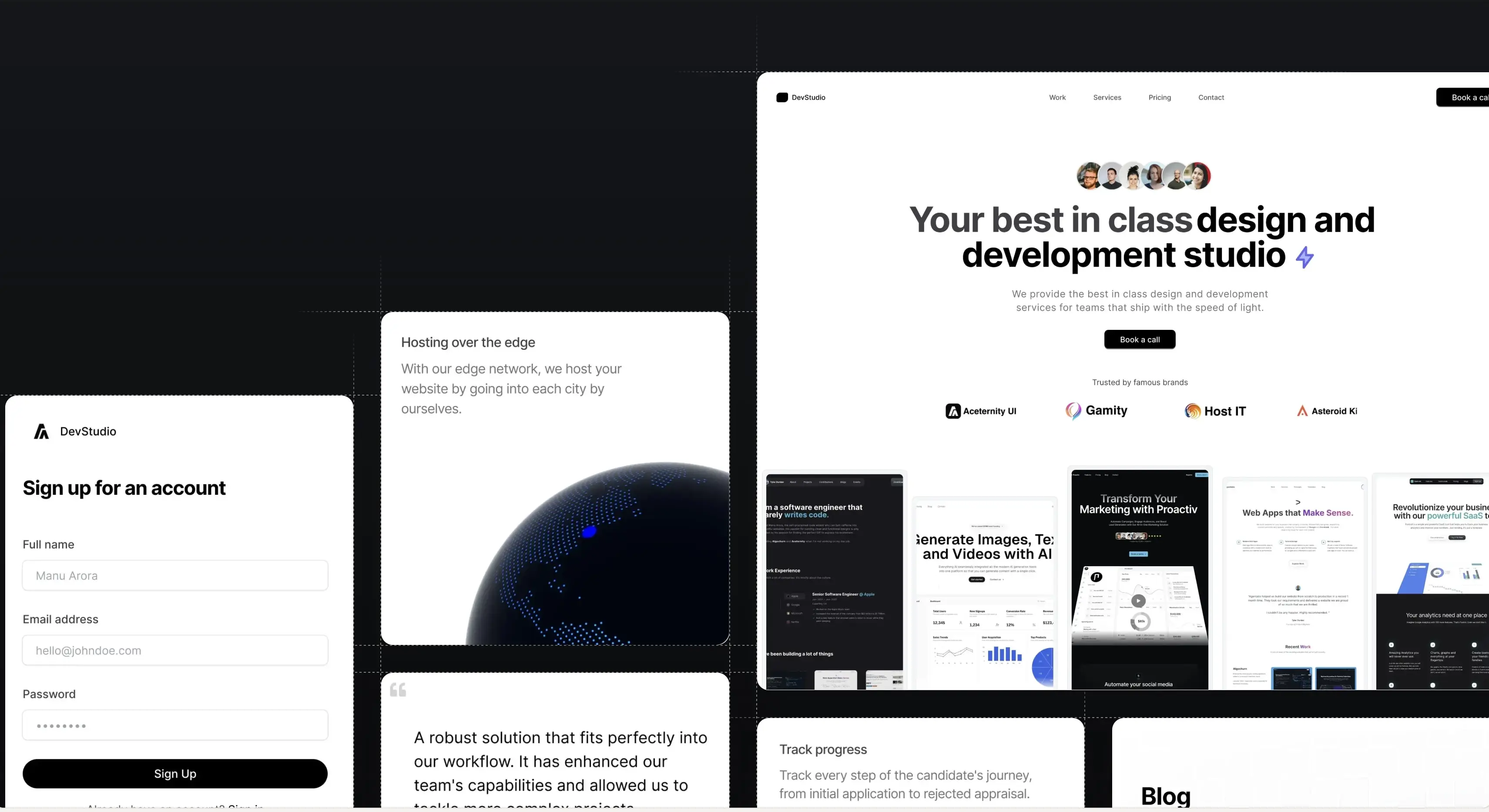
10% off on all-access. Use code SUPER10.
    d :
    h :
    m :
    Logo

    Cards

    A set of cards that can be used for different use cases

    Installation

    Run the following command

    npx shadcn@latest add @aceternity/cards-demo-1 @aceternity/cards-demo-2 @aceternity/cards-demo-3

    Modify Tailwind Config File

    tailwind.config.ts
    import type { Config } from "tailwindcss";
     
    const config: Config = {
      content: [
        "./pages/**/*.{js,ts,jsx,tsx,mdx}",
        "./components/**/*.{js,ts,jsx,tsx,mdx}",
        "./app/**/*.{js,ts,jsx,tsx,mdx}",
      ],
      theme: {
        extend: {
          animation: {
            move: "move 5s linear infinite",
          },
          keyframes: {
            move: {
              "0%": { transform: "translateX(-200px)" },
              "100%": { transform: "translateX(200px)" },
            },
          },
        },
      },
      plugins: [],
    };
     
    export default config;

    Feature Block Animated Card

    Damn good card

    A card that showcases a set of tools that you use to create your product.

    Background Overlay Card

    Background Overlays

    This card is for some special elements, like displaying background gifs on hover only.

    Content Card

    Avatar

    Manu Arora

    2 min read

    Author Card

    Card with Author avatar, complete name and time to read - most suitable for blogs.

    Build websites faster and 10x better than your competitors with

    Aceternity UI Pro

    Next.js 15, Tailwind CSS v4 and Motion for react powered templates

    100+ templates and blocks combined

    Ready to copy paste component blocks, save days of development time
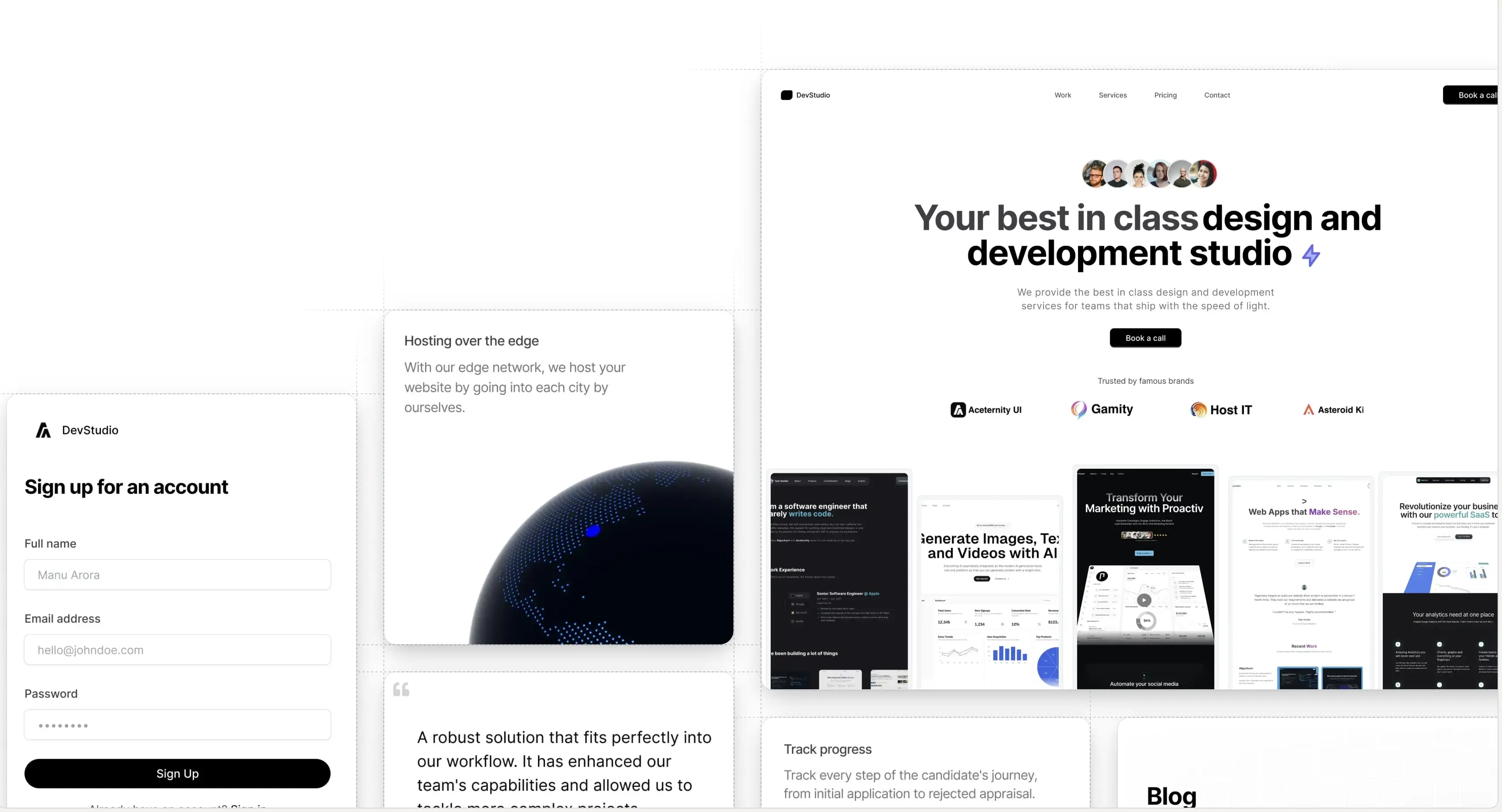
    Aceternity UI Pro Demo - Light Mode
    Logo
    Aceternity UI

    Access an ever-growing collection of premium, meticulously crafted templates and Component Blocks.

    A product by Aceternity
    Building in public at @mannupaaji

    © 2026 Aceternity Labs LLC. All Rights Reserved.