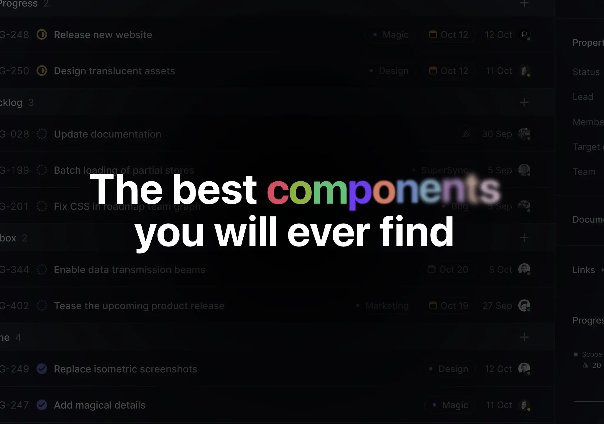
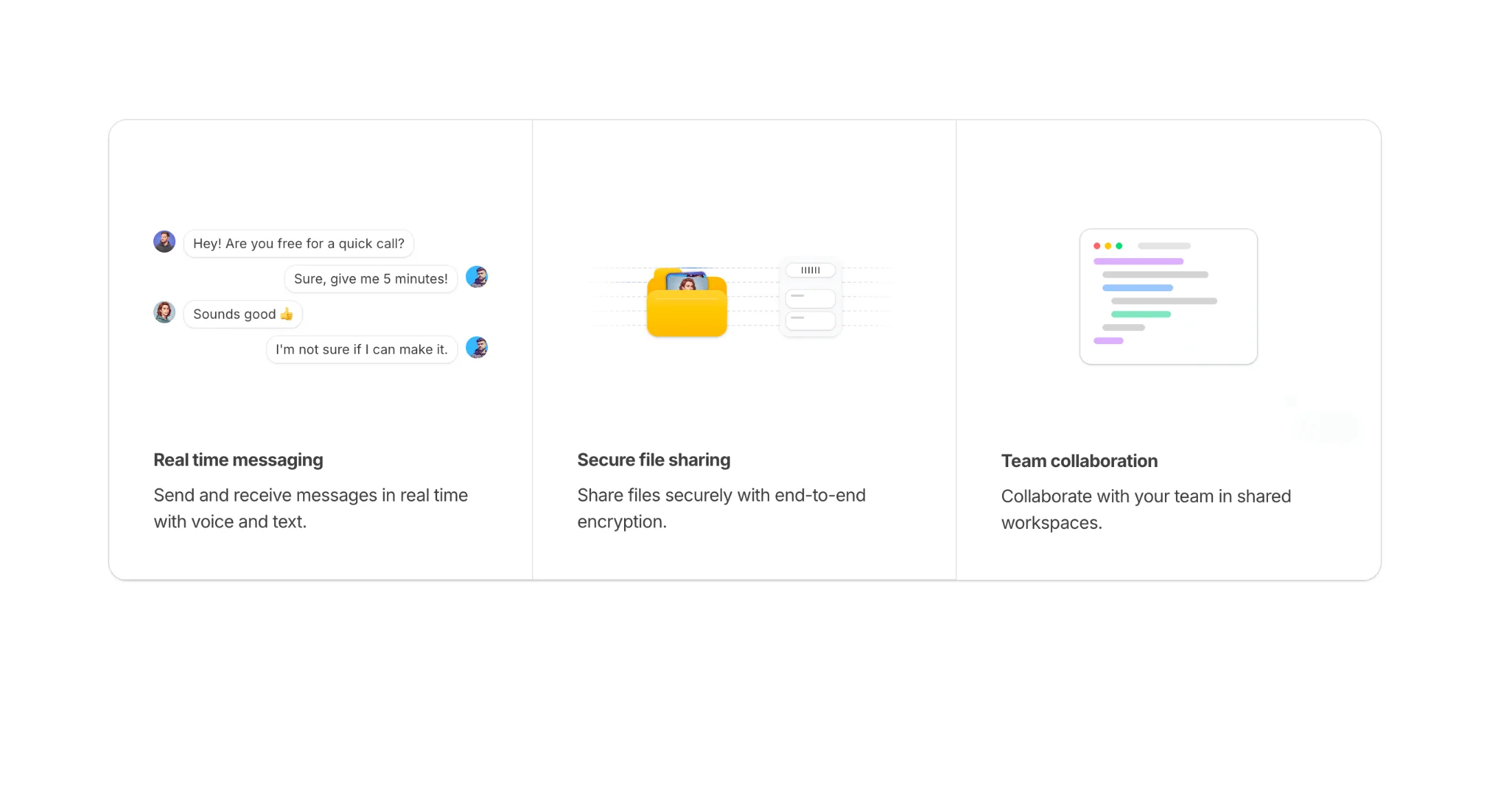
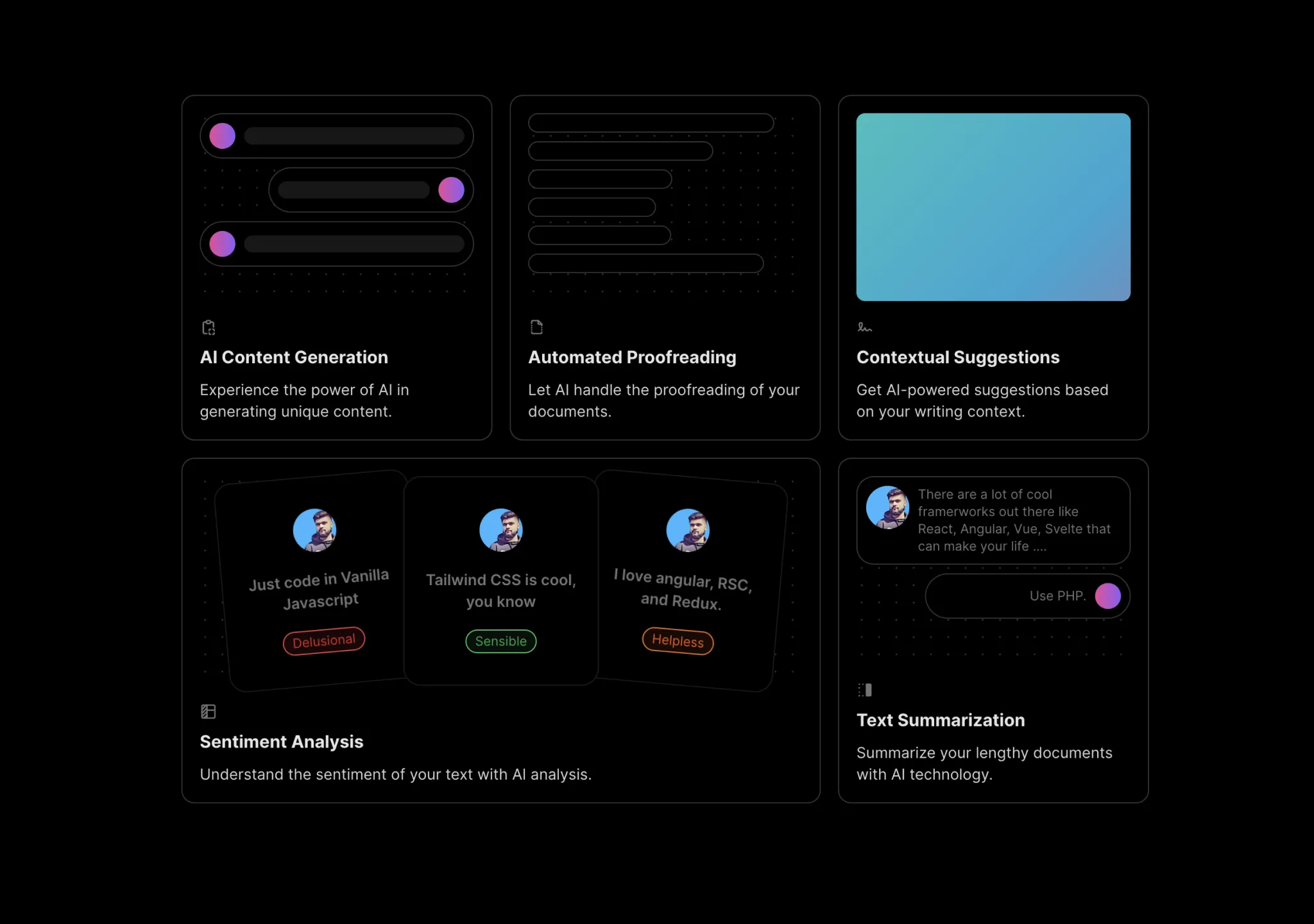
Best Free Features Components for your Tailwind CSS and React project
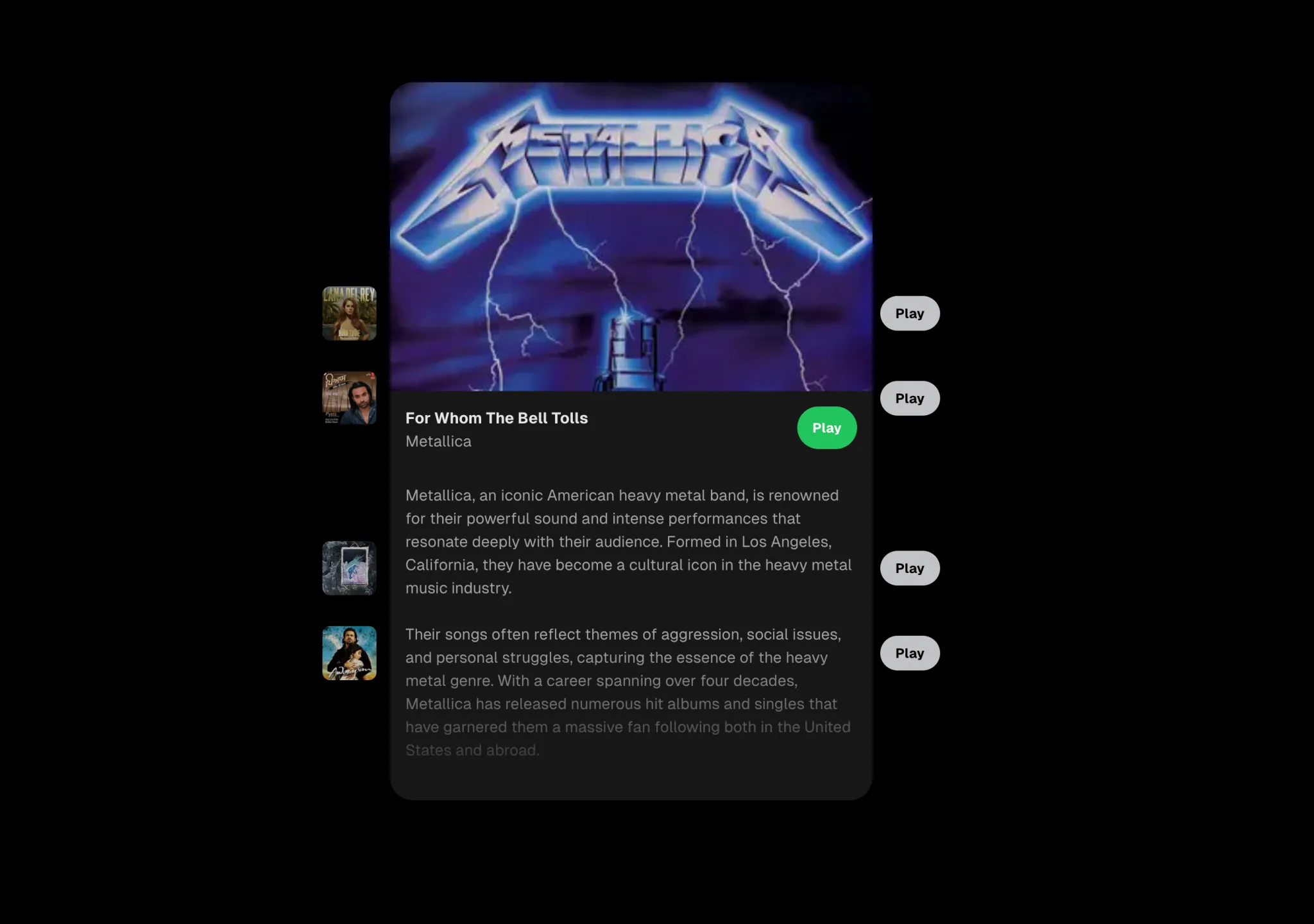
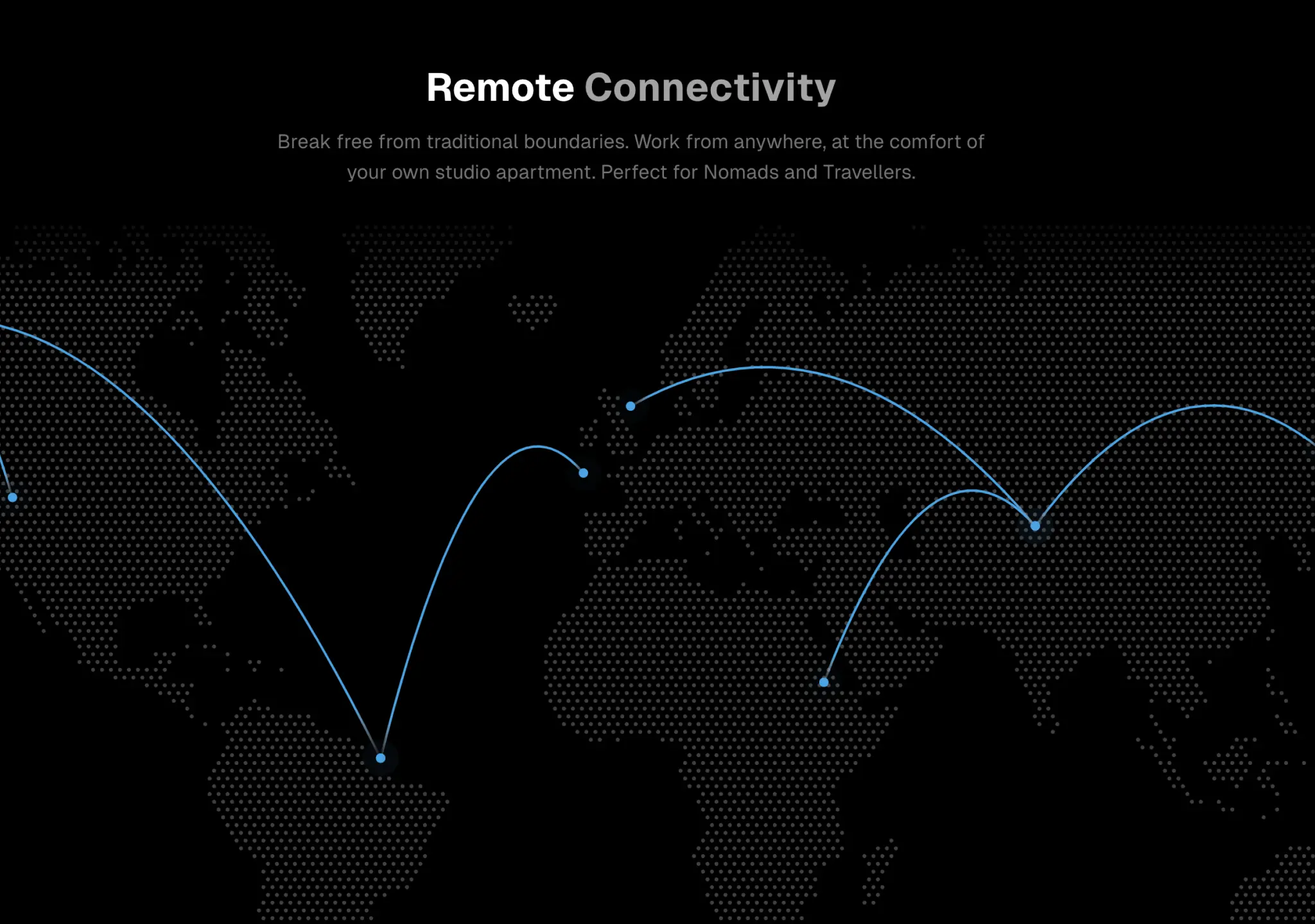
Explore the best components and templates for your project to help you stand out from the crowd.


Coming Soon
We are working hard to bring you more components. Bookmark this page to stay tuned!
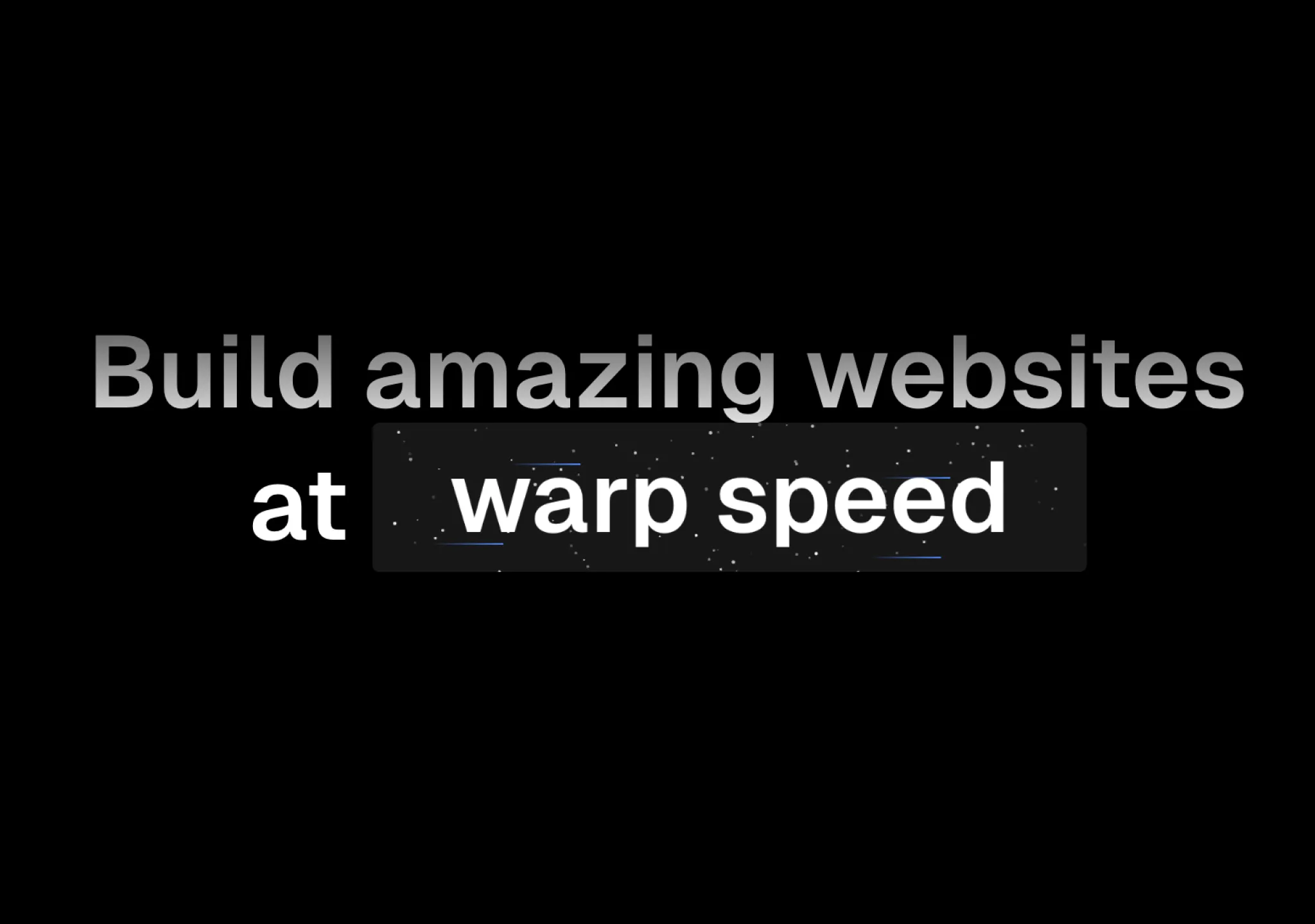
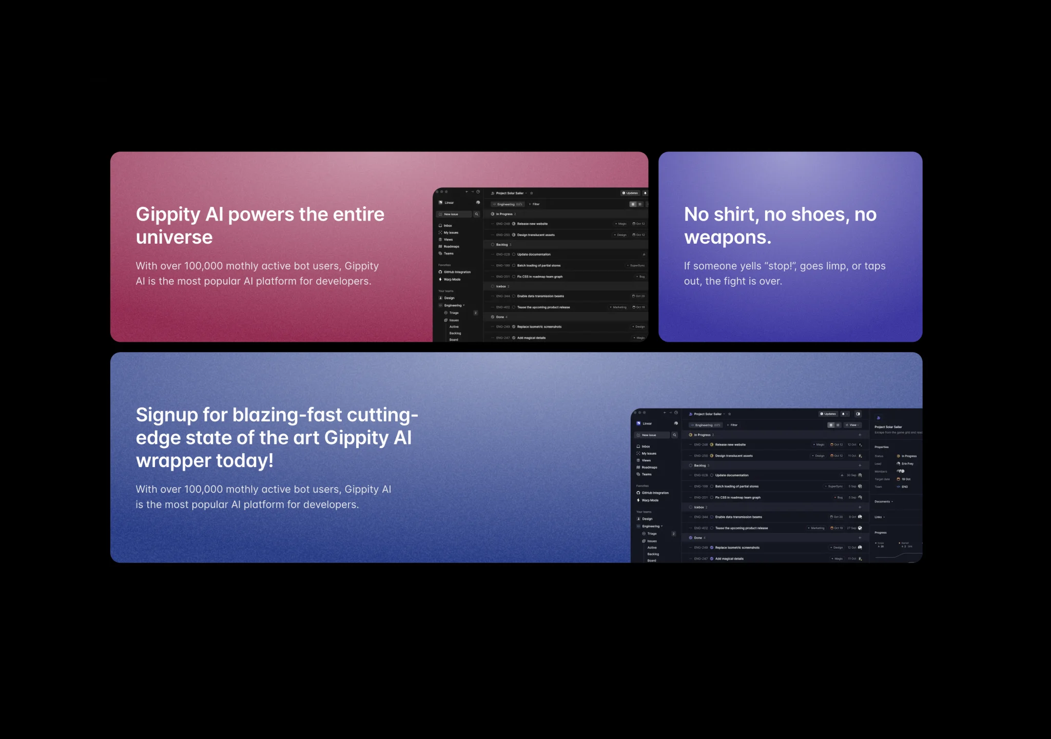
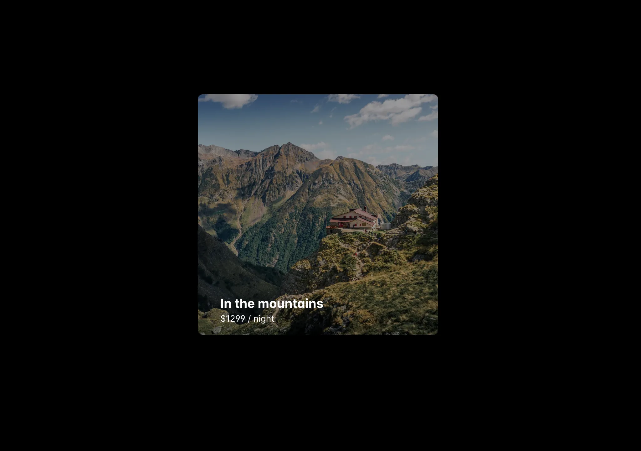
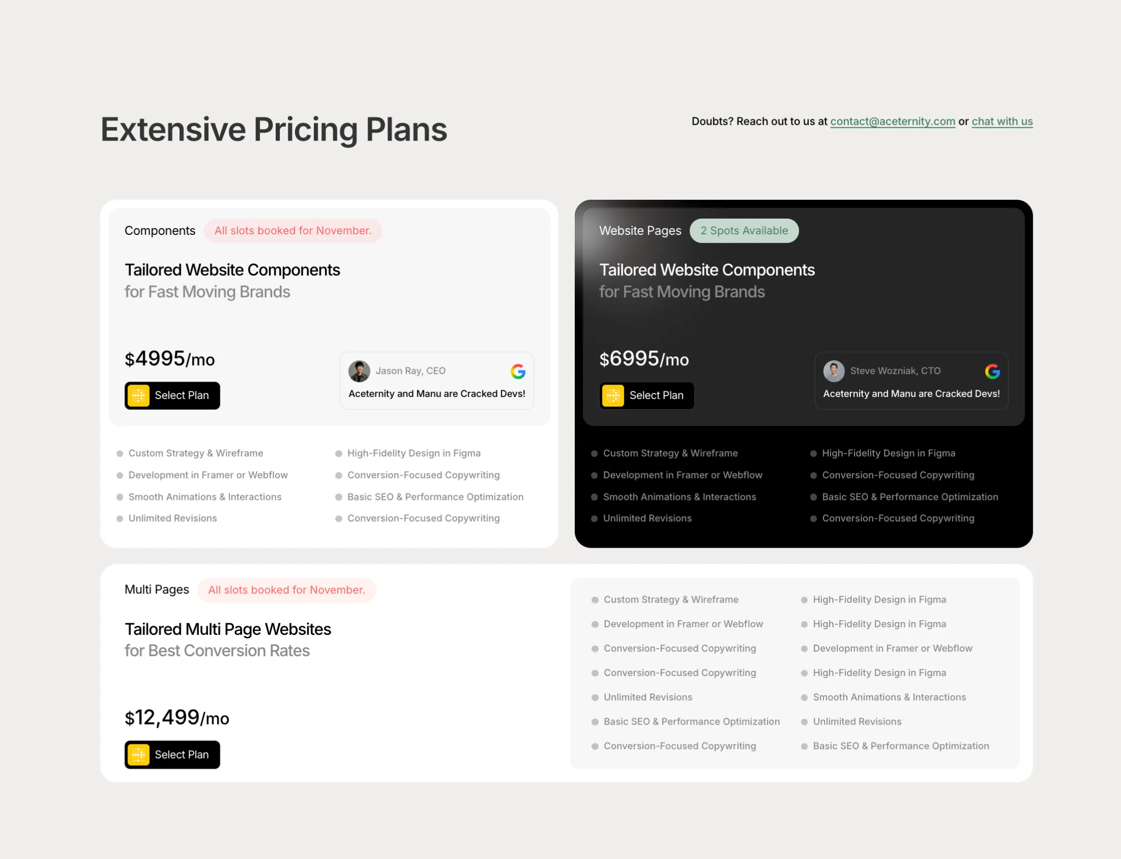
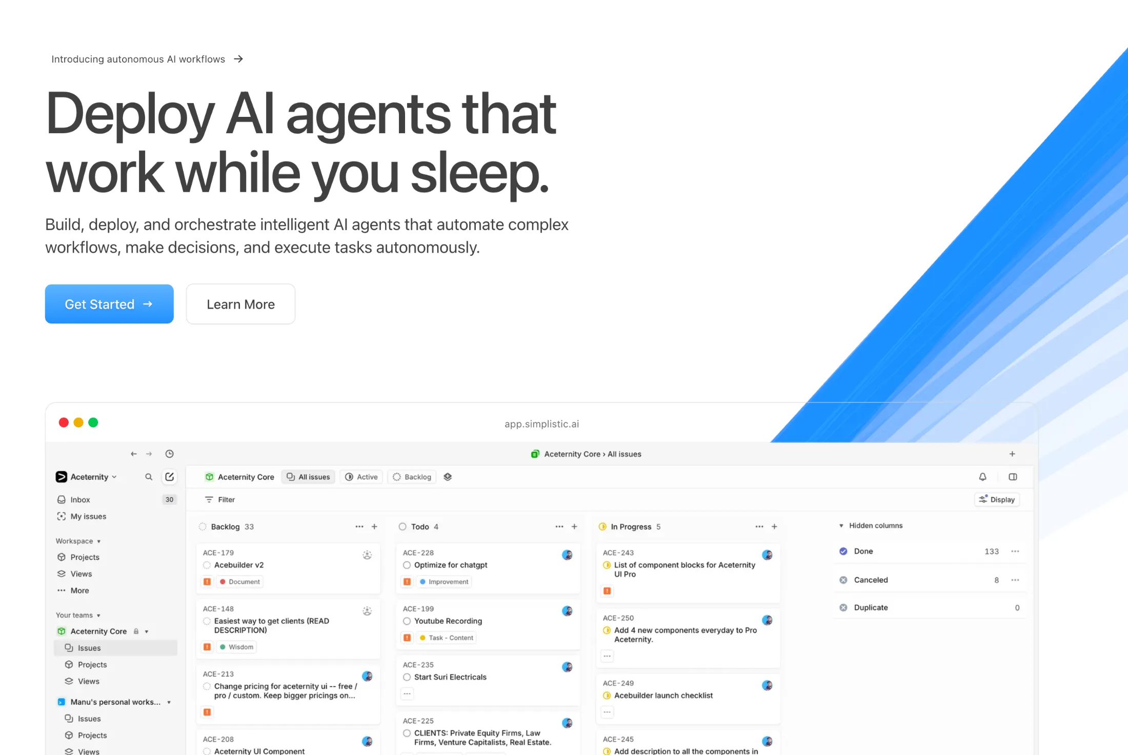
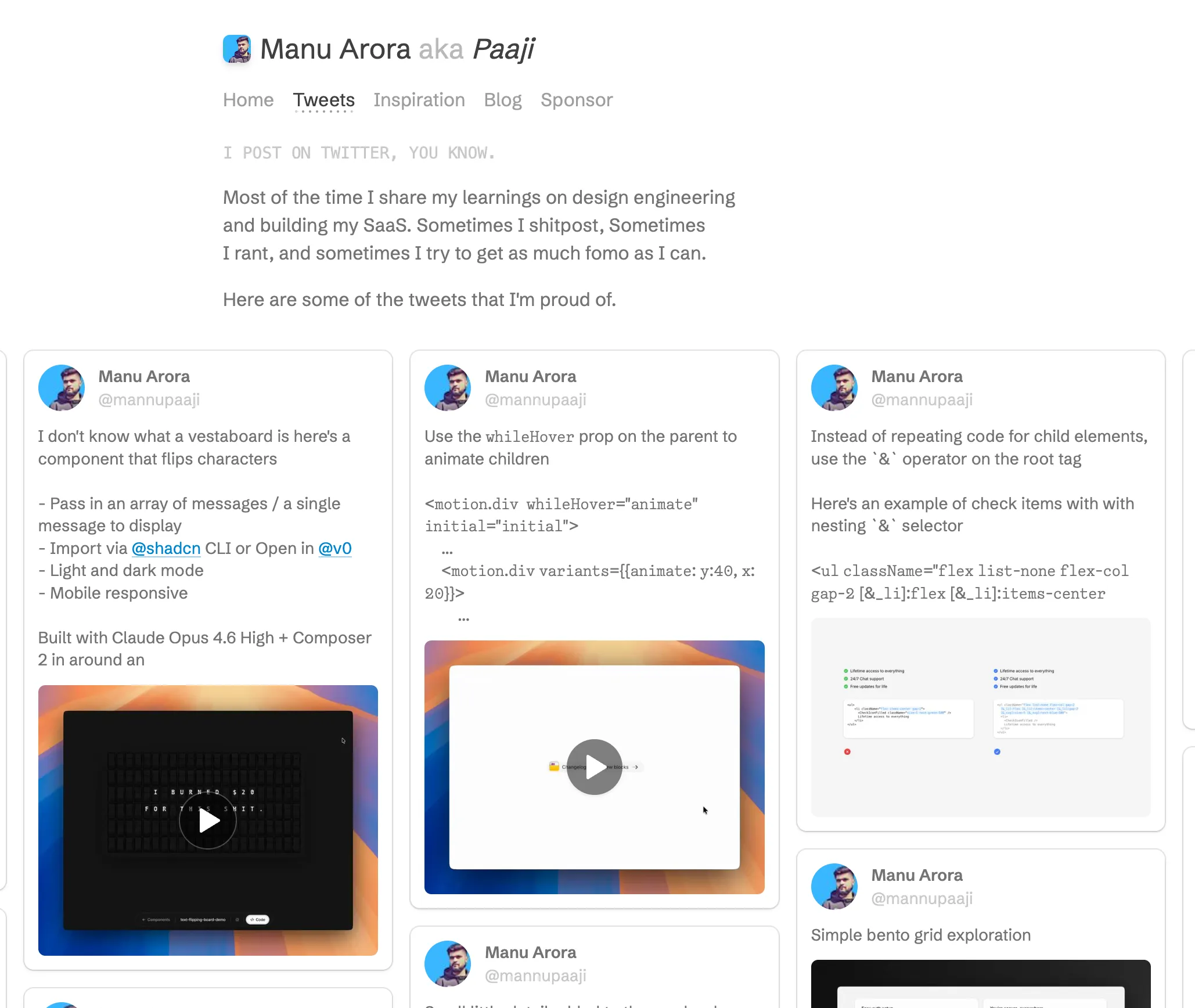
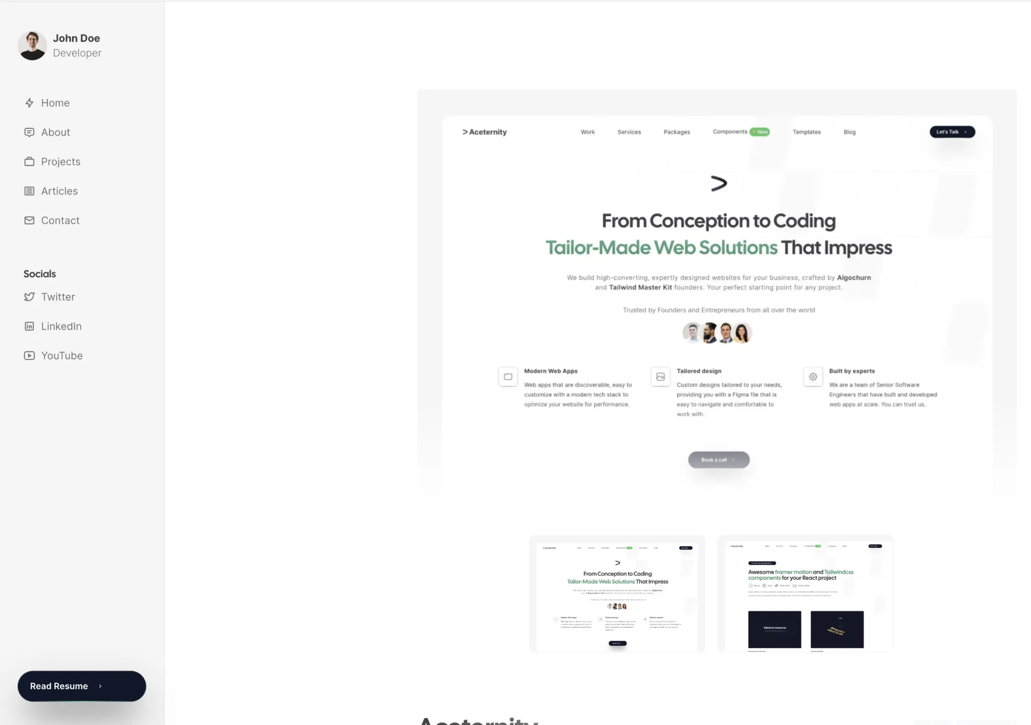
Build websites faster and 10x better than your competitors with
Aceternity UI Pro
Next.js 15, Tailwind CSS v4 and Motion for react powered templates
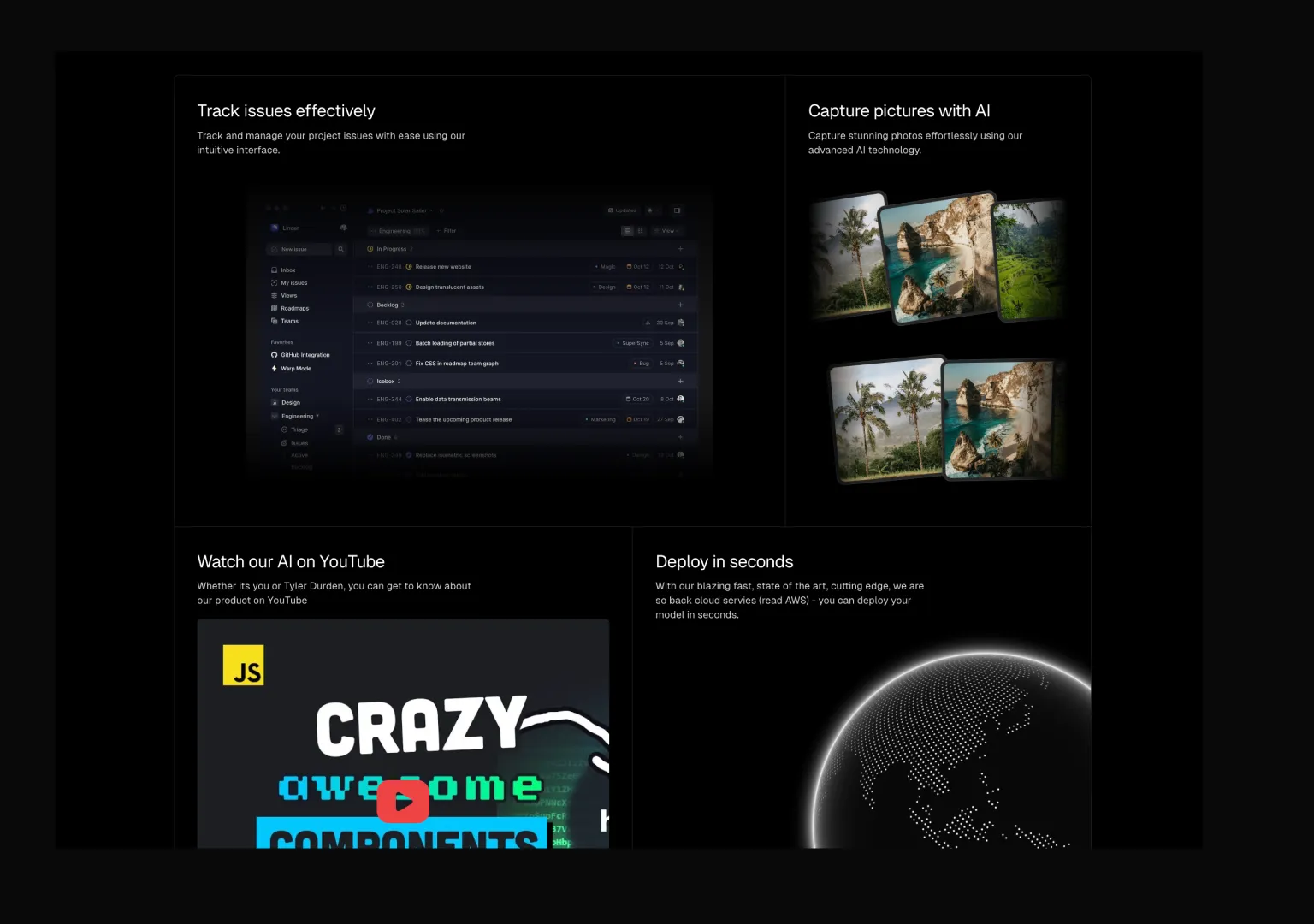
200+ templates and blocks combined
Ready to copy paste component blocks, save days of development time

