Introducing Aceternity UI Pro - Premium component packs and templates to build awesome websites.
Logo
Component Thumbnail

Macbook Scroll

Scroll through the page and see the image come out of the screen.

Component Thumbnail

3D Card Effect

A card perspective effect, hover over the card to elevate card elements.

Component Thumbnail

Apple Cards Carousel

A sleek and minimal carousel implementation, as seen on apple.com

Component Thumbnail

Background Beams With Collision

Exploding beams in the background

Component Thumbnail

Background Lines

A set of svg paths that animate in a wave pattern. Good for hero sections background, as seen on height.app

Component Thumbnail

Card Spotlight

A card component with a spotlight effect revealing a radial gradient background

Component Thumbnail

Compare

A comparison component between two images, slide or drag to compare

Component Thumbnail

Cover

A Cover component that wraps any children, providing beams and space effect, hover to reveal speed.

Component Thumbnail

Expandable Cards

Click cards to expand them and show additional information

Component Thumbnail

Feature Sections

A set of feature sections ranging from bento grids to simple layouts

Component Thumbnail

File Upload

A minimal file upload form with background grid, drag and drop, and micro interactions.

Component Thumbnail

Floating Dock

A floating dock mac os style component, acts as a navigation bar.

Component Thumbnail

Focus Cards

Hover over the card to focus on it, blurring the rest of the cards.

Component Thumbnail

Lens

A lens component to zoom into images, videos, or practically anything.

Component Thumbnail

Google Gemini Effect

An effect of SVGs as seen on the Google Gemini Website

Component Thumbnail

Tracing Beam

A Beam that follows the path of an SVG as the user scrolls. Adjusts beam length with scroll speed.

Component Thumbnail

Animated Modal

A customizable, compound modal component with animated transitions

Component Thumbnail

Animated Tooltip

A cool tooltip that reveals on hover, follows mouse pointer

Component Thumbnail

Aurora Background

A subtle Aurora or Southern Lights background for your website.

Component Thumbnail

Background Beams

Multiple background beams that follow a path of SVG, makes a good hero section background.

Component Thumbnail

Background Gradient Animation

A smooth and elegant background gradient animation that changes the gradient position over time.

Component Thumbnail

Bento Grid

A skewed grid layout with Title, description and a header component

Component Thumbnail

Canvas Reveal Effect

A dot background that expands on hover, as seen on Clerk's website

Component Thumbnail

Card Stack

Cards stack on top of each other after some interval. Perfect for showing testimonials.

Component Thumbnail

Cards

A set of cards that can be used for different use cases

Component Thumbnail

Container Scroll Animation

A scroll animation that rotates in 3d on scroll. Perfect for hero or marketing sections.

Component Thumbnail

Evervault Card

A cool card with amazing hover effect, reveals encrypted text and a mixed gradient.

Component Thumbnail

Flip Words

A component that flips through a list of words

Component Thumbnail

GitHub Globe

A globe animation as seen on GitHub's homepage. Interactive and customizable.

Component Thumbnail

Glare Card

A glare effect that happens on hover, as seen on Linear's website

Component Thumbnail

Glowing Background Stars Card

Card background stars that animate on hover and animate anyway

Component Thumbnail

Grid and Dot Backgrounds

A simple grid and dots background to make your sections stand out.

Component Thumbnail

Hero Highlight

A background effect with a text highlight component, perfect for hero sections.

Component Thumbnail

Hero Parallax

A scroll effect with rotation, translation and opacity animations.

Component Thumbnail

Infinite Moving Cards

A customizable group of cards that move infinitely in a loop. Made with Framer Motion and Tailwind CSS.

Component Thumbnail

Lamp Section Header

A lamp effect as seen on linear, great for section headers.

Component Thumbnail

Layout Grid

A layout effect that animates the grid item on click, powered by framer motion layout

Component Thumbnail

Link Preview

Dynamic link previews for your anchor tags

Component Thumbnail

Meteor Effect

A group of beams in the background of a container, sort of like meteors.

Component Thumbnail

Moving Border

A border that moves around the container. Perfect for making your buttons stand out.

Component Thumbnail

Parallax Grid Scroll

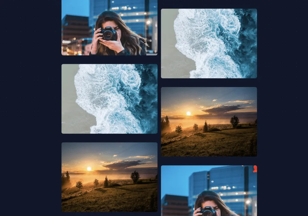
A grid where two columns scroll in oposite directions, giving a parallax effect.
Component Thumbnail

Placeholders And Vanish Input

Sliding in placeholders and vanish effect of input on submit

Component Thumbnail

Shooting Stars and Stars Background

A shooting star animation on top of a starry background, as seen on figmaplug.in

Component Thumbnail

Sidebar

Expandable sidebar that expands on hover, mobile responsive and dark mode support

Component Thumbnail

Signup Form

A customizable form built on top of shadcn's input and label, with a touch of framer motion

Component Thumbnail

Sparkles

A configurable sparkles component that can be used as a background or as a standalone component.

Component Thumbnail

Spotlight

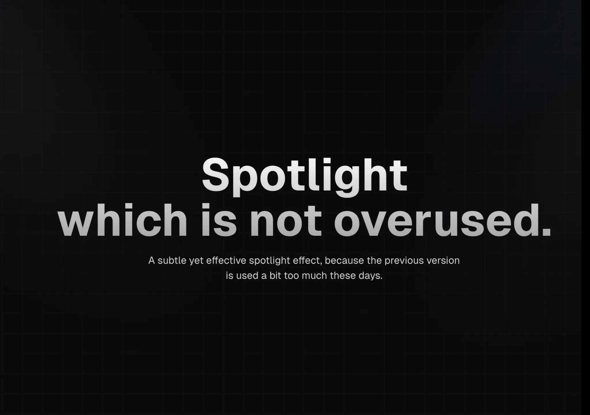
A spotlight effect with Tailwind CSS, good for drawing attention to a particular element on the page.

Component Thumbnail

Sticky Scroll Reveal

A sticky container that sticks while scrolling, text reveals on scroll

Component Thumbnail

SVG Mask Effect

A mask reveal effect, hover the cursor over a container to reveal what's underneath.

Component Thumbnail

Animated Tabs

Tabs to switch content, click on a tab to check background animation.

Component Thumbnail

Text Generate Effect

A cool text effect that fades in text on page load, one by one.

Component Thumbnail

Text Reveal Card

Mousemove effect to reveal text content at the bottom of the card.

Component Thumbnail

Typewriter Effect

Text generates as if it is being typed on the screen.

Component Thumbnail

Vortex Background

A wavy, swirly, vortex background ideal for CTAs and backgrounds.

Component Thumbnail

Wavy Background

A cool background effect with waves that move.

Component Thumbnail

Wobble Card

A card effect that translates and scales on mousemove, perfect for feature cards.

Component Thumbnail

Hover Border Gradient

A hover effect that expands to the entire container with a gradient border.

Component Thumbnail

Multi Step Loader

A step loader for screens that take a lot of time to load.

Component Thumbnail

3D Animated Pin

A gradient pin that animates on hover, perfect for product links.

Component Thumbnail

Background Boxes

A full width background box container that highlights on hover

Component Thumbnail

Background Gradient

An animated gradient that sits at the background of a card, button or anything.

Component Thumbnail

Hover Effect

Hover over the cards and the effect slides to the currently hovered card.

Component Thumbnail

Direction Aware Hover

A direction aware hover effect using Framer Motion, Tailwindcss and good old javascript.

Component Thumbnail

Floating Navbar

A sticky Navbar that hides on scroll, reveals when scrolled up.

Component Thumbnail

Following Pointer

A custom pointer that follows mouse arrow and animates in pointer and content.

Component Thumbnail

Images Slider

A full page slider with images that can be navigated with the keyboard.

Component Thumbnail

Navbar Menu

A navbar menu that animates its children on hover, makes a beautiful bignav

Component Thumbnail

Tailwind CSS buttons

A curated list of awesome, battle tested Tailwind CSS buttons components

Component Thumbnail

Text Hover Effect

A text hover effect that animates and outlines gradient on hover, as seen on x.ai

Component Thumbnail

Timeline

A timeline component with sticky header and scroll beam follow.

Coming Soon

We are working hard to bring you more components. Bookmark this page to stay tuned!

A product by Aceternity
Building in public at @mannupaaji