Following Pointer
A custom pointer that follows mouse arrow and animates in pointer and content.
Amazing Tailwindcss Grid Layout Examples
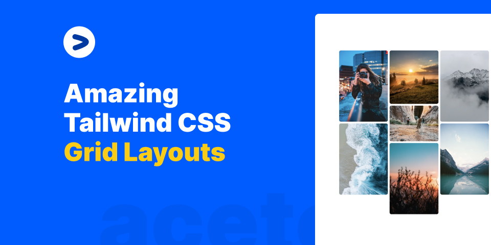
Grids are cool, but Tailwindcss grids are cooler. In this article, we will learn how to create amazing Grid layouts with Tailwindcs grid and React.
28th March, 2023
Read More
Installation
Install dependencies
npm i framer-motion clsx tailwind-merge
Add util file
lib/utils.ts
import { ClassValue, clsx } from "clsx";
import { twMerge } from "tailwind-merge";
export function cn(...inputs: ClassValue[]) {
return twMerge(clsx(inputs));
}
Copy the source code
components/ui/following-pointer.tsx
// Core component that receives mouse positions and renders pointer and content
import React, { useEffect, useState } from "react";
import { motion, AnimatePresence, useMotionValue } from "framer-motion";
import { cn } from "@/lib/utils";
export const FollowerPointerCard = ({
children,
className,
title,
}: {
children: React.ReactNode;
className?: string;
title?: string | React.ReactNode;
}) => {
const x = useMotionValue(0);
const y = useMotionValue(0);
const ref = React.useRef<HTMLDivElement>(null);
const [rect, setRect] = useState<DOMRect | null>(null);
const [isInside, setIsInside] = useState<boolean>(false); // Add this line
useEffect(() => {
if (ref.current) {
setRect(ref.current.getBoundingClientRect());
}
}, []);
const handleMouseMove = (e: React.MouseEvent<HTMLDivElement>) => {
if (rect) {
const scrollX = window.scrollX;
const scrollY = window.scrollY;
x.set(e.clientX - rect.left + scrollX);
y.set(e.clientY - rect.top + scrollY);
}
};
const handleMouseLeave = () => {
setIsInside(false);
};
const handleMouseEnter = () => {
setIsInside(true);
};
return (
<div
onMouseLeave={handleMouseLeave}
onMouseEnter={handleMouseEnter}
onMouseMove={handleMouseMove}
style={{
cursor: "none",
}}
ref={ref}
className={cn("relative", className)}
>
<AnimatePresence>
{isInside && <FollowPointer x={x} y={y} title={title} />}
</AnimatePresence>
{children}
</div>
);
};
export const FollowPointer = ({
x,
y,
title,
}: {
x: any;
y: any;
title?: string | React.ReactNode;
}) => {
const colors = [
"var(--sky-500)",
"var(--neutral-500)",
"var(--teal-500)",
"var(--green-500)",
"var(--blue-500)",
"var(--red-500)",
"var(--yellow-500)",
];
return (
<motion.div
className="h-4 w-4 rounded-full absolute z-50"
style={{
top: y,
left: x,
pointerEvents: "none",
}}
initial={{
scale: 1,
opacity: 1,
}}
animate={{
scale: 1,
opacity: 1,
}}
exit={{
scale: 0,
opacity: 0,
}}
>
<svg
stroke="currentColor"
fill="currentColor"
strokeWidth="1"
viewBox="0 0 16 16"
className="h-6 w-6 text-sky-500 transform -rotate-[70deg] -translate-x-[12px] -translate-y-[10px] stroke-sky-600"
height="1em"
width="1em"
xmlns="http://www.w3.org/2000/svg"
>
<path d="M14.082 2.182a.5.5 0 0 1 .103.557L8.528 15.467a.5.5 0 0 1-.917-.007L5.57 10.694.803 8.652a.5.5 0 0 1-.006-.916l12.728-5.657a.5.5 0 0 1 .556.103z"></path>
</svg>
<motion.div
style={{
backgroundColor: colors[Math.floor(Math.random() * colors.length)],
}}
initial={{
scale: 0.5,
opacity: 0,
}}
animate={{
scale: 1,
opacity: 1,
}}
exit={{
scale: 0.5,
opacity: 0,
}}
className={
"px-2 py-2 bg-neutral-200 text-white whitespace-nowrap min-w-max text-xs rounded-full"
}
>
{title || `William Shakespeare`}
</motion.div>
</motion.div>
);
};
Add the following code in tailwind.config.js
file
const defaultTheme = require("tailwindcss/defaultTheme");
const colors = require("tailwindcss/colors");
const {
default: flattenColorPalette,
} = require("tailwindcss/lib/util/flattenColorPalette");
/** @type {import('tailwindcss').Config} */
module.exports = {
content: ["./src/**/*.{ts,tsx}"],
darkMode: "class",
theme: {
// rest of the code
},
plugins: [
// rest of the code
addVariablesForColors,
],
};
// This plugin adds each Tailwind color as a global CSS variable, e.g. var(--gray-200).
function addVariablesForColors({ addBase, theme }: any) {
let allColors = flattenColorPalette(theme("colors"));
let newVars = Object.fromEntries(
Object.entries(allColors).map(([key, val]) => [`--${key}`, val])
);
addBase({
":root": newVars,
});
}
Props
FollowerPointerCard Props
Prop name | Type | Description |
---|---|---|
children | React.ReactNode | The content to be rendered inside the component. |
className | string (optional) | The class name of the FollowerPointerCard component. |
title | string or ReactNode (optional) | The title to be displayed on the pointer. |
Get beautiful, hand-crafted templates and components with Aceternity UI Pro
Professional, beautiful and elegant templates for your business. Get the best component packs and templates with Aceternity UI Pro.
Manu is the man! He is the best front-end developer I have worked with. He took the requirements and quite literally ran with them. We are super happy with the result and product we go...
John Shahawy
Founder at Rogue and Moonbeam