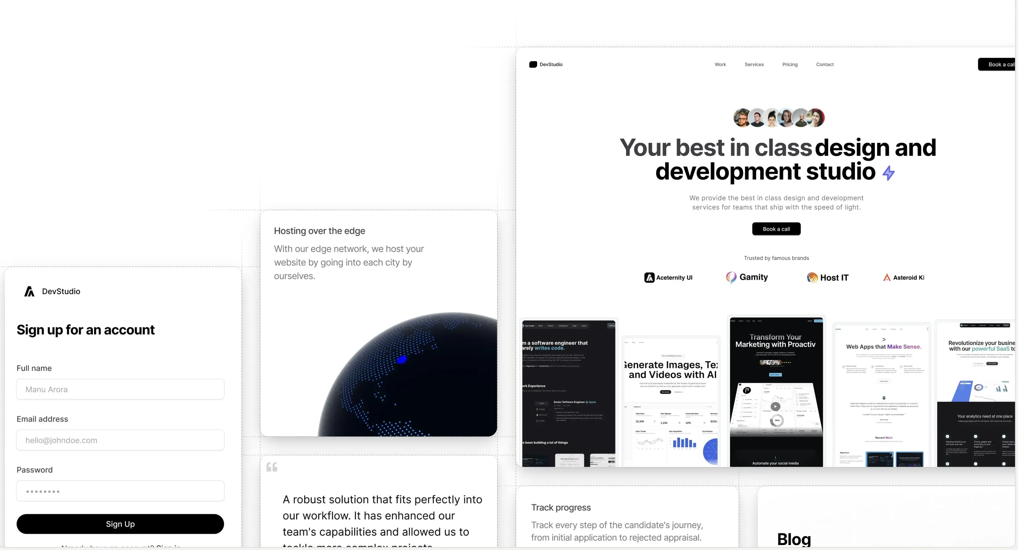
Introducing Aceternity UI Pro - Premium component packs and templates to build awesome websites.
Logo

Signup Form

A customizable form built on top of shadcn's input and label, with a touch of framer motion

Welcome to Aceternity

Login to aceternity if you can because we don't have a login flow yet

Installation

Install dependencies

npm i framer-motion clsx tailwind-merge @radix-ui/react-label @tabler/icons-react

Add util file

lib/utils.ts
import { ClassValue, clsx } from "clsx";
import { twMerge } from "tailwind-merge";
 
export function cn(...inputs: ClassValue[]) {
  return twMerge(clsx(inputs));
}

Modify the config file to add a plugin and a box shadow

tailwind.config.ts
const defaultTheme = require("tailwindcss/defaultTheme");
 
const colors = require("tailwindcss/colors");
const {
  default: flattenColorPalette,
} = require("tailwindcss/lib/util/flattenColorPalette");
 
/** @type {import('tailwindcss').Config} */
module.exports = {
  content: ["./src/**/*.{ts,tsx}"],
  darkMode: "class",
  theme: {
    // rest of the code
    extend: {
      boxShadow: {
        input: `0px 2px 3px -1px rgba(0,0,0,0.1), 0px 1px 0px 0px rgba(25,28,33,0.02), 0px 0px 0px 1px rgba(25,28,33,0.08)`,
      },
    },
  },
  plugins: [addVariablesForColors],
};
 
function addVariablesForColors({ addBase, theme }: any) {
  let allColors = flattenColorPalette(theme("colors"));
  let newVars = Object.fromEntries(
    Object.entries(allColors).map(([key, val]) => [`--${key}`, val])
  );
 
  addBase({
    ":root": newVars,
  });
}

Copy the source code

components/ui/input.tsx

// Input component extends from shadcnui - https://ui.shadcn.com/docs/components/input
"use client";
import * as React from "react";
import { cn } from "@/lib/utils";
import { useMotionTemplate, useMotionValue, motion } from "framer-motion";
 
export interface InputProps
  extends React.InputHTMLAttributes<HTMLInputElement> {}
 
const Input = React.forwardRef<HTMLInputElement, InputProps>(
  ({ className, type, ...props }, ref) => {
    const radius = 100; // change this to increase the rdaius of the hover effect
    const [visible, setVisible] = React.useState(false);
 
    let mouseX = useMotionValue(0);
    let mouseY = useMotionValue(0);
 
    function handleMouseMove({ currentTarget, clientX, clientY }: any) {
      let { left, top } = currentTarget.getBoundingClientRect();
 
      mouseX.set(clientX - left);
      mouseY.set(clientY - top);
    }
    return (
      <motion.div
        style={{
          background: useMotionTemplate`
        radial-gradient(
          ${visible ? radius + "px" : "0px"} circle at ${mouseX}px ${mouseY}px,
          var(--blue-500),
          transparent 80%
        )
      `,
        }}
        onMouseMove={handleMouseMove}
        onMouseEnter={() => setVisible(true)}
        onMouseLeave={() => setVisible(false)}
        className="p-[2px] rounded-lg transition duration-300 group/input"
      >
        <input
          type={type}
          className={cn(
            `flex h-10 w-full border-none bg-gray-50 dark:bg-zinc-800 text-black dark:text-white shadow-input rounded-md px-3 py-2 text-sm  file:border-0 file:bg-transparent 
          file:text-sm file:font-medium placeholder:text-neutral-400 dark:placeholder-text-neutral-600 
          focus-visible:outline-none focus-visible:ring-[2px]  focus-visible:ring-neutral-400 dark:focus-visible:ring-neutral-600
           disabled:cursor-not-allowed disabled:opacity-50
           dark:shadow-[0px_0px_1px_1px_var(--neutral-700)]
           group-hover/input:shadow-none transition duration-400
           `,
            className
          )}
          ref={ref}
          {...props}
        />
      </motion.div>
    );
  }
);
Input.displayName = "Input";
 
export { Input };

components/ui/label.tsx

// Label component extends from shadcnui - https://ui.shadcn.com/docs/components/label
 
"use client";
import * as React from "react";
import * as LabelPrimitive from "@radix-ui/react-label";
 
import { cn } from "@/lib/utils";
 
const Label = React.forwardRef<
  React.ElementRef<typeof LabelPrimitive.Root>,
  React.ComponentPropsWithoutRef<typeof LabelPrimitive.Root>
>(({ className, ...props }, ref) => (
  <LabelPrimitive.Root
    ref={ref}
    className={cn(
      "text-sm font-medium text-black dark:text-white leading-none peer-disabled:cursor-not-allowed peer-disabled:opacity-70",
      className
    )}
    {...props}
  />
));
Label.displayName = LabelPrimitive.Root.displayName;
 
export { Label };

Props

input.tsx

Prop NameTypeDescription
classNamestringAdditional CSS classes to apply to the input component.
typestringSpecifies the type of input (e.g., "text", "password"). Inherits all standard HTML input types.
...propsReact.InputHTMLAttributes<HTMLInputElement>Spreads the rest of the input attributes (e.g., placeholder, disabled, value, etc.) from React's InputHTMLAttributes.
refReact.Ref<HTMLInputElement>Ref forwarding is used to allow parent components to directly access the DOM input element.

label.tsx

PropTypeDescription
classNamestringAdditional CSS classes to apply to the label component.
...propsReact.ComponentPropsWithoutRef<typeof LabelPrimitive.Root>All other props supported by LabelPrimitive.Root from @radix-ui/react-label.
A product by Aceternity
Building in public at @mannupaaji