Logo

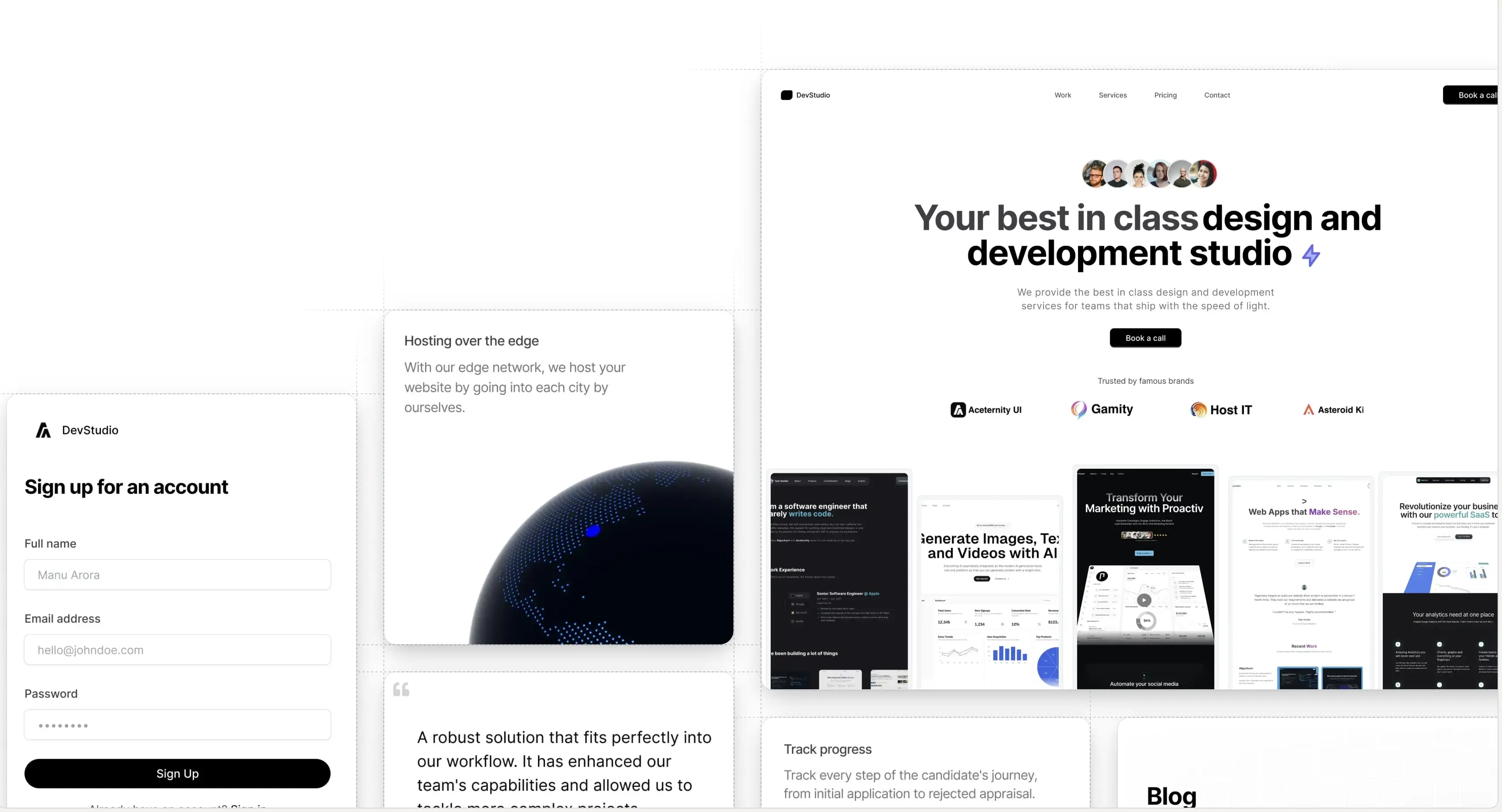
Link Preview

Dynamic link previews for your anchor tags

Tailwind CSS and Framer Motion are a great way to build modern websites.

Visit Aceternity UI for amazing Tailwind and Framer Motion components.

Installation

Install util dependencies

npm i framer-motion clsx tailwind-merge

Install component dependencies

npm i @radix-ui/react-hover-card qss

Add util file

utils/cn.ts
import { ClassValue, clsx } from "clsx";
import { twMerge } from "tailwind-merge";
 
export function cn(...inputs: ClassValue[]) {
  return twMerge(clsx(inputs));
}

Add microlink in next.config file

next.config.js
/** @type {import('next').NextConfig} */
const nextConfig = {
  images: {
    domains: [
      "api.microlink.io", // Microlink Image Preview
    ],
  },
};
 
module.exports = nextConfig;

Copy the source code

components/ui/link-preview.tsx

"use client";
import * as HoverCardPrimitive from "@radix-ui/react-hover-card";
import Image from "next/image";
import { encode } from "qss";
import React from "react";
import {
  AnimatePresence,
  motion,
  useMotionValue,
  useSpring,
} from "framer-motion";
import Link from "next/link";
import { cn } from "@/utils/cn";
 
type LinkPreviewProps = {
  children: React.ReactNode;
  url: string;
  className?: string;
  width?: number;
  height?: number;
  quality?: number;
  layout?: string;
} & (
  | { isStatic: true; imageSrc: string }
  | { isStatic?: false; imageSrc?: never }
);
 
export const LinkPreview = ({
  children,
  url,
  className,
  width = 200,
  height = 125,
  quality = 50,
  layout = "fixed",
  isStatic = false,
  imageSrc = "",
}: LinkPreviewProps) => {
  let src;
  if (!isStatic) {
    const params = encode({
      url,
      screenshot: true,
      meta: false,
      embed: "screenshot.url",
      colorScheme: "dark",
      "viewport.isMobile": true,
      "viewport.deviceScaleFactor": 1,
      "viewport.width": width * 3,
      "viewport.height": height * 3,
    });
    src = `https://api.microlink.io/?${params}`;
  } else {
    src = imageSrc;
  }
 
  const [isOpen, setOpen] = React.useState(false);
 
  const [isMounted, setIsMounted] = React.useState(false);
 
  React.useEffect(() => {
    setIsMounted(true);
  }, []);
 
  const springConfig = { stiffness: 100, damping: 15 };
  const x = useMotionValue(0);
 
  const translateX = useSpring(x, springConfig);
 
  const handleMouseMove = (event: any) => {
    const targetRect = event.target.getBoundingClientRect();
    const eventOffsetX = event.clientX - targetRect.left;
    const offsetFromCenter = (eventOffsetX - targetRect.width / 2) / 2; // Reduce the effect to make it subtle
    x.set(offsetFromCenter);
  };
 
  return (
    <>
      {isMounted ? (
        <div className="hidden">
          <Image
            src={src}
            width={width}
            height={height}
            quality={quality}
            layout={layout}
            priority={true}
            alt="hidden image"
          />
        </div>
      ) : null}
 
      <HoverCardPrimitive.Root
        openDelay={50}
        closeDelay={100}
        onOpenChange={(open) => {
          setOpen(open);
        }}
      >
        <HoverCardPrimitive.Trigger
          onMouseMove={handleMouseMove}
          className={cn("text-black dark:text-white", className)}
          href={url}
        >
          {children}
        </HoverCardPrimitive.Trigger>
 
        <HoverCardPrimitive.Content
          className="[transform-origin:var(--radix-hover-card-content-transform-origin)]"
          side="top"
          align="center"
          sideOffset={10}
        >
          <AnimatePresence>
            {isOpen && (
              <motion.div
                initial={{ opacity: 0, y: 20, scale: 0.6 }}
                animate={{
                  opacity: 1,
                  y: 0,
                  scale: 1,
                  transition: {
                    type: "spring",
                    stiffness: 260,
                    damping: 20,
                  },
                }}
                exit={{ opacity: 0, y: 20, scale: 0.6 }}
                className="shadow-xl rounded-xl"
                style={{
                  x: translateX,
                }}
              >
                <Link
                  href={url}
                  className="block p-1 bg-white border-2 border-transparent shadow rounded-xl hover:border-neutral-200 dark:hover:border-neutral-800"
                  style={{ fontSize: 0 }}
                >
                  <Image
                    src={isStatic ? imageSrc : src}
                    width={width}
                    height={height}
                    quality={quality}
                    layout={layout}
                    priority={true}
                    className="rounded-lg"
                    alt="preview image"
                  />
                </Link>
              </motion.div>
            )}
          </AnimatePresence>
        </HoverCardPrimitive.Content>
      </HoverCardPrimitive.Root>
    </>
  );
};

Static Image Preview Example

Visit Aceternity UI and for amazing Tailwind and Framer Motion components.

I listen to this guy and I watch this movie twice a day

This example shows images being generated from a url AND images being fetched from local folder with a different url for link.

Props

Prop NameTypeDefault ValueDescription
childrenReact.ReactNodeNoneThe content to be displayed inside the link component.
urlstringNoneThe URL for the link and for generating the preview image if isStatic is false.
classNamestringNoneAdditional CSS classes to apply to the link component.
widthnumber200Width of the preview image.
heightnumber125Height of the preview image.
qualitynumber50Quality of the preview image.
layoutstring"fixed"Layout type of the image, affects how the image resizes.
isStaticbooleanfalseDetermines if the image source is static or dynamically generated from the URL.
imageSrcstring""Source of the image when isStatic is true. If isStatic is false, this prop should not be used.
A product by Aceternity
Building in public at @mannupaaji