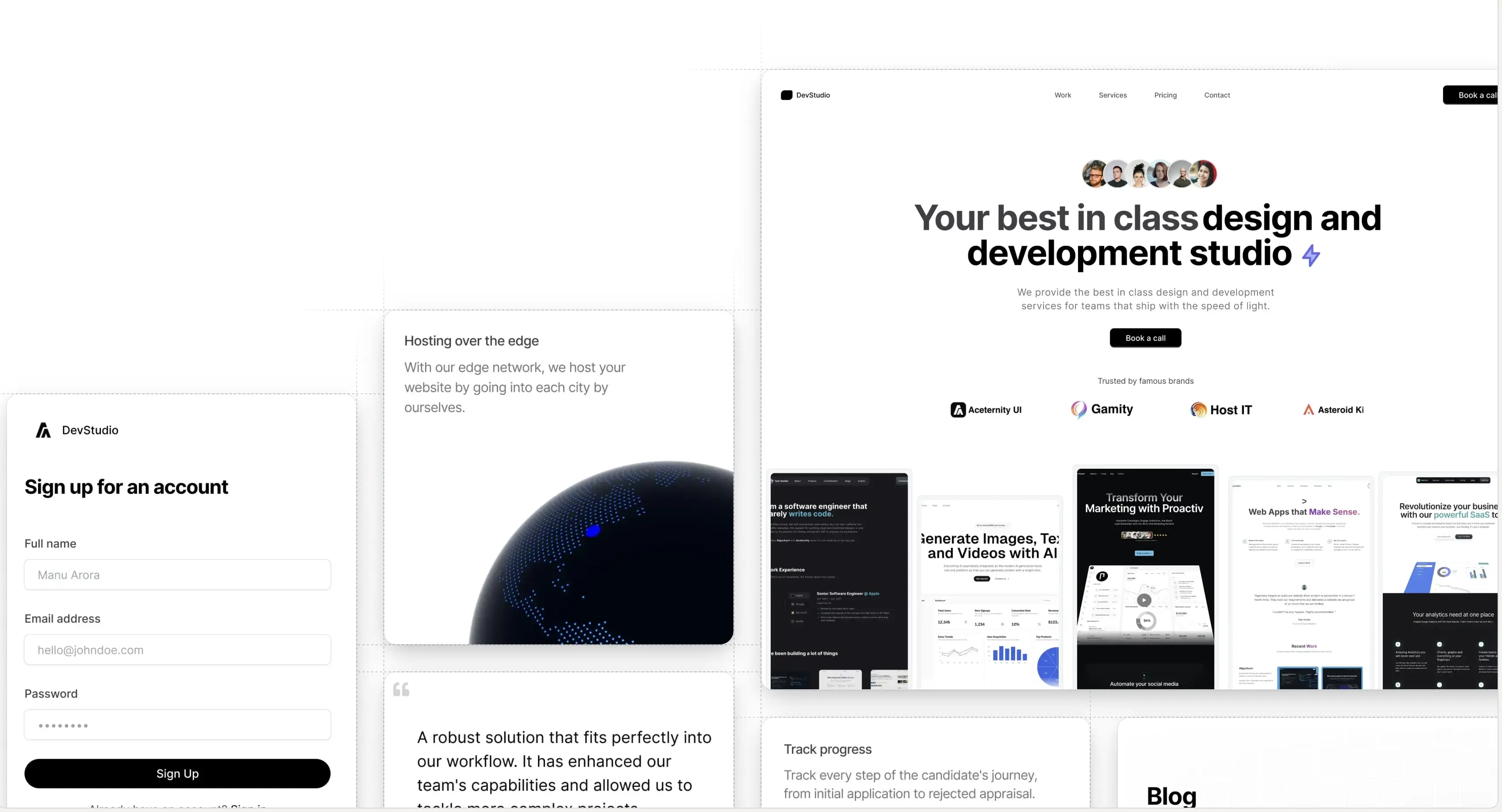
Introducing Aceternity UI Pro - Premium component packs and templates to build awesome websites.
Logo

Navbar Menu

A navbar menu that animates its children on hover, makes a beautiful bignav

The Navbar will show on top of the page

Installation

Install dependencies

npm i framer-motion clsx tailwind-merge

Add util file

lib/utils.ts
import { ClassValue, clsx } from "clsx";
import { twMerge } from "tailwind-merge";
 
export function cn(...inputs: ClassValue[]) {
  return twMerge(clsx(inputs));
}

Copy the source code

components/ui/navbar-menu.tsx

"use client";
import React from "react";
import { motion } from "framer-motion";
import Link from "next/link";
import Image from "next/image";
 
const transition = {
  type: "spring",
  mass: 0.5,
  damping: 11.5,
  stiffness: 100,
  restDelta: 0.001,
  restSpeed: 0.001,
};
 
export const MenuItem = ({
  setActive,
  active,
  item,
  children,
}: {
  setActive: (item: string) => void;
  active: string | null;
  item: string;
  children?: React.ReactNode;
}) => {
  return (
    <div onMouseEnter={() => setActive(item)} className="relative ">
      <motion.p
        transition={{ duration: 0.3 }}
        className="cursor-pointer text-black hover:opacity-[0.9] dark:text-white"
      >
        {item}
      </motion.p>
      {active !== null && (
        <motion.div
          initial={{ opacity: 0, scale: 0.85, y: 10 }}
          animate={{ opacity: 1, scale: 1, y: 0 }}
          transition={transition}
        >
          {active === item && (
            <div className="absolute top-[calc(100%_+_1.2rem)] left-1/2 transform -translate-x-1/2 pt-4">
              <motion.div
                transition={transition}
                layoutId="active" // layoutId ensures smooth animation
                className="bg-white dark:bg-black backdrop-blur-sm rounded-2xl overflow-hidden border border-black/[0.2] dark:border-white/[0.2] shadow-xl"
              >
                <motion.div
                  layout // layout ensures smooth animation
                  className="w-max h-full p-4"
                >
                  {children}
                </motion.div>
              </motion.div>
            </div>
          )}
        </motion.div>
      )}
    </div>
  );
};
 
export const Menu = ({
  setActive,
  children,
}: {
  setActive: (item: string | null) => void;
  children: React.ReactNode;
}) => {
  return (
    <nav
      onMouseLeave={() => setActive(null)} // resets the state
      className="relative rounded-full border border-transparent dark:bg-black dark:border-white/[0.2] bg-white shadow-input flex justify-center space-x-4 px-8 py-6 "
    >
      {children}
    </nav>
  );
};
 
export const ProductItem = ({
  title,
  description,
  href,
  src,
}: {
  title: string;
  description: string;
  href: string;
  src: string;
}) => {
  return (
    <Link href={href} className="flex space-x-2">
      <Image
        src={src}
        width={140}
        height={70}
        alt={title}
        className="flex-shrink-0 rounded-md shadow-2xl"
      />
      <div>
        <h4 className="text-xl font-bold mb-1 text-black dark:text-white">
          {title}
        </h4>
        <p className="text-neutral-700 text-sm max-w-[10rem] dark:text-neutral-300">
          {description}
        </p>
      </div>
    </Link>
  );
};
 
export const HoveredLink = ({ children, ...rest }: any) => {
  return (
    <Link
      {...rest}
      className="text-neutral-700 dark:text-neutral-200 hover:text-black "
    >
      {children}
    </Link>
  );
};

Props

Prop nameTypeDescription
classNamestringThe class name of the child component.
A product by Aceternity
Building in public at @mannupaaji