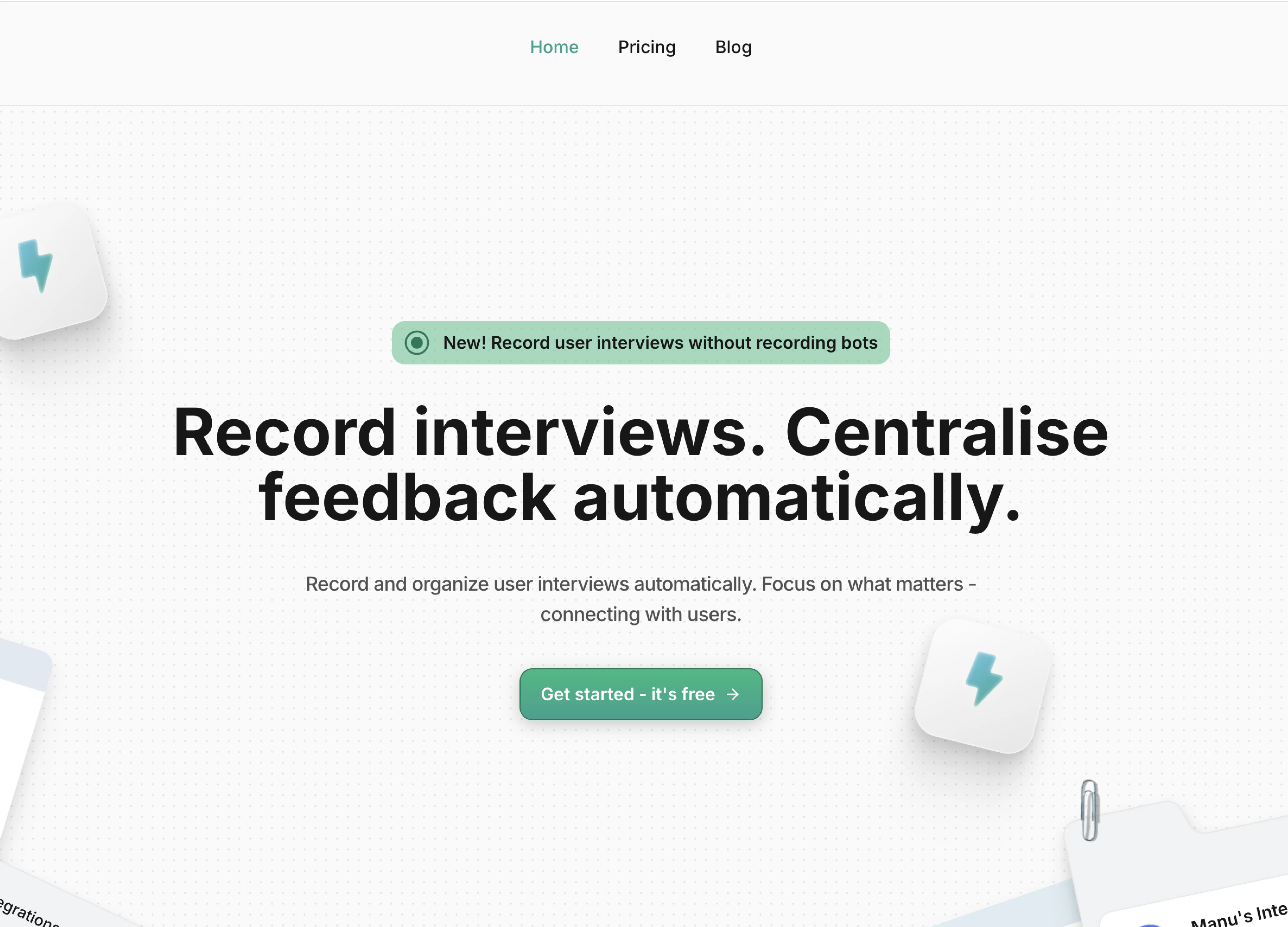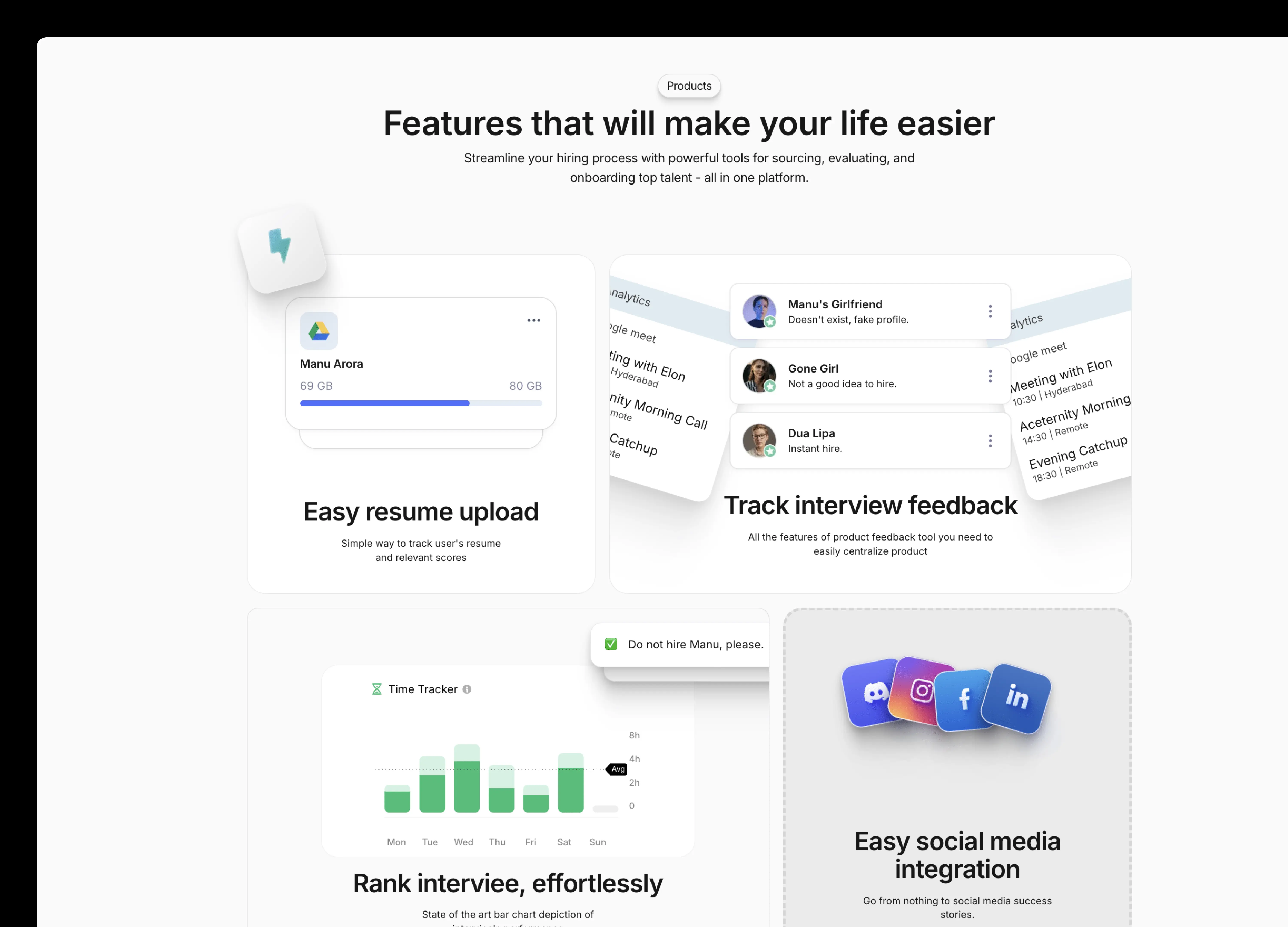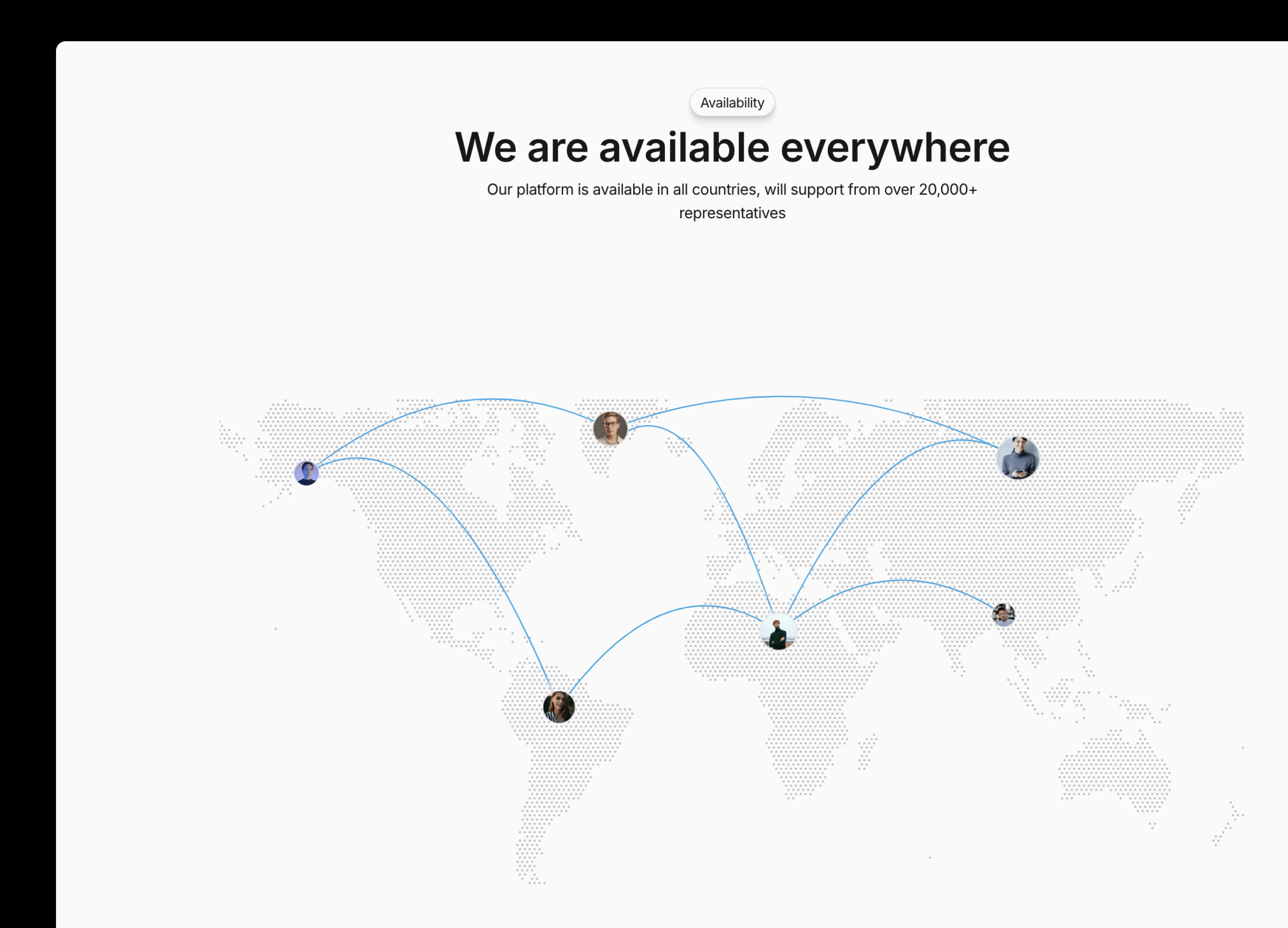








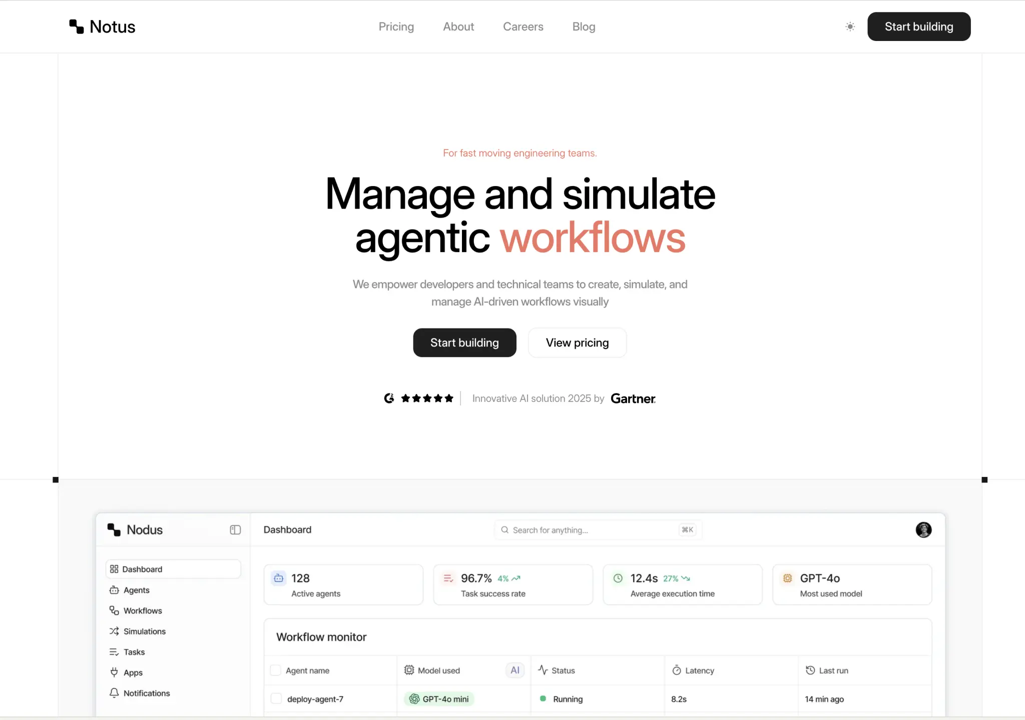
Minimal Portfolio and Minimalist Portfolio for personal sites, Startup Landing Page and Playful Marketing for launches, and Nodus if you want a minimal treatment on an AI product. Every one of them is easier to edit than a maximal template, because there is less to keep consistent.
A template focused for startups building for AI agents and AI Chatbots. Clean, Minimal and Modern.
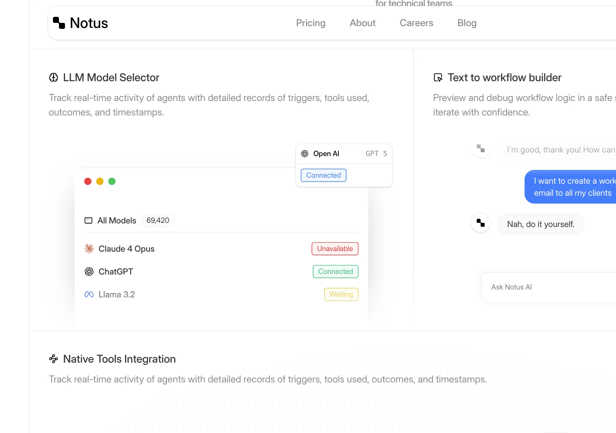
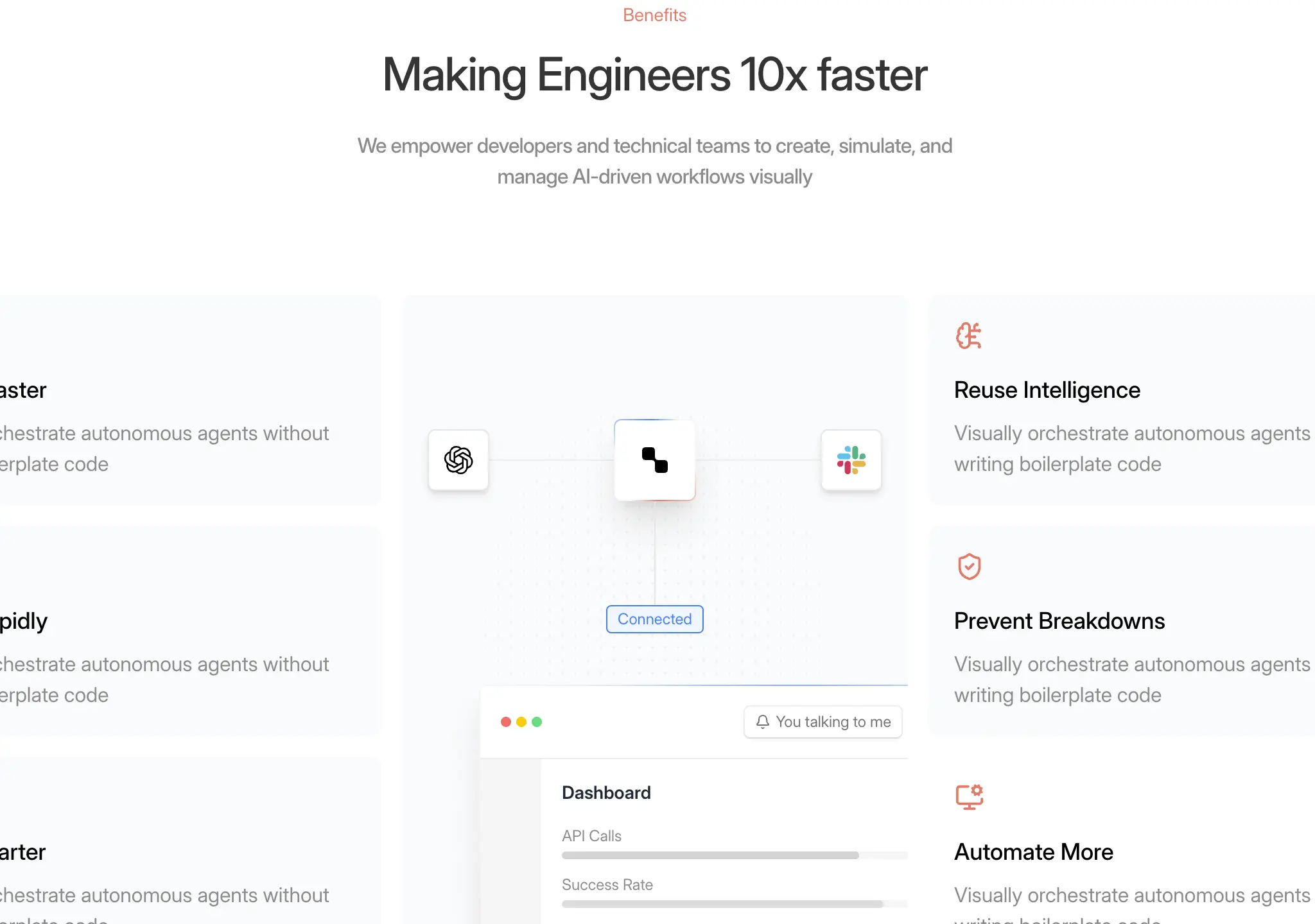
A simple, clean, modern and minimalistic landing page template for startups. Filled with microinteractions to keep your users engaged.


An elegant, feature rich portfolio website template with a minimalistic center design along with tasteful microinteractions.
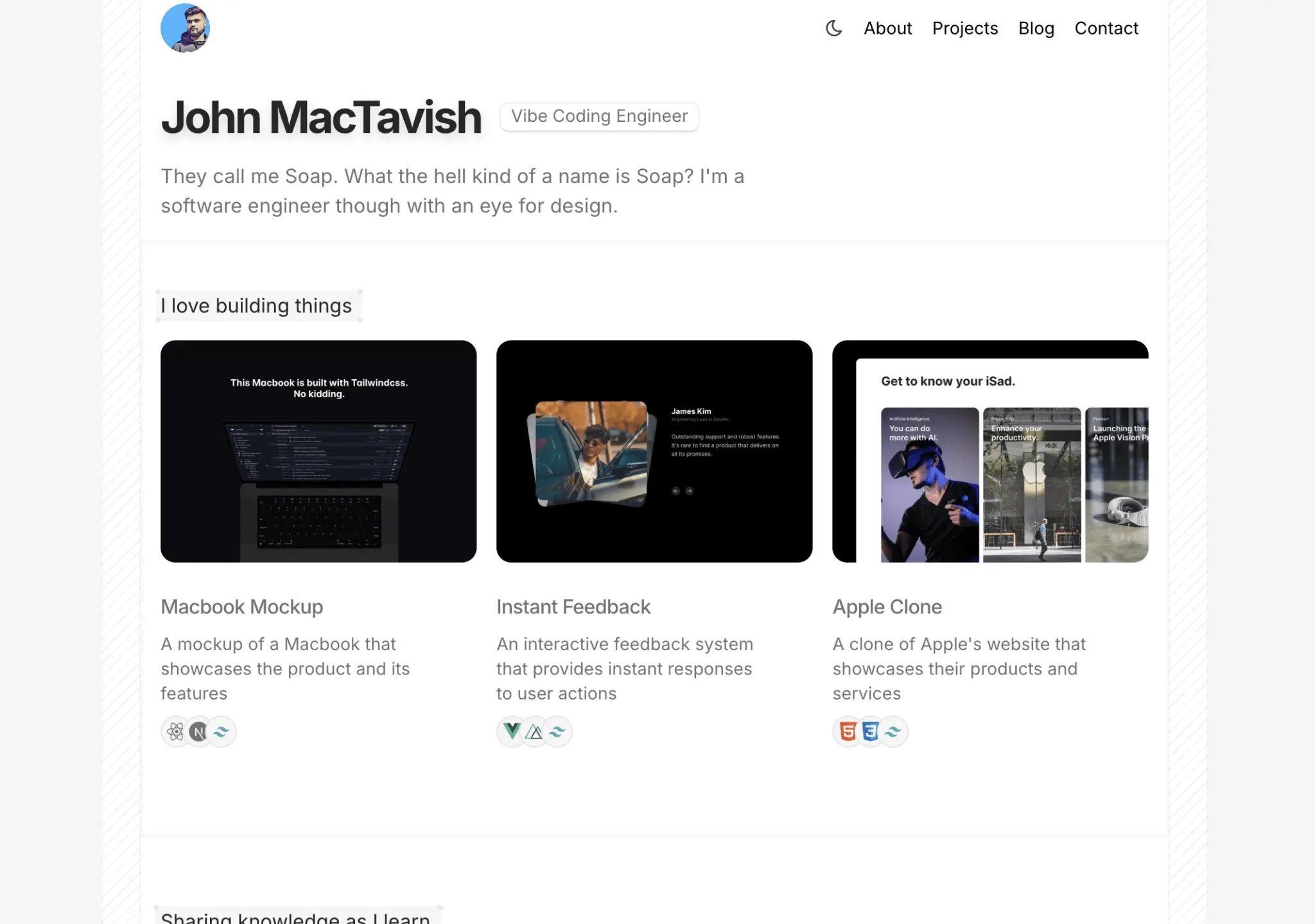
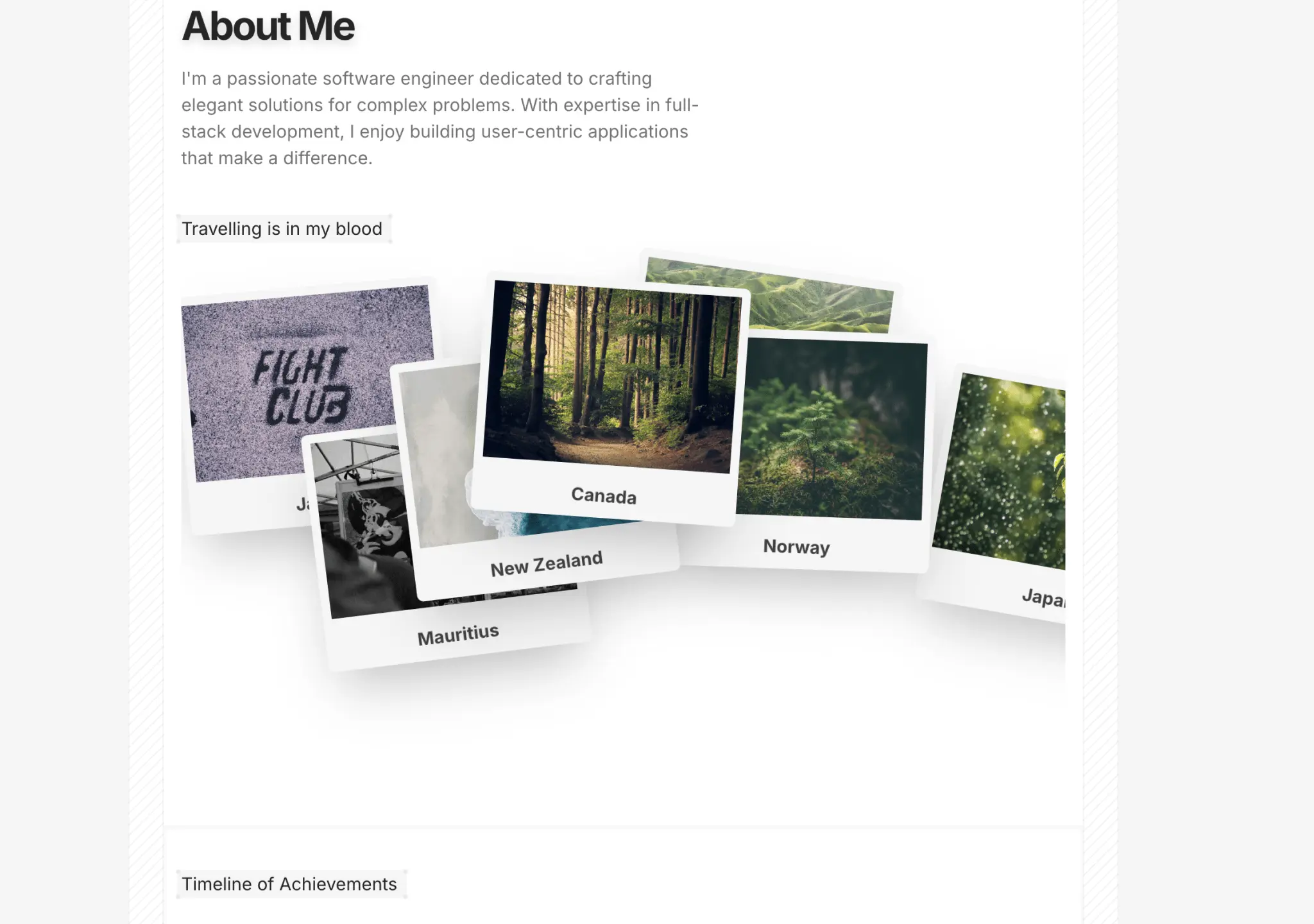
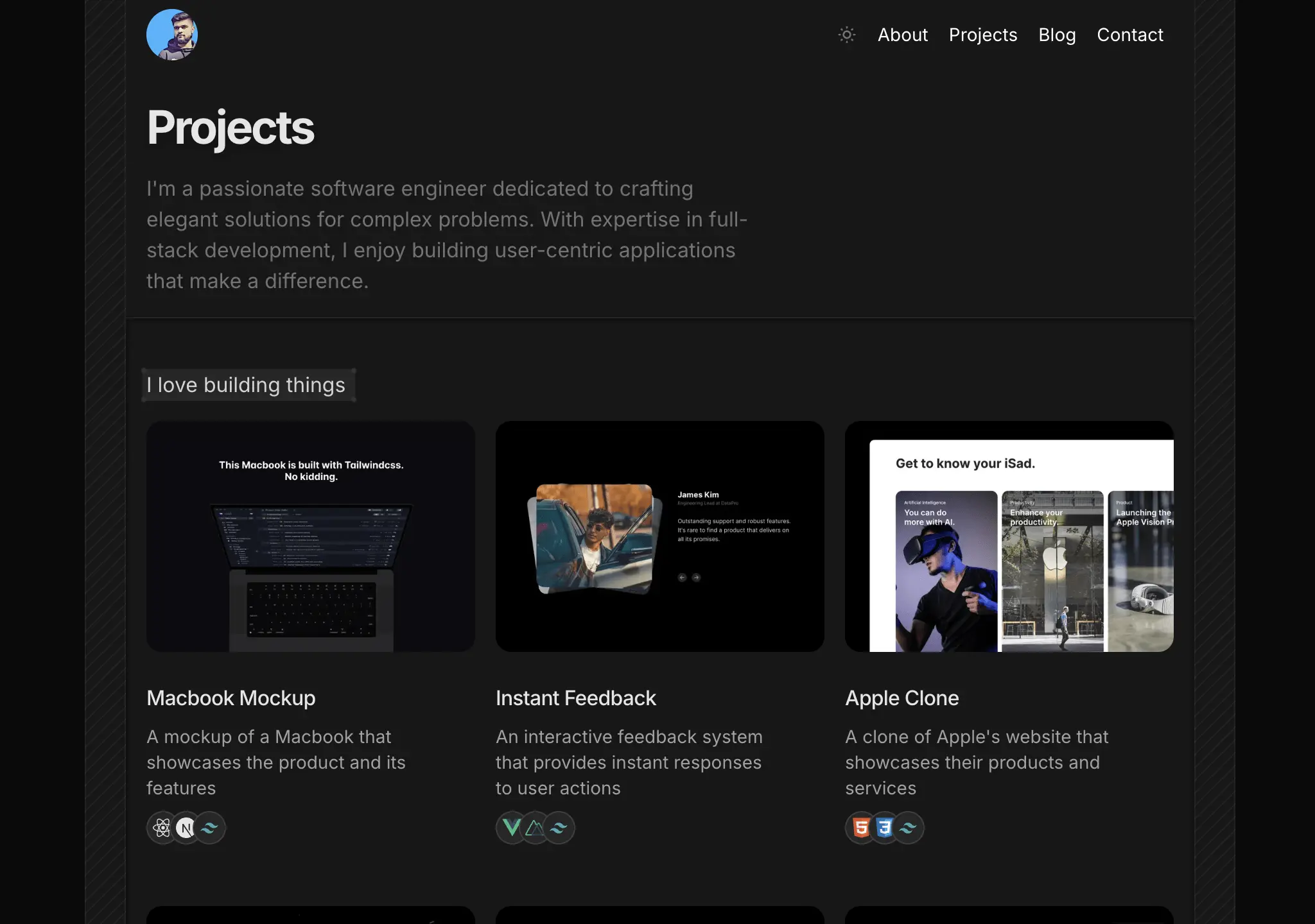
A minimalist portfolio template with a clean, modern design and a focus on content. Features 5 pages with a simple navigation. Change fonts and colors to your liking.
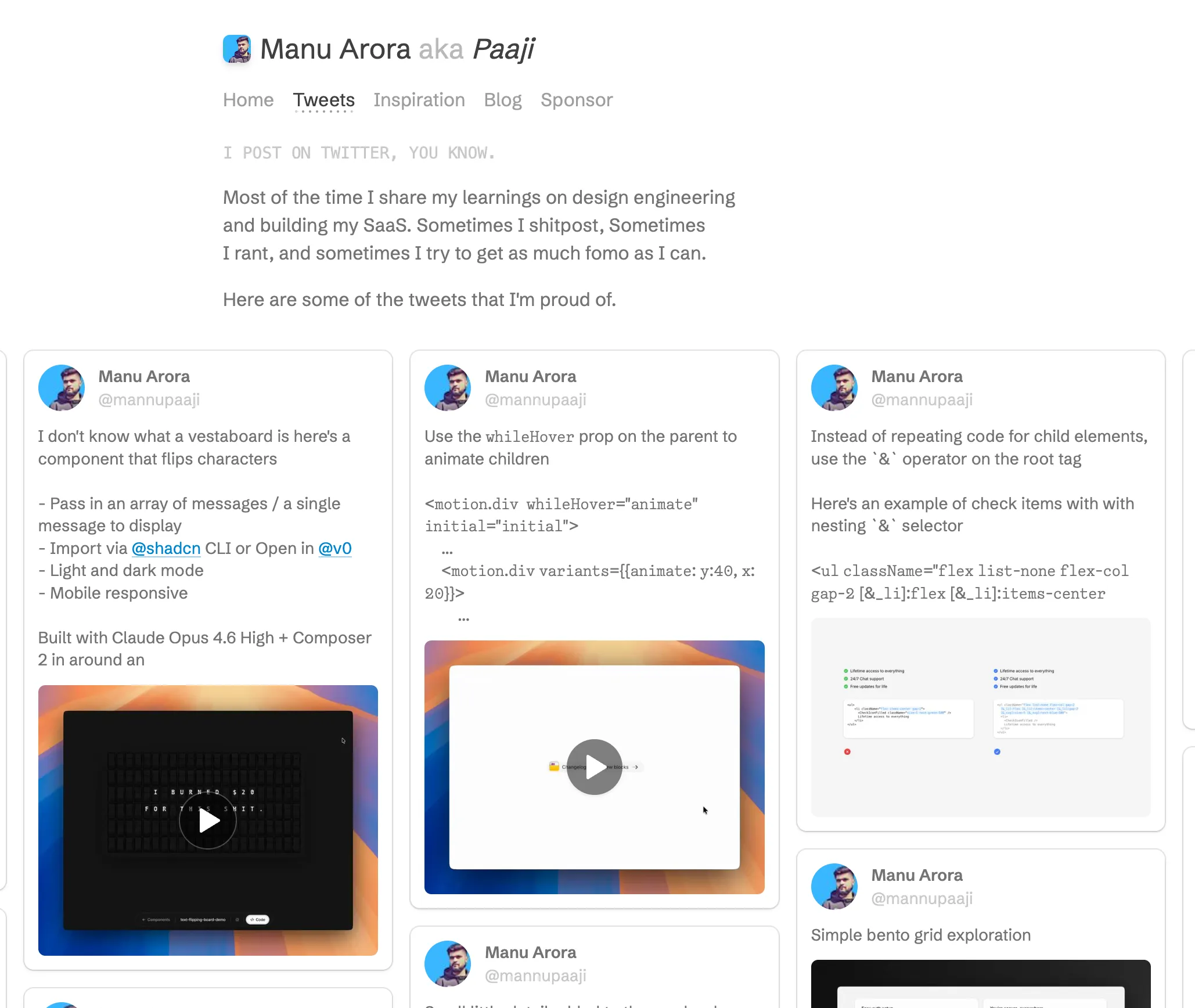
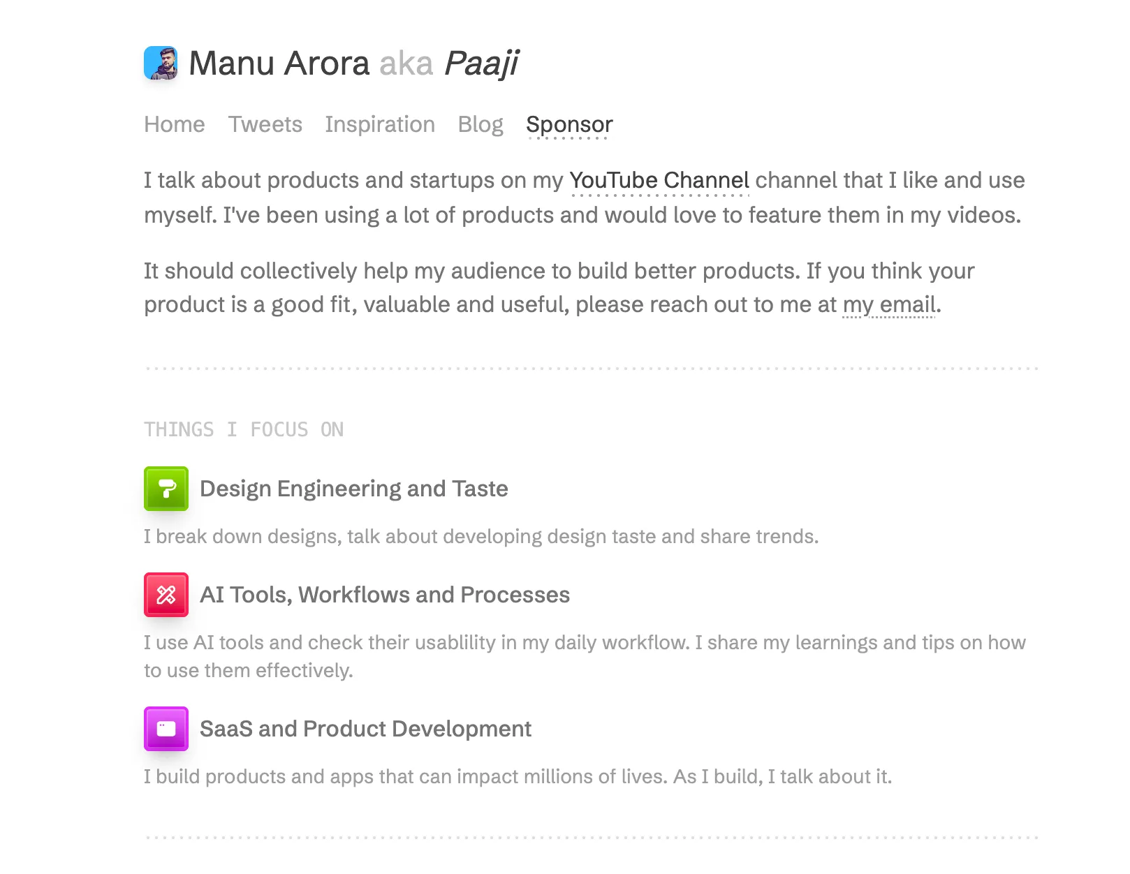
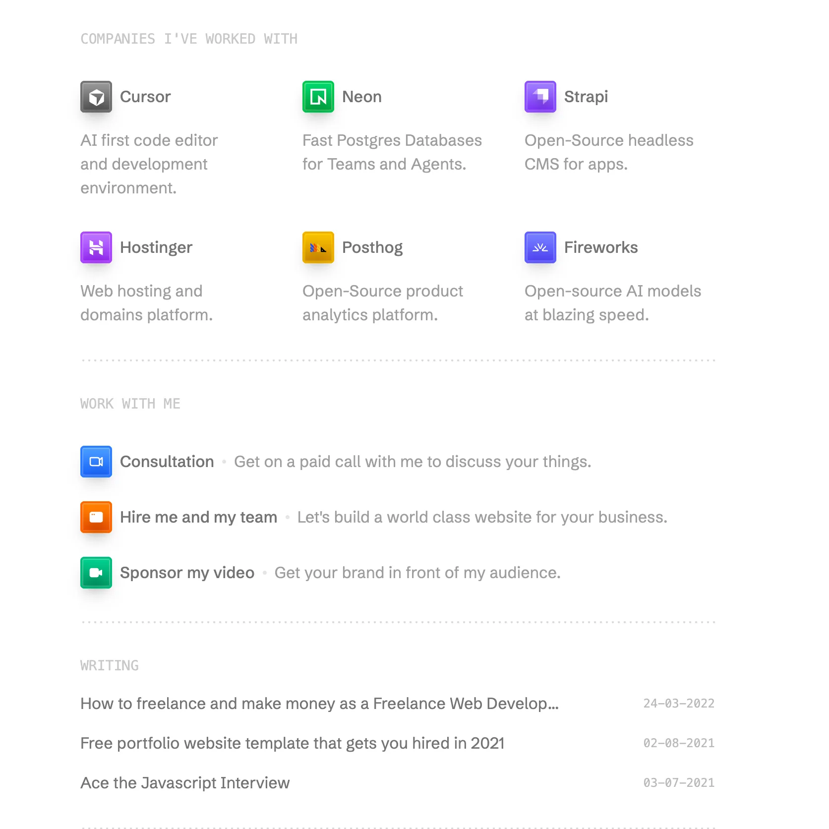
Most sites called minimal are just under-designed. The difference is intent. A minimal layout removes things that were doing a job and replaces that job with hierarchy, so a section that used to be separated by a coloured band is now separated by ninety-six pixels of nothing and a change in type size. That only works if the type and spacing are decided deliberately. Remove the decoration without doing that work and you get a page that looks unfinished rather than composed.
Start with the typographic scale and stop improvising sizes. Pick four or five steps, something like 14, 16, 20, 32 and 56 pixels, and refuse to add a sixth when a heading feels slightly wrong. If two things need to look different, change weight or colour before you invent a new size. The same restraint applies to colour: one text colour, one muted variant for secondary text, one accent, and a background. Playful Marketing shows how far you can get with almost no colour and one recurring accent.
Whitespace is not emptiness. Space between elements communicates grouping, and space around a block communicates importance. A common failure is uniform padding everywhere, which flattens the page and makes everything read as equally urgent, so nothing does. Use tight spacing inside a group, and much looser spacing between groups. The ratio matters more than the absolute numbers, and roughly two to three times is a good starting point.
Minimal designs are unforgiving about line length and alignment. With no visual noise to hide behind, a paragraph running to 120 characters per line or a heading that misses the grid by four pixels is immediately visible. Cap body text around 65 to 75 characters. On animation, keep the budget small and make each movement mean something: one entrance transition per section, short durations, and nothing that loops forever in the corner of the viewport. Restraint in motion is the part people most often skip, and it is what separates the Minimalist Portfolio template from a page with the same layout and six competing animations.
A limited type scale, a small colour set, generous and uneven spacing, and very little ornament. The test is whether removing any remaining element would lose information. If it would not, the design is not minimal yet.
Usually, because they ship fewer images, fewer fonts, fewer third-party scripts and less animation code, so the first paint is quicker. The gain is not automatic though, since one 400 KB hero photograph will undo it regardless of how sparse the layout looks.
The Startup Landing Page template is the direct answer, with a single page structure and small micro-interactions. Nodus is worth a look if your product is an AI agent, since it keeps the same restraint but has sections written for that audience.
Yes. Each template defines its palette through Tailwind theme values, so changing the accent and background in one place propagates through the pages. Keep it to a single accent if you want the layout to hold together.
Here's what some of our users have to say about Aceternity UI.

amazing to see @calcom find its way into proper templates 🥳 excited to be powering the next thousands of startups and their demo calls!

Stumbled upon ui.aceternity.com today and my mind is blown 🤯 The seamless integration of framer-motion, tailwind CSS, and shadcn showcases a masterclass in UI design. 🚀 Kudos to @mannupaaji for creating such an innovative and inspirational resource for devs! #UI #nextjs

Have you heard of Aceternity UI? It's packed with various animated components that are ready to copy and paste! Mind-blowing stuff... 🤯 Click here ➡️ ui.aceternity.com #framermotion #nextjs #tailwindcss #techinnovation

ui.aceternity.com So well done. And its bloody free 🤯🤯 Phenomenal work by @mannupaaji

So happy to see @mannupaaji work being recognised 🥹🤌🏻♥️ His work is literally a treasure trove for devs 💎

Aceternity UI has some of the best components for designing landing pages I've ever seen. If you're struggling with figuring out what animations to use. Check it out. Thank me later 😉. ui.aceternity.com
See what the best YouTubers are saying about Aceternity UI.


ceternity UI
Access an ever-growing collection of premium, meticulously crafted templates and Component Blocks.
© 2026 Aceternity Labs LLC. All Rights Reserved.