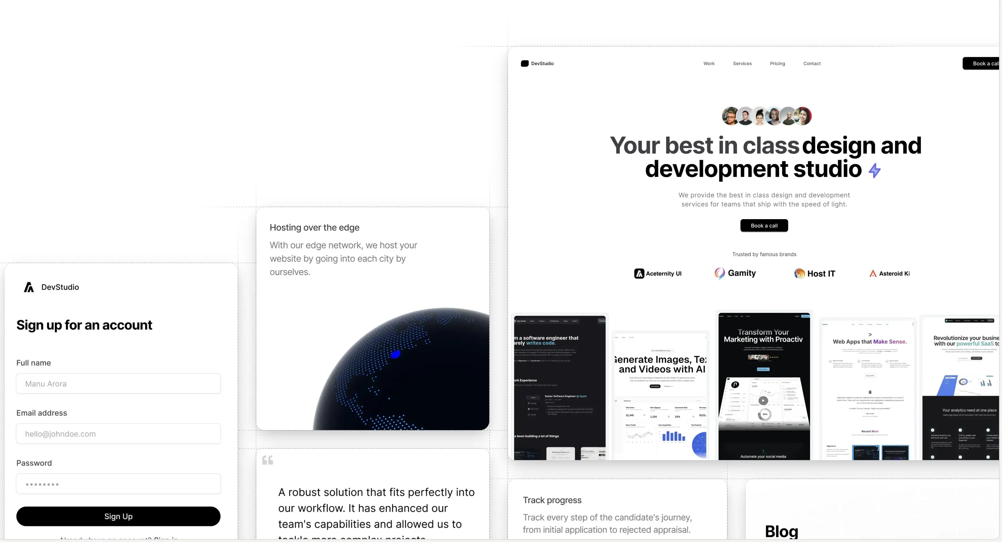
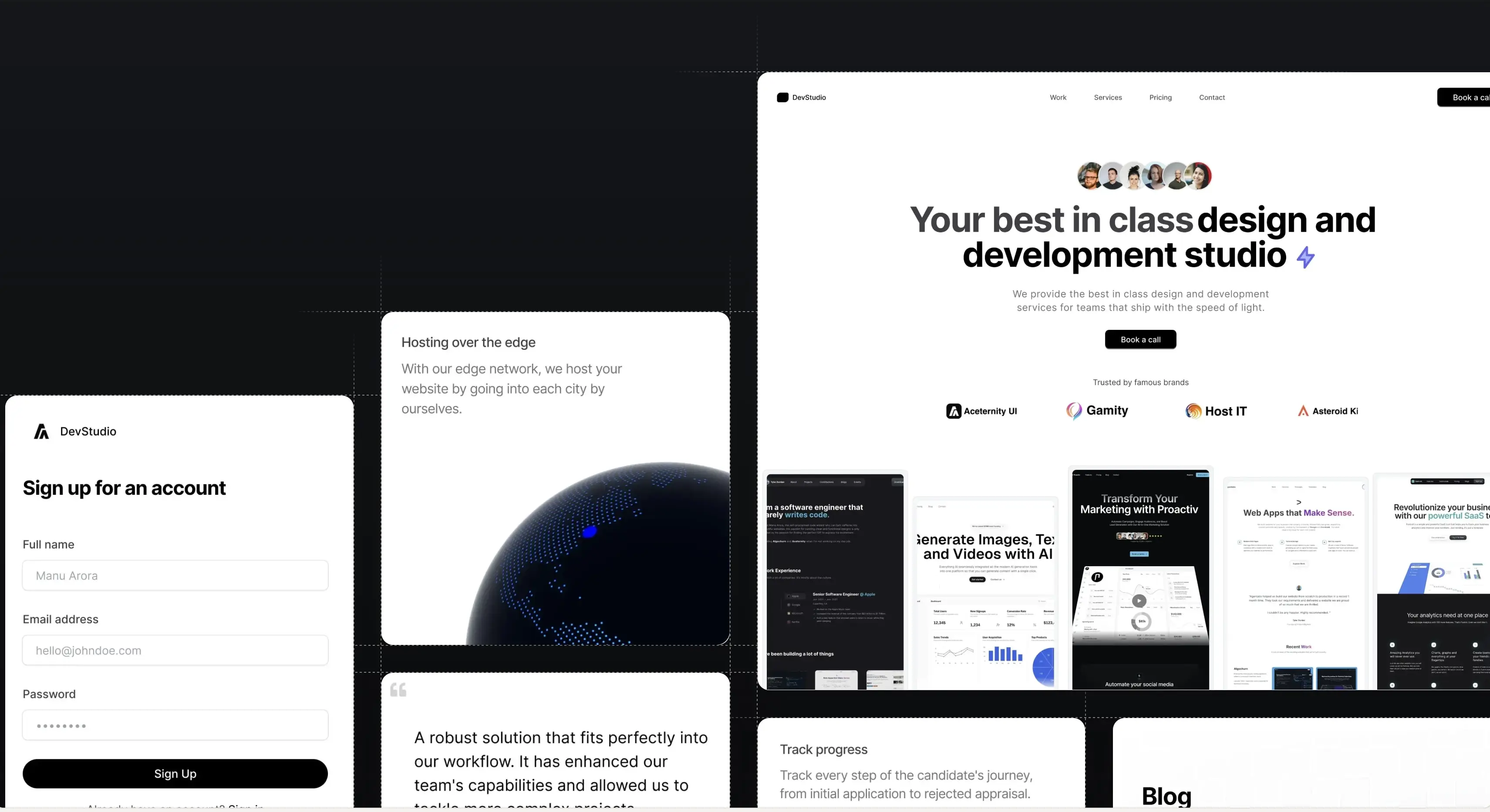
Layout Grid
A layout effect that animates the grid item on click, powered by framer motion layout
Installation
Install dependencies
npm i framer-motion clsx tailwind-merge
Add util file
lib/utils.ts
import { ClassValue, clsx } from "clsx";
import { twMerge } from "tailwind-merge";
export function cn(...inputs: ClassValue[]) {
return twMerge(clsx(inputs));
}
Copy the source code
components/ui/layout-grid.tsx
"use client";
import React, { useState, useRef, useEffect } from "react";
import { AnimatePresence, motion } from "framer-motion";
import { cn } from "@/lib/utils";
import Image from "next/image";
type Card = {
id: number;
content: JSX.Element | React.ReactNode | string;
className: string;
thumbnail: string;
};
export const LayoutGrid = ({ cards }: { cards: Card[] }) => {
const [selected, setSelected] = useState<Card | null>(null);
const [lastSelected, setLastSelected] = useState<Card | null>(null);
const handleClick = (card: Card) => {
setLastSelected(selected);
setSelected(card);
};
const handleOutsideClick = () => {
setLastSelected(selected);
setSelected(null);
};
return (
<div className="w-full h-full p-10 grid grid-cols-1 md:grid-cols-3 max-w-7xl mx-auto gap-4 relative">
{cards.map((card, i) => (
<div key={i} className={cn(card.className, "")}>
<motion.div
onClick={() => handleClick(card)}
className={cn(
card.className,
"relative overflow-hidden",
selected?.id === card.id
? "rounded-lg cursor-pointer absolute inset-0 h-1/2 w-full md:w-1/2 m-auto z-50 flex justify-center items-center flex-wrap flex-col"
: lastSelected?.id === card.id
? "z-40 bg-white rounded-xl h-full w-full"
: "bg-white rounded-xl h-full w-full"
)}
layoutId={`card-${card.id}`}
>
{selected?.id === card.id && <SelectedCard selected={selected} />}
<ImageComponent card={card} />
</motion.div>
</div>
))}
<motion.div
onClick={handleOutsideClick}
className={cn(
"absolute h-full w-full left-0 top-0 bg-black opacity-0 z-10",
selected?.id ? "pointer-events-auto" : "pointer-events-none"
)}
animate={{ opacity: selected?.id ? 0.3 : 0 }}
/>
</div>
);
};
const ImageComponent = ({ card }: { card: Card }) => {
return (
<motion.img
layoutId={`image-${card.id}-image`}
src={card.thumbnail}
height="500"
width="500"
className={cn(
"object-cover object-top absolute inset-0 h-full w-full transition duration-200"
)}
alt="thumbnail"
/>
);
};
const SelectedCard = ({ selected }: { selected: Card | null }) => {
return (
<div className="bg-transparent h-full w-full flex flex-col justify-end rounded-lg shadow-2xl relative z-[60]">
<motion.div
initial={{
opacity: 0,
}}
animate={{
opacity: 0.6,
}}
className="absolute inset-0 h-full w-full bg-black opacity-60 z-10"
/>
<motion.div
layoutId={`content-${selected?.id}`}
initial={{
opacity: 0,
y: 100,
}}
animate={{
opacity: 1,
y: 0,
}}
exit={{
opacity: 0,
y: 100,
}}
transition={{
duration: 0.3,
ease: "easeInOut",
}}
className="relative px-8 pb-4 z-[70]"
>
{selected?.content}
</motion.div>
</div>
);
};
Props
Prop | Type | Description |
---|---|---|
cards | Card[] | An array of Card objects. Each Card object should have the following properties: id (a unique identifier), content (the JSX.Element to be displayed), className (the CSS class name for the card), and thumbnail (the URL of the thumbnail image). |
The Card type is defined as follows:
Property | Type | Description |
---|---|---|
id | number | A unique identifier for the card. |
content | JSX.Element | React.ReactNode | string | The content to be displayed in the card. |
className | string | The CSS class name for the card. |
thumbnail | string | The URL of the thumbnail image for the card. |
Get beautiful, hand-crafted templates and components with Aceternity UI Pro
Professional, beautiful and elegant templates for your business. Get the best component packs and templates with Aceternity UI Pro.
This service exceeded our expectations, since not only was the development technically flawless, but Manu and his team also acted as strategic partners by encouraging us to add ...
Georg Weingartner
CMO at Renderwork