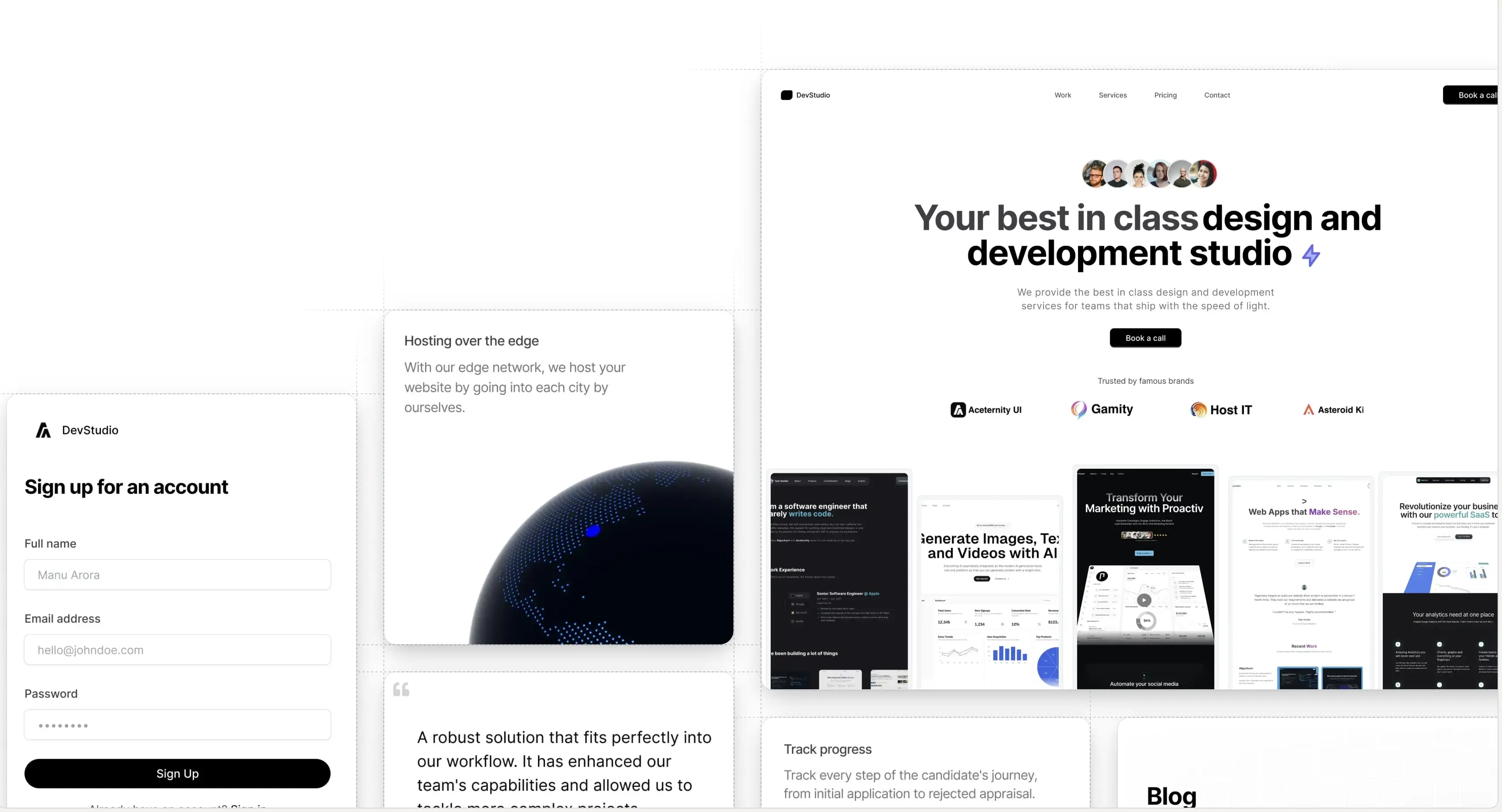
Introducing Aceternity UI Pro - Premium component packs and templates to build awesome websites.
Logo

Resizable Navbar

A navbar that changes width on scroll, responsive and animated.

Open in

Check the navbar at the top of the container

For demo purpose we have kept the position as Sticky. Keep in mind that this component is fixed and will not move when scrolling.

The

First

Rule

Of

F

Club

Is

You

Do NOT TALK about

F Club

Installation

Install dependencies

npm i motion clsx tailwind-merge @tabler/icons-react

Add util file

lib/utils.ts
import { ClassValue, clsx } from "clsx";
import { twMerge } from "tailwind-merge";
 
export function cn(...inputs: ClassValue[]) {
  return twMerge(clsx(inputs));
}

Copy the source code

components/ui/resizable-navbar.tsx

"use client";
import { cn } from "@/lib/utils";
import { IconMenu2, IconX } from "@tabler/icons-react";
import {
  motion,
  AnimatePresence,
  useScroll,
  useMotionValueEvent,
} from "motion/react";
import Link from "next/link";
import React, { useRef, useState } from "react";
import Image from "next/image";
 
interface NavbarProps {
  children: React.ReactNode;
  className?: string;
}
 
interface NavBodyProps {
  children: React.ReactNode;
  className?: string;
  visible?: boolean;
}
 
interface NavItemsProps {
  items: {
    name: string;
    link: string;
  }[];
  className?: string;
  onItemClick?: () => void;
}
 
interface MobileNavProps {
  children: React.ReactNode;
  className?: string;
  visible?: boolean;
}
 
interface MobileNavHeaderProps {
  children: React.ReactNode;
  className?: string;
}
 
interface MobileNavMenuProps {
  children: React.ReactNode;
  className?: string;
  isOpen: boolean;
  onClose: () => void;
}
 
export const Navbar = ({ children, className }: NavbarProps) => {
  const ref = useRef<HTMLDivElement>(null);
  const { scrollY } = useScroll({
    target: ref,
    offset: ["start start", "end start"],
  });
  const [visible, setVisible] = useState<boolean>(false);
 
  useMotionValueEvent(scrollY, "change", (latest) => {
    if (latest > 100) {
      setVisible(true);
    } else {
      setVisible(false);
    }
  });
 
  return (
    <motion.div
      ref={ref}
      // IMPORTANT: Change this to class of `fixed` if you want the navbar to be fixed
      className={cn("sticky inset-x-0 top-20 z-40 w-full", className)}
    >
      {React.Children.map(children, (child) =>
        React.isValidElement(child)
          ? React.cloneElement(
              child as React.ReactElement<{ visible?: boolean }>,
              { visible },
            )
          : child,
      )}
    </motion.div>
  );
};
 
export const NavBody = ({ children, className, visible }: NavBodyProps) => {
  return (
    <motion.div
      animate={{
        backdropFilter: visible ? "blur(10px)" : "none",
        boxShadow: visible
          ? "0 0 24px rgba(34, 42, 53, 0.06), 0 1px 1px rgba(0, 0, 0, 0.05), 0 0 0 1px rgba(34, 42, 53, 0.04), 0 0 4px rgba(34, 42, 53, 0.08), 0 16px 68px rgba(47, 48, 55, 0.05), 0 1px 0 rgba(255, 255, 255, 0.1) inset"
          : "none",
        width: visible ? "40%" : "100%",
        y: visible ? 20 : 0,
      }}
      transition={{
        type: "spring",
        stiffness: 200,
        damping: 50,
      }}
      style={{
        minWidth: "800px",
      }}
      className={cn(
        "relative z-[60] mx-auto hidden w-full max-w-7xl flex-row items-center justify-between self-start rounded-full bg-transparent px-4 py-2 lg:flex dark:bg-transparent",
        visible && "bg-white/80 dark:bg-neutral-950/80",
        className,
      )}
    >
      {children}
    </motion.div>
  );
};
 
export const NavItems = ({ items, className, onItemClick }: NavItemsProps) => {
  const [hovered, setHovered] = useState<number | null>(null);
 
  return (
    <motion.div
      onMouseLeave={() => setHovered(null)}
      className={cn(
        "absolute inset-0 hidden flex-1 flex-row items-center justify-center space-x-2 text-sm font-medium text-zinc-600 transition duration-200 hover:text-zinc-800 lg:flex lg:space-x-2",
        className,
      )}
    >
      {items.map((item, idx) => (
        <Link
          onMouseEnter={() => setHovered(idx)}
          onClick={onItemClick}
          className="relative px-4 py-2 text-neutral-600 dark:text-neutral-300"
          key={`link-${idx}`}
          href={item.link}
        >
          {hovered === idx && (
            <motion.div
              layoutId="hovered"
              className="absolute inset-0 h-full w-full rounded-full bg-gray-100 dark:bg-neutral-800"
            />
          )}
          <span className="relative z-20">{item.name}</span>
        </Link>
      ))}
    </motion.div>
  );
};
 
export const MobileNav = ({ children, className, visible }: MobileNavProps) => {
  return (
    <motion.div
      animate={{
        backdropFilter: visible ? "blur(10px)" : "none",
        boxShadow: visible
          ? "0 0 24px rgba(34, 42, 53, 0.06), 0 1px 1px rgba(0, 0, 0, 0.05), 0 0 0 1px rgba(34, 42, 53, 0.04), 0 0 4px rgba(34, 42, 53, 0.08), 0 16px 68px rgba(47, 48, 55, 0.05), 0 1px 0 rgba(255, 255, 255, 0.1) inset"
          : "none",
        width: visible ? "90%" : "100%",
        paddingRight: visible ? "12px" : "0px",
        paddingLeft: visible ? "12px" : "0px",
        borderRadius: visible ? "4px" : "2rem",
        y: visible ? 20 : 0,
      }}
      transition={{
        type: "spring",
        stiffness: 200,
        damping: 50,
      }}
      className={cn(
        "relative z-50 mx-auto flex w-full max-w-[calc(100vw-2rem)] flex-col items-center justify-between bg-transparent px-0 py-2 lg:hidden",
        visible && "bg-white/80 dark:bg-neutral-950/80",
        className,
      )}
    >
      {children}
    </motion.div>
  );
};
 
export const MobileNavHeader = ({
  children,
  className,
}: MobileNavHeaderProps) => {
  return (
    <div
      className={cn(
        "flex w-full flex-row items-center justify-between",
        className,
      )}
    >
      {children}
    </div>
  );
};
 
export const MobileNavMenu = ({
  children,
  className,
  isOpen,
  onClose,
}: MobileNavMenuProps) => {
  return (
    <AnimatePresence>
      {isOpen && (
        <motion.div
          initial={{ opacity: 0 }}
          animate={{ opacity: 1 }}
          exit={{ opacity: 0 }}
          className={cn(
            "absolute inset-x-0 top-16 z-50 flex w-full flex-col items-start justify-start gap-4 rounded-lg bg-white px-4 py-8 shadow-[0_0_24px_rgba(34,_42,_53,_0.06),_0_1px_1px_rgba(0,_0,_0,_0.05),_0_0_0_1px_rgba(34,_42,_53,_0.04),_0_0_4px_rgba(34,_42,_53,_0.08),_0_16px_68px_rgba(47,_48,_55,_0.05),_0_1px_0_rgba(255,_255,_255,_0.1)_inset] dark:bg-neutral-950",
            className,
          )}
        >
          {children}
        </motion.div>
      )}
    </AnimatePresence>
  );
};
 
export const MobileNavToggle = ({
  isOpen,
  onClick,
}: {
  isOpen: boolean;
  onClick: () => void;
}) => {
  return isOpen ? (
    <IconX className="text-black dark:text-white" onClick={onClick} />
  ) : (
    <IconMenu2 className="text-black dark:text-white" onClick={onClick} />
  );
};
 
export const NavbarLogo = () => {
  return (
    <Link
      href="#"
      className="relative z-20 mr-4 flex items-center space-x-2 px-2 py-1 text-sm font-normal text-black"
    >
      <Image
        src="https://assets.aceternity.com/logo-dark.png"
        alt="logo"
        width={30}
        height={30}
      />
      <span className="font-medium text-black dark:text-white">Startup</span>
    </Link>
  );
};
 
export const NavbarButton = ({
  href,
  as: Tag = "a",
  children,
  className,
  variant = "primary",
  ...props
}: {
  href?: string;
  as?: React.ElementType;
  children: React.ReactNode;
  className?: string;
  variant?: "primary" | "secondary" | "dark" | "gradient";
} & (
  | React.ComponentPropsWithoutRef<"a">
  | React.ComponentPropsWithoutRef<"button">
)) => {
  const baseStyles =
    "px-4 py-2 rounded-md bg-white button bg-white text-black text-sm font-bold relative cursor-pointer hover:-translate-y-0.5 transition duration-200 inline-block text-center";
 
  const variantStyles = {
    primary:
      "shadow-[0_0_24px_rgba(34,_42,_53,_0.06),_0_1px_1px_rgba(0,_0,_0,_0.05),_0_0_0_1px_rgba(34,_42,_53,_0.04),_0_0_4px_rgba(34,_42,_53,_0.08),_0_16px_68px_rgba(47,_48,_55,_0.05),_0_1px_0_rgba(255,_255,_255,_0.1)_inset]",
    secondary: "bg-transparent shadow-none dark:text-white",
    dark: "bg-black text-white shadow-[0_0_24px_rgba(34,_42,_53,_0.06),_0_1px_1px_rgba(0,_0,_0,_0.05),_0_0_0_1px_rgba(34,_42,_53,_0.04),_0_0_4px_rgba(34,_42,_53,_0.08),_0_16px_68px_rgba(47,_48,_55,_0.05),_0_1px_0_rgba(255,_255,_255,_0.1)_inset]",
    gradient:
      "bg-gradient-to-b from-blue-500 to-blue-700 text-white shadow-[0px_2px_0px_0px_rgba(255,255,255,0.3)_inset]",
  };
 
  return (
    <Tag
      href={href || undefined}
      className={cn(baseStyles, variantStyles[variant], className)}
      {...props}
    >
      {children}
    </Tag>
  );
};

Props

Resizable Navbar Props

PropTypeDefaultDescription
childrenReact.ReactNode-Child elements to render inside the navbar
classNamestring-Additional CSS classes to apply to the navbar
PropTypeDefaultDescription
childrenReact.ReactNode-Child elements to render inside the nav body
classNamestring-Additional CSS classes to apply to the nav body
visiblebooleanfalseControls the visibility state of the nav body
PropTypeDefaultDescription
itemsArray<{ name: string, link: string }>-Array of navigation items with name and link
classNamestring-Additional CSS classes to apply to the nav items
onItemClick() => void-Callback function when a nav item is clicked

MobileNav

PropTypeDefaultDescription
childrenReact.ReactNode-Child elements to render inside the mobile nav
classNamestring-Additional CSS classes to apply to the mobile nav
visiblebooleanfalseControls the visibility state of the mobile nav

MobileNavHeader

PropTypeDefaultDescription
childrenReact.ReactNode-Child elements to render inside the mobile nav header
classNamestring-Additional CSS classes to apply to the mobile nav header

MobileNavMenu

PropTypeDefaultDescription
childrenReact.ReactNode-Child elements to render inside the mobile nav menu
classNamestring-Additional CSS classes to apply to the mobile nav menu
isOpenboolean-Controls whether the mobile menu is open
onClose() => void-Callback function when the mobile menu is closed

MobileNavToggle

PropTypeDefaultDescription
isOpenboolean-Controls whether the mobile menu is open
onClick() => void-Callback function when the toggle is clicked
PropTypeDefaultDescription
hrefstring-URL for the button link
asReact.ElementType"a"HTML element type to render (a or button)
childrenReact.ReactNode-Child elements to render inside the button
classNamestring-Additional CSS classes to apply to the button
variant"primary" | "secondary" | "dark" | "gradient""primary"Visual style variant of the button

Build websites faster and 10x better than your competitors with Aceternity UI Pro

With the best in class components and templates, stand out from the crowd and get more attention to your website. Trusted by founders and entrepreneurs from all over the world.

Go Pro
Manu was quick to respond, very professional, and delivered a website within a week. Very good job. Looking forward to collaborating again

Asriel Han

Founder, CTO at Advex AI

A product by Aceternity
Building in public at @mannupaaji