GTA VI Poster
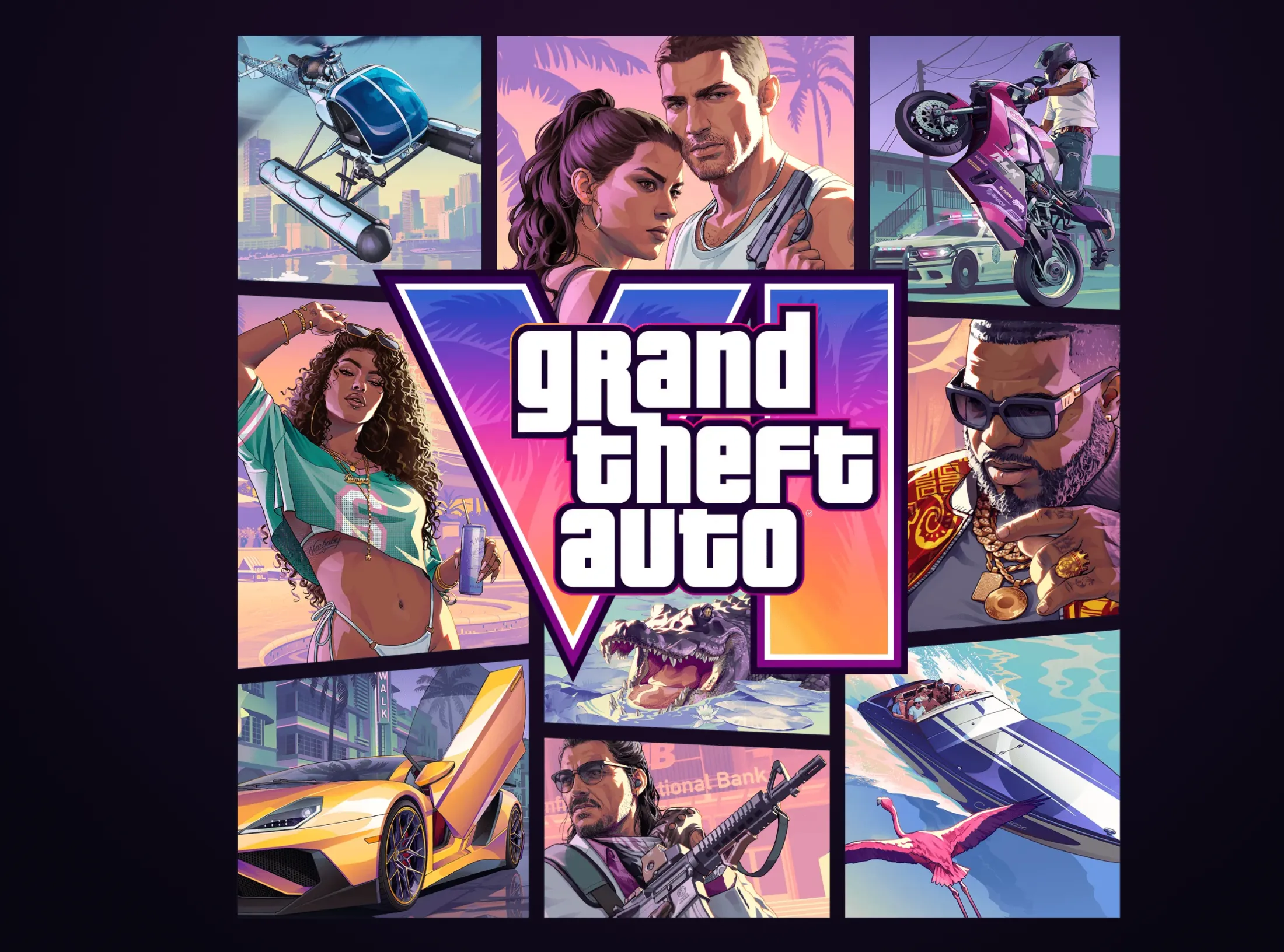
A new Labs block, GTA VI Poster, recreates the game-art reveal with layered images, a soft camera zoom, and a replay button.
You can tune the timing, zoom, depth, background, and logo wipe from the control panel.
A new Labs block, GTA VI Poster, recreates the game-art reveal with layered images, a soft camera zoom, and a replay button.
You can tune the timing, zoom, depth, background, and logo wipe from the control panel.

A new Labs block, a play/pause button where the two pause bars smoothly morph into a play triangle on click.
You can tweak the size, stroke, color, and the spring right from the control panel.
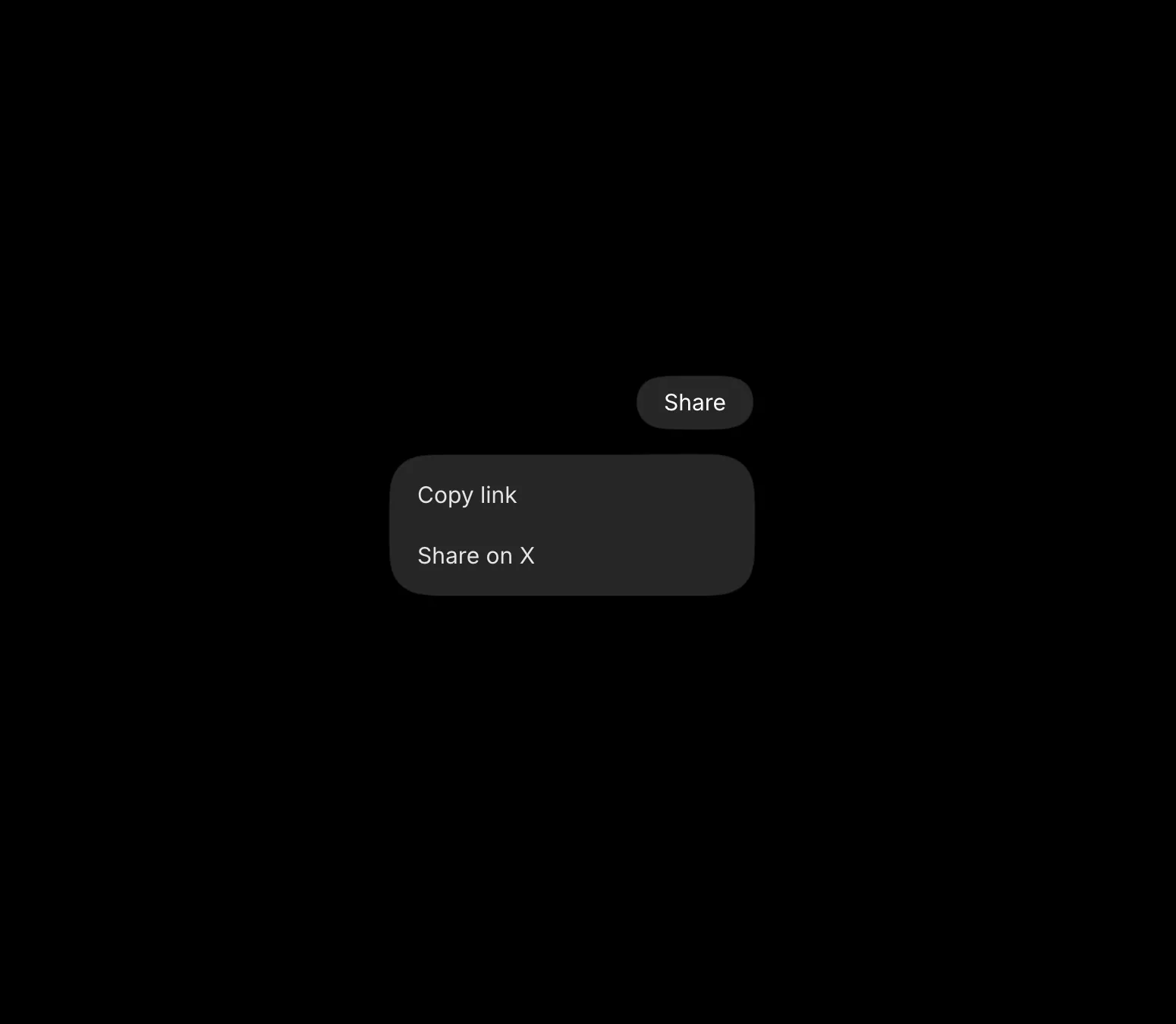
A new Labs block, the Gooey Dropdown, inspired by aave.com, where the trigger pill stretches and melts into the menu when you open it.
You can tweak the width, spacing, corner radius, and the spring right from the control panel.
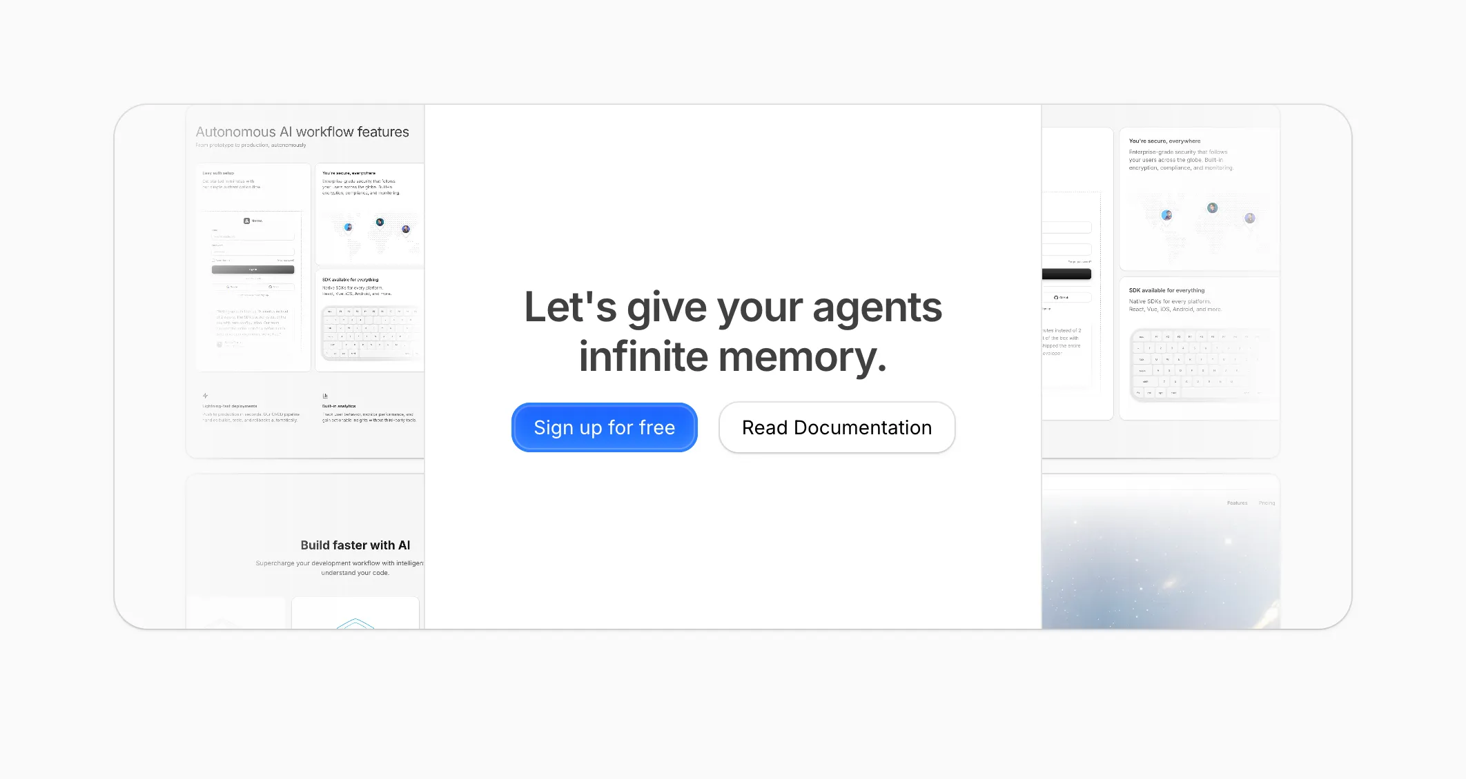
A new Labs block inspired by fey.com, where a row of cards fan out on hover or tap while the headline fades between a flat and a gradient fill.
You can tweak how far the cards push apart, the swap speed, and the spring right from the control panel.
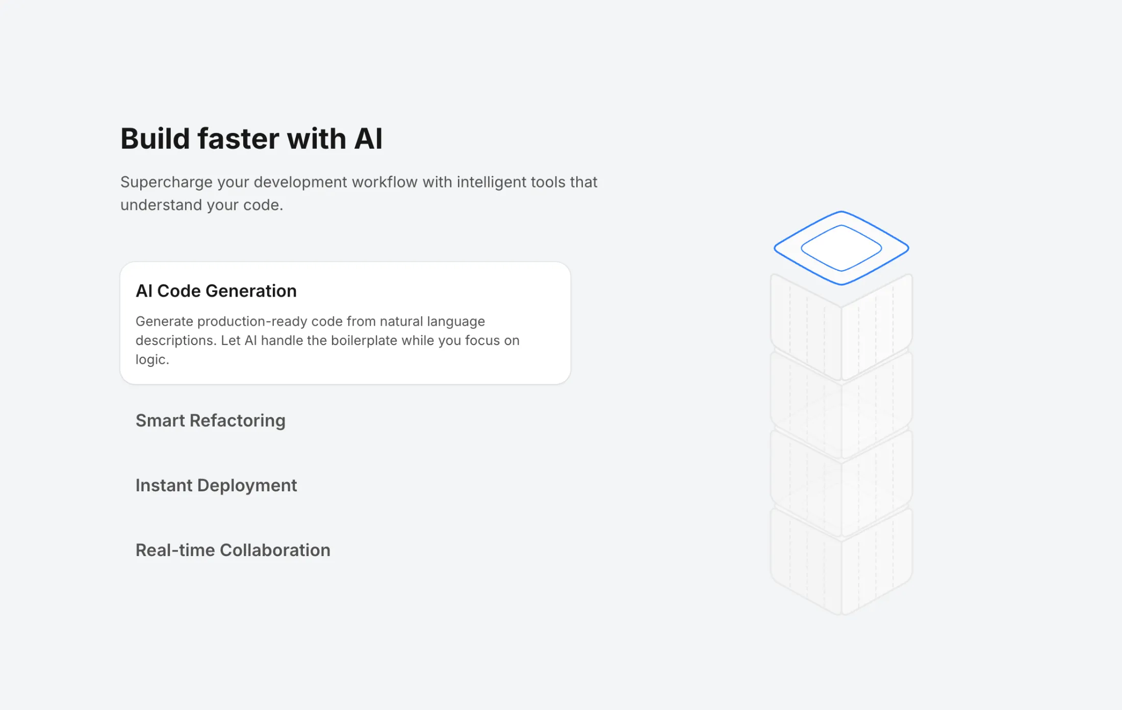
Introducing Labs, a home for interactive, editable experiments you can play with right in the browser.
Tweak any block's code live, adjust its values on the fly with the built-in control panel, then drop it into your project with the CLI. Kicking things off are a Wispr Flow text animation and a set of Interface Crafts cards that fan out and expand on click.
Added Notch to the free components.
A floating, configurable notch that pins to the top or bottom of the screen. Pass an array of groups, each with their own options, and the shell smoothly morphs to fit whichever panel is open, calling you back on every selection.
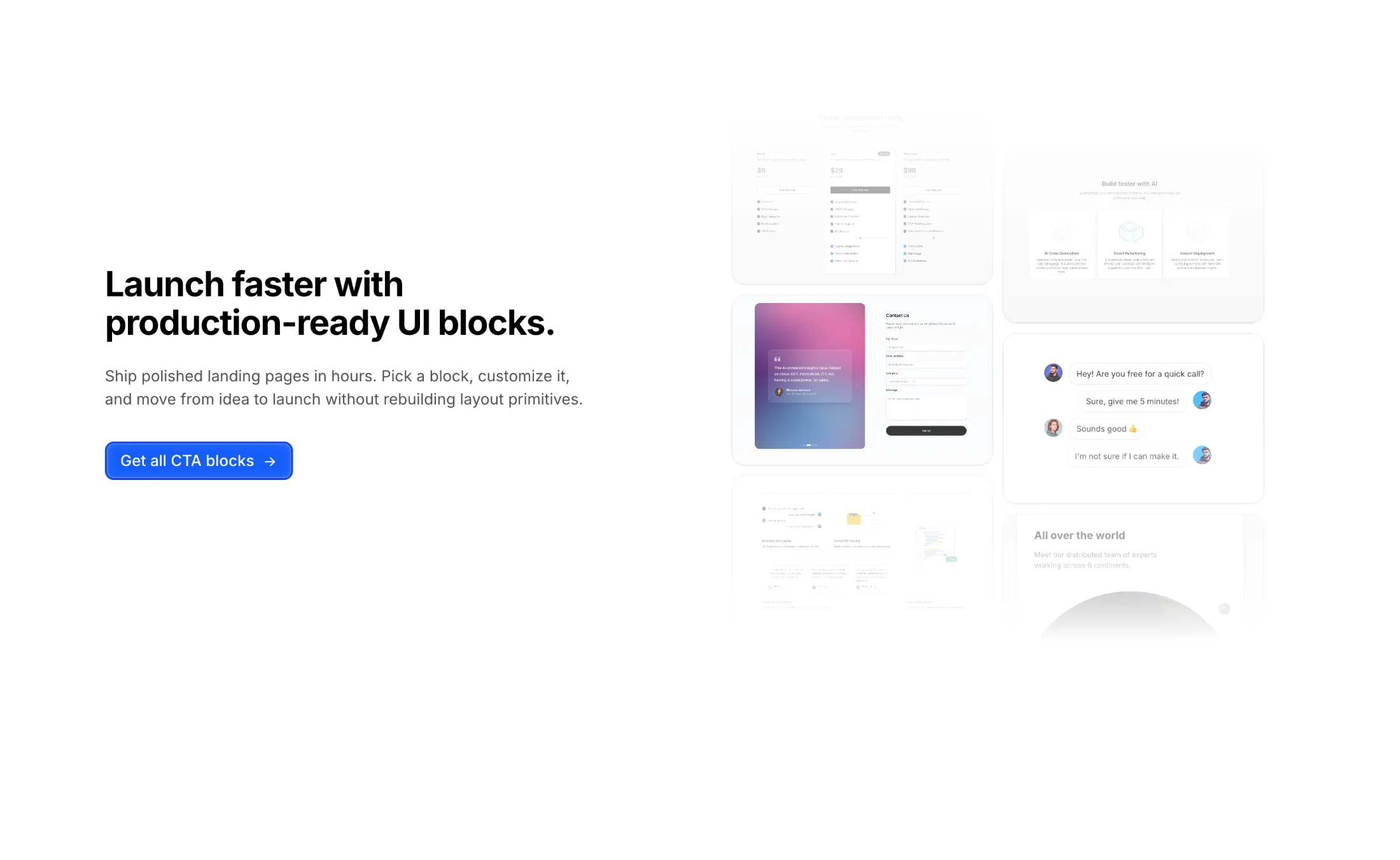
New Productized Agency Template for agencies that sell services as products.
A conversion focused, multi-page template to showcase your services, packages and pricing with a clean, professional design that turns visitors into clients.
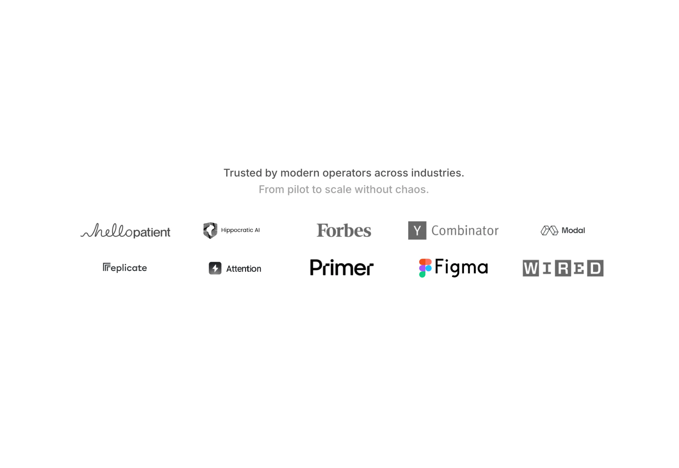
New logo cloud block: Single Row Logo Cloud.
A slim “trusted by” row that flips between two sets of logos on a timer, so you get movement without taking much room. Handy when you need proof in one line—under a hero or above a footer—and it tightens up nicely on a phone.
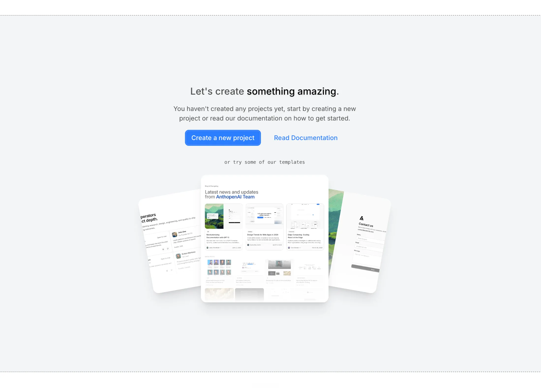
Empty States gives you Pro blocks for the dull moment when a list or workspace is still empty—you get clear next steps without a wall of placeholder text.
The set mixes simple paths (cards on a grid, stacked photos) with a swipeable deck when the empty state should feel a little more hands-on.
Added Blog With Categories to the Blog Sections bundle.
Three posts get the full treatment up top; the rest sit in a tighter grid underneath—handy when you’re mixing “what’s new” with a longer archive and want categories visible at a glance.
Added Magnetic Button to the free components.
Wraps any button so it drifts toward the cursor on hover and springs back when you leave, a small touch that makes call-to-actions feel a little more alive.
Added Squiggly Text to the free components.
Wraps a word (or whole headline) in a wobbly SVG filter so it looks hand-drawn and a little restless, good for playful hero copy where plain type feels too tidy.
Added CTA With Centered Text to CTA Sections (Pro).
Centered copy and two buttons over a soft grid of product shots, for a mid-page signup or doc link that still feels considered.
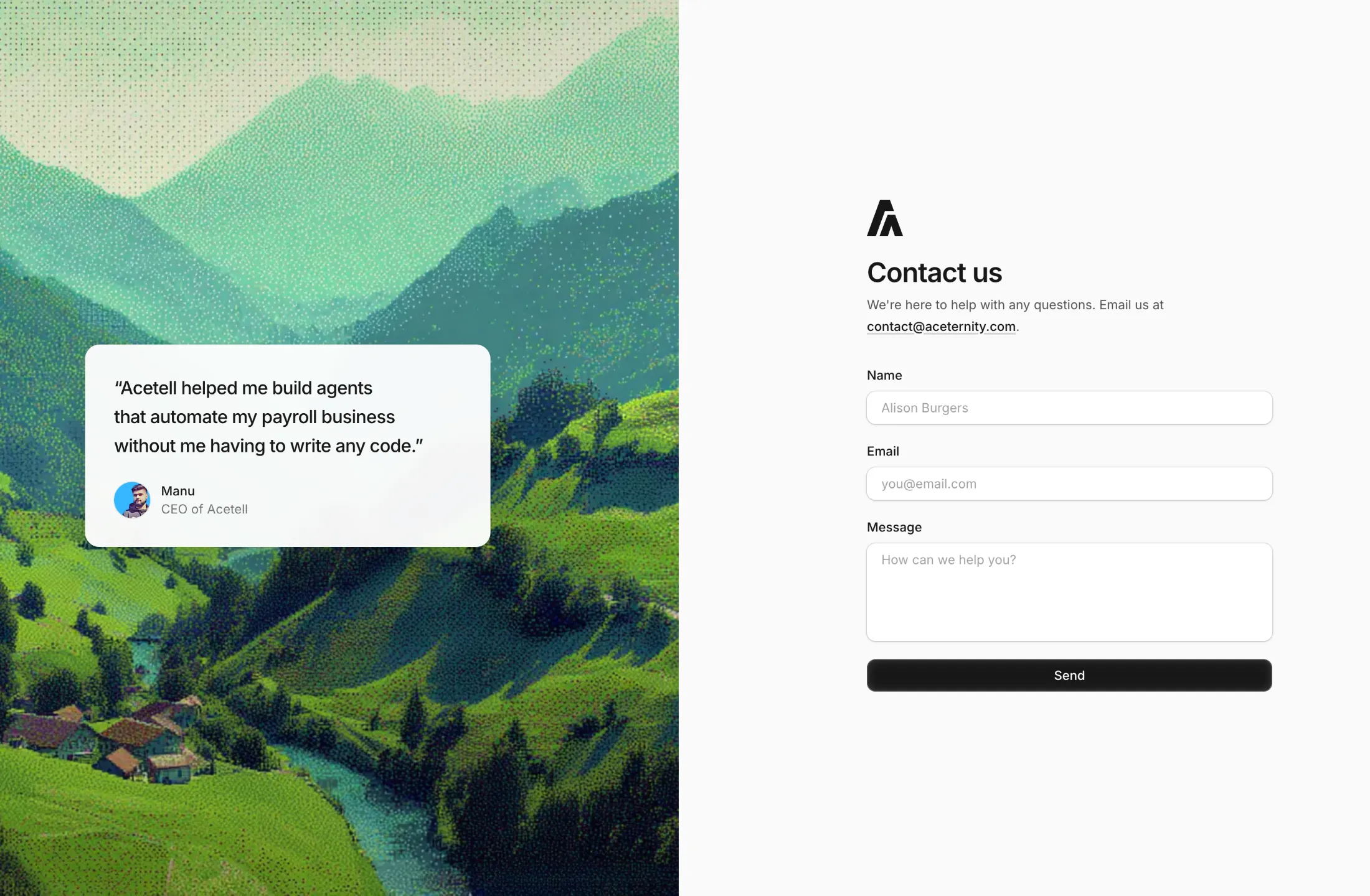
Added Contact With Dither Image to Contact Sections (Pro).
A split contact block: dithered landscape and a small testimonial on one side, form on the other. Handy when you want something warmer than a plain form but still easy to wire up.
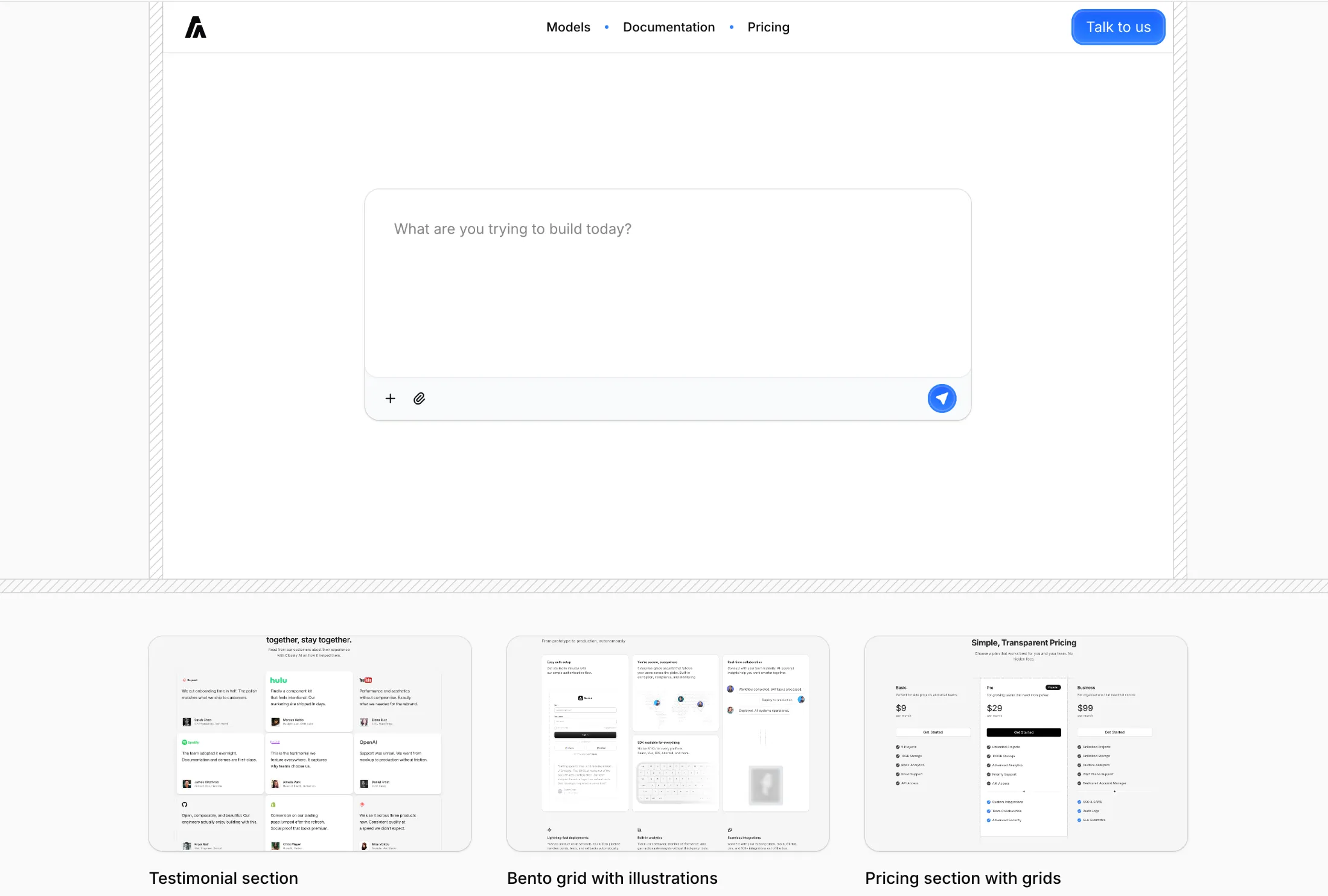
Added Hero With Chat Input to Hero Sections (Pro).
Big prompt field up front with a simple action bar, plus a row of sample work so the page still feels grounded. Meant for builders or AI products that want the first screen to feel like starting a conversation.
Added Draggable Cards to Illustrations (Pro).
A stack you can flick through one card at a time. The swiped card springs out and cycles to the back so the deck never runs out.
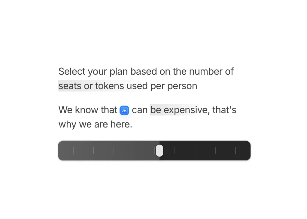
Added Slider Illustration to Illustrations.
Seats-or-tokens copy sits above a draggable track with a floating preview, so people can map tiers right beside the paragraph.
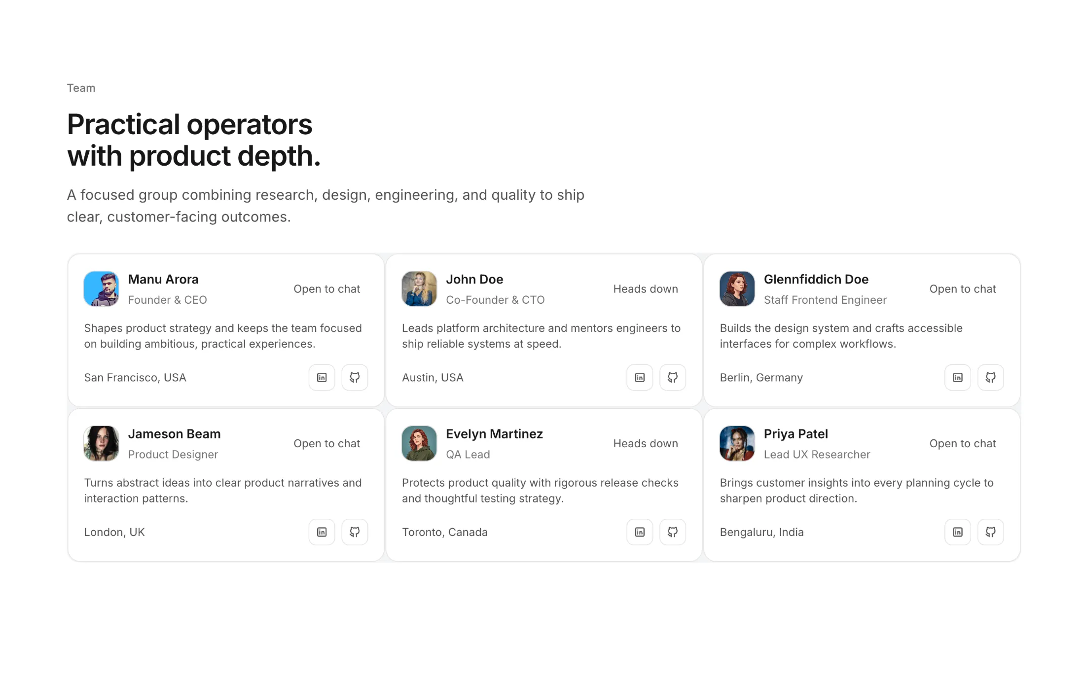
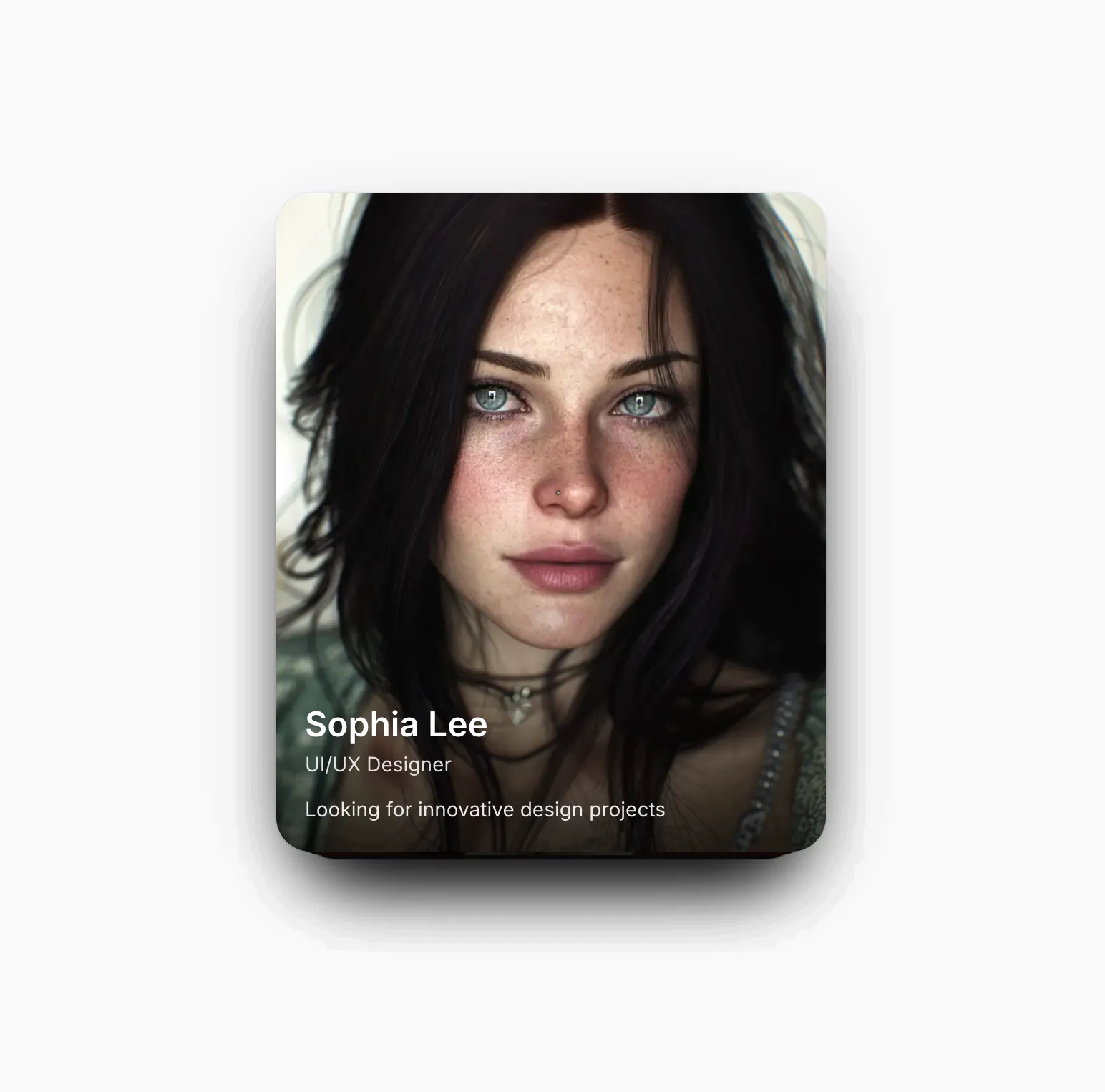
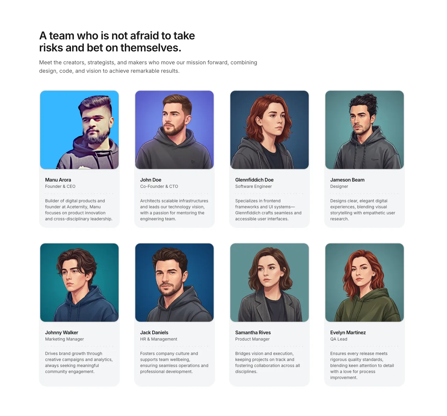
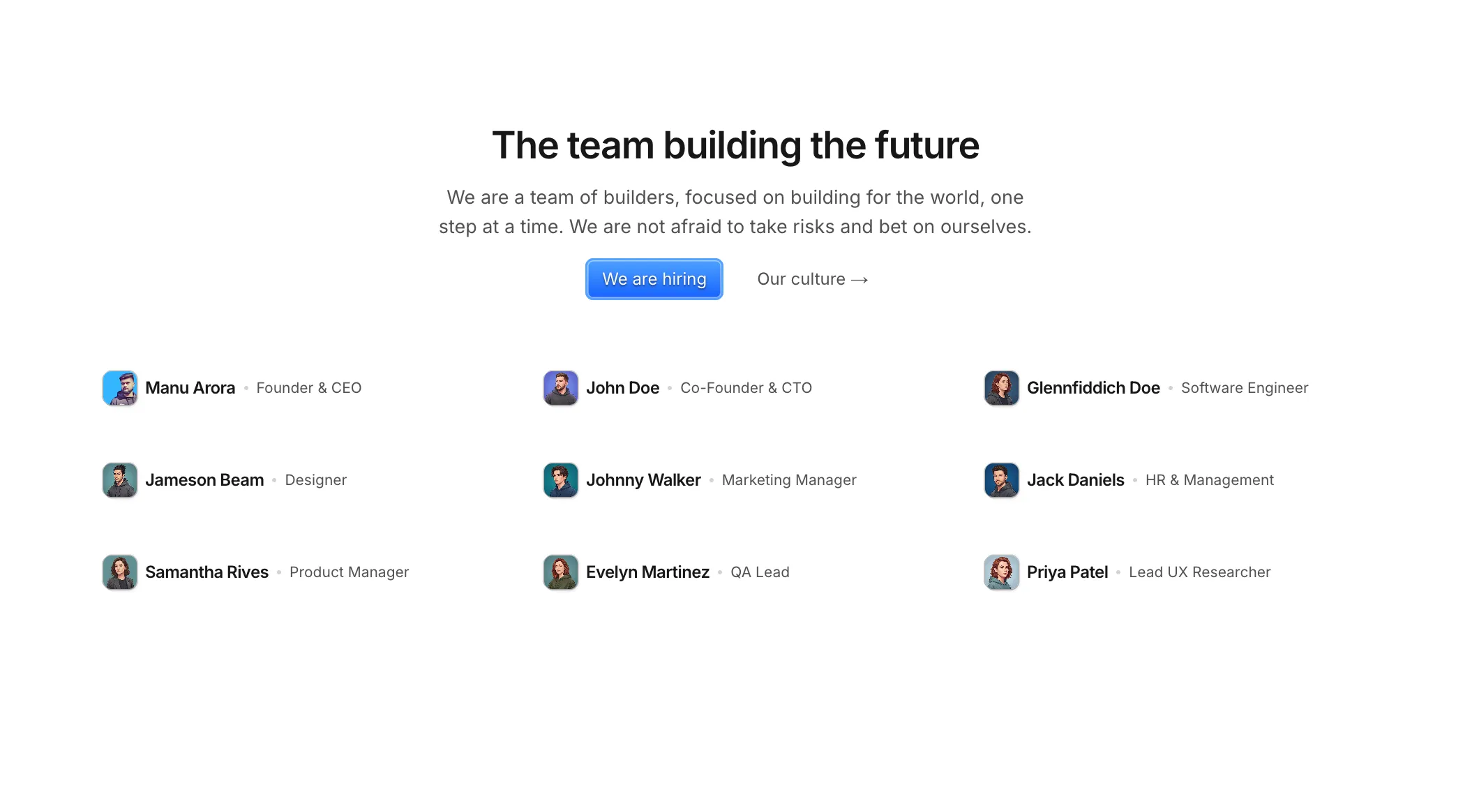
New team section: Team Section With Timeline Cards. It gives you a clean profile grid with status badges, location, and social links so visitors can quickly understand who is on the team.
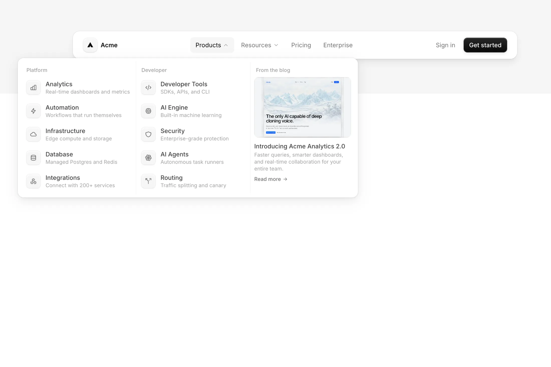
New navbar: Navbar Dark Shadow. A dark navbar with layered ridge shadows and dropdown mega menus that slide between panels. The Products dropdown opens a 3-column grid with a featured blog post alongside categorized links.
We introduced Team Sections, a new Pro block category for meet-the-team and About pages. The first block is Team Section with Scales, a simple portrait grid with light ruler lines so names and roles stay easy to scan.
We also shipped Team Section with Light Background: soft cards with a dotted line between role and bio so each profile stays easy to read.
Team Section with Small Avatars adds a tight list with tiny photos and hiring or culture buttons when you do not need full-width portraits.
New FREE template Minimalist Portfolio Template for a portfolio that stays out of the way: five pages, simple navigation, and space to swap fonts and colors so your work reads clearly.
Use it when you want a calm, content-first site without extra chrome.
Completely Free and open source.
Added Inline Icon Illustration to Illustrations.
It drops a logo into the headline and draws a dashed branch line into a short stack of perks, so the pitch reads like one connected idea instead of a loose bullet list.
Added a new Hero Section with Dither Background to the hero sections collection.
You get a dithered backdrop, fixed nav, and your headline up front—handy when a glossy photo would feel too plain and you still want a single strong fold.
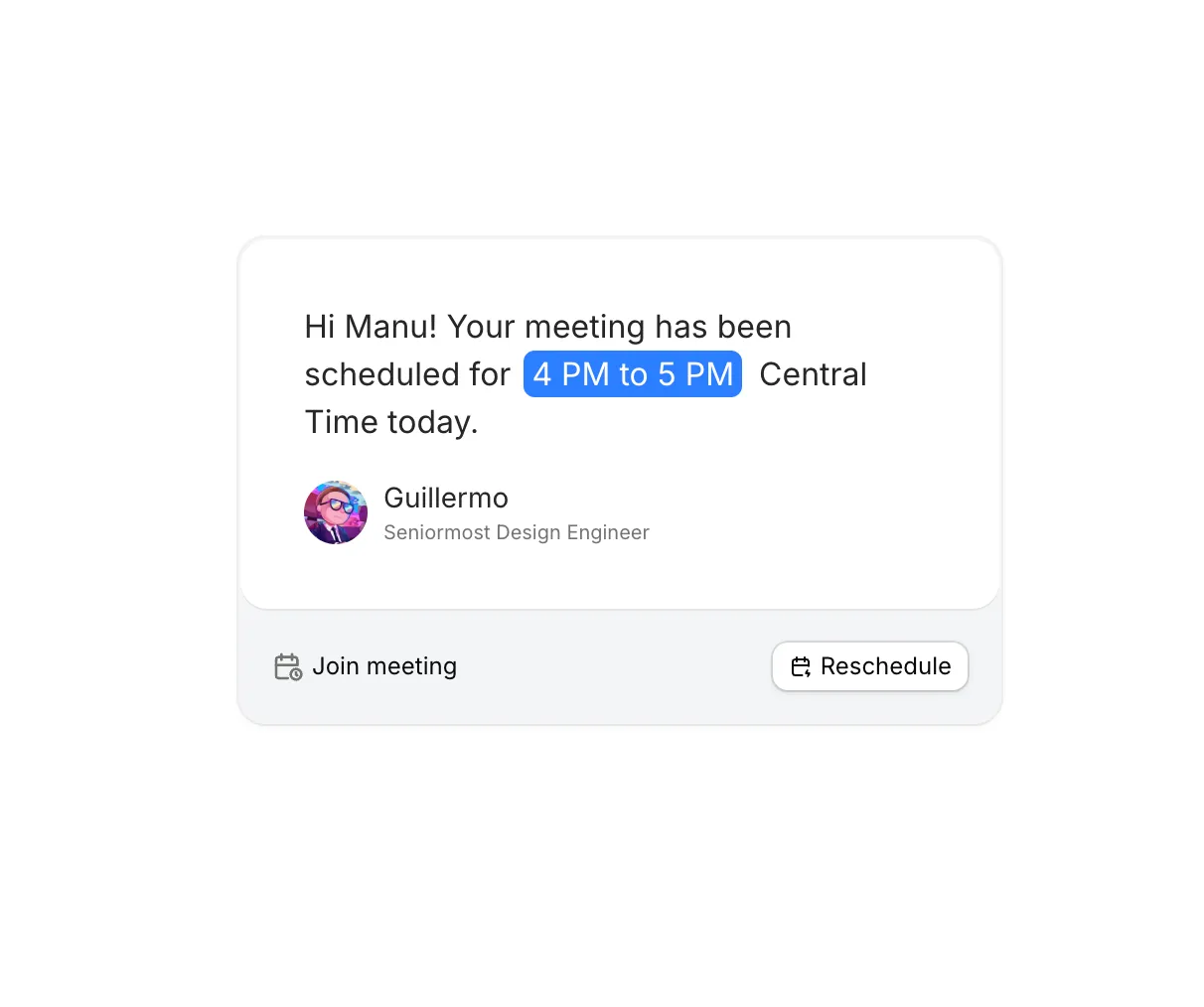
We added Meeting Illustration to Illustrations.
A tight meeting-confirmation card: time callout, sender line, and join or reschedule. Handy when you want scheduling context without building a full mock.
Added Multicolored Features to Feature Sections.
Rows of creator clips on color-tinted cards, with thumbnails you can open in a lightbox—handy when you want recognizable channels in the story instead of another wall of quotes.
We added Dither Features to Feature Sections.
A tabbed feature section with a dithered image backdrop and chat-style skeletons. Click a tab and the title, description, and skeleton swap in.
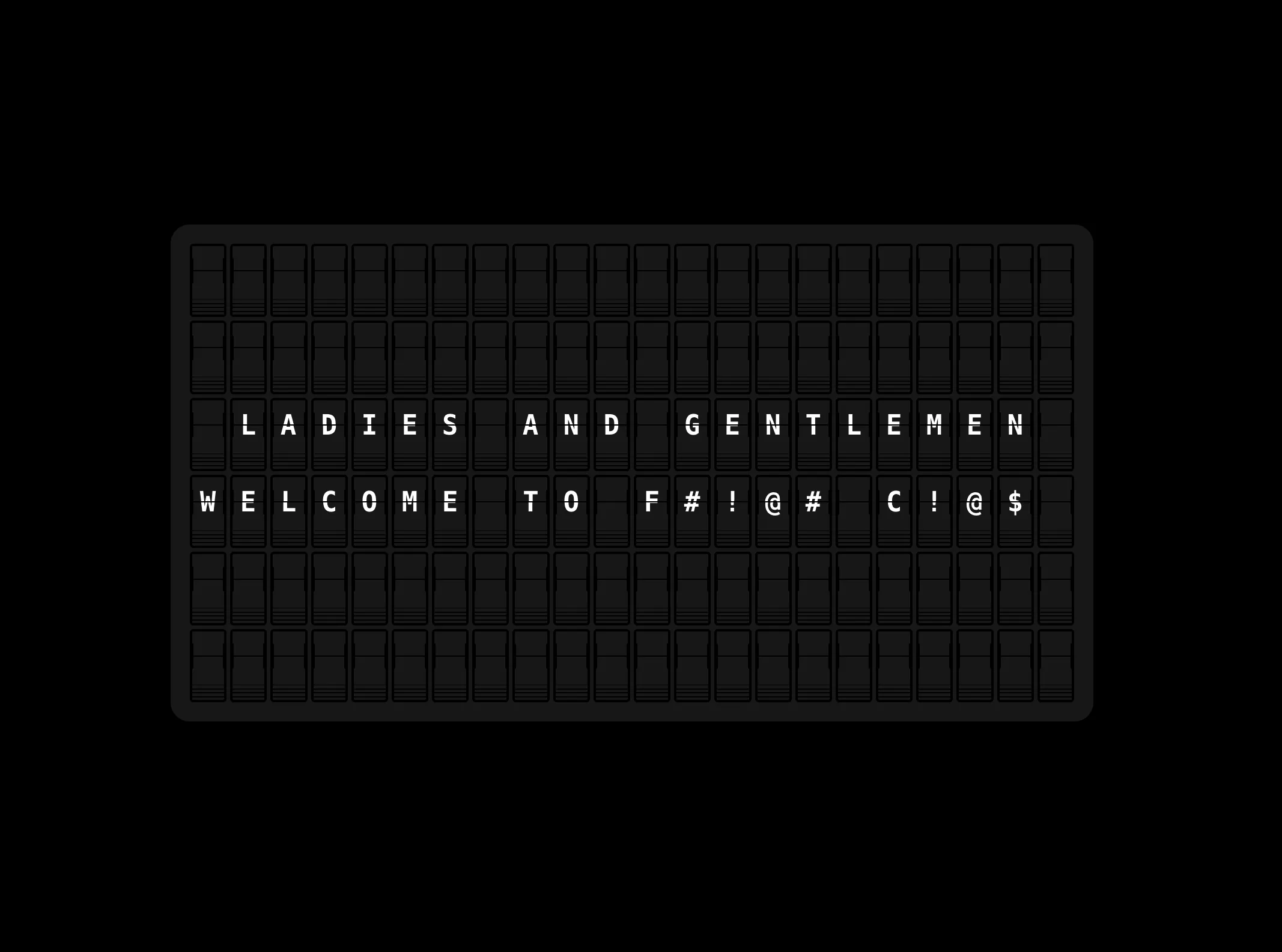
Added Text Flipping Board to the free components.
A split-flap display you can drop into any page. Pass it a string, and it scrambles through random characters before landing on your message, just like the real thing.
We added Features With Hover And Text Animation to Feature Sections.
It’s for pages where you speak to more than one audience: hover a row and the headline follows, so visitors see who each block is for without wading through extra copy.
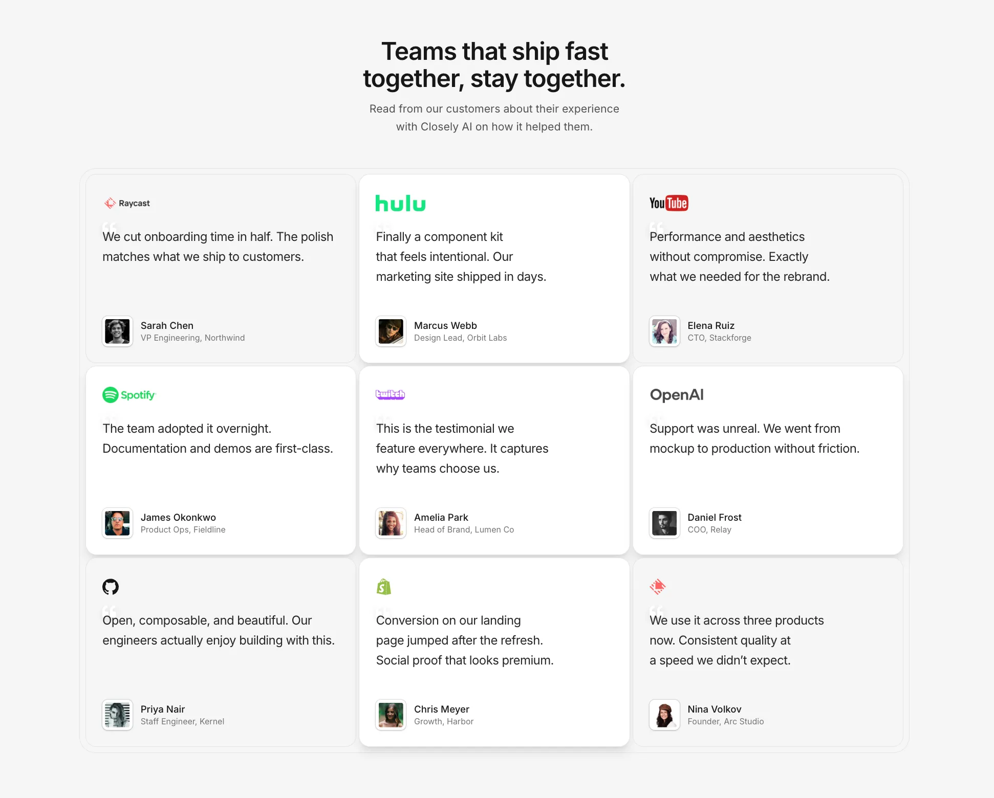
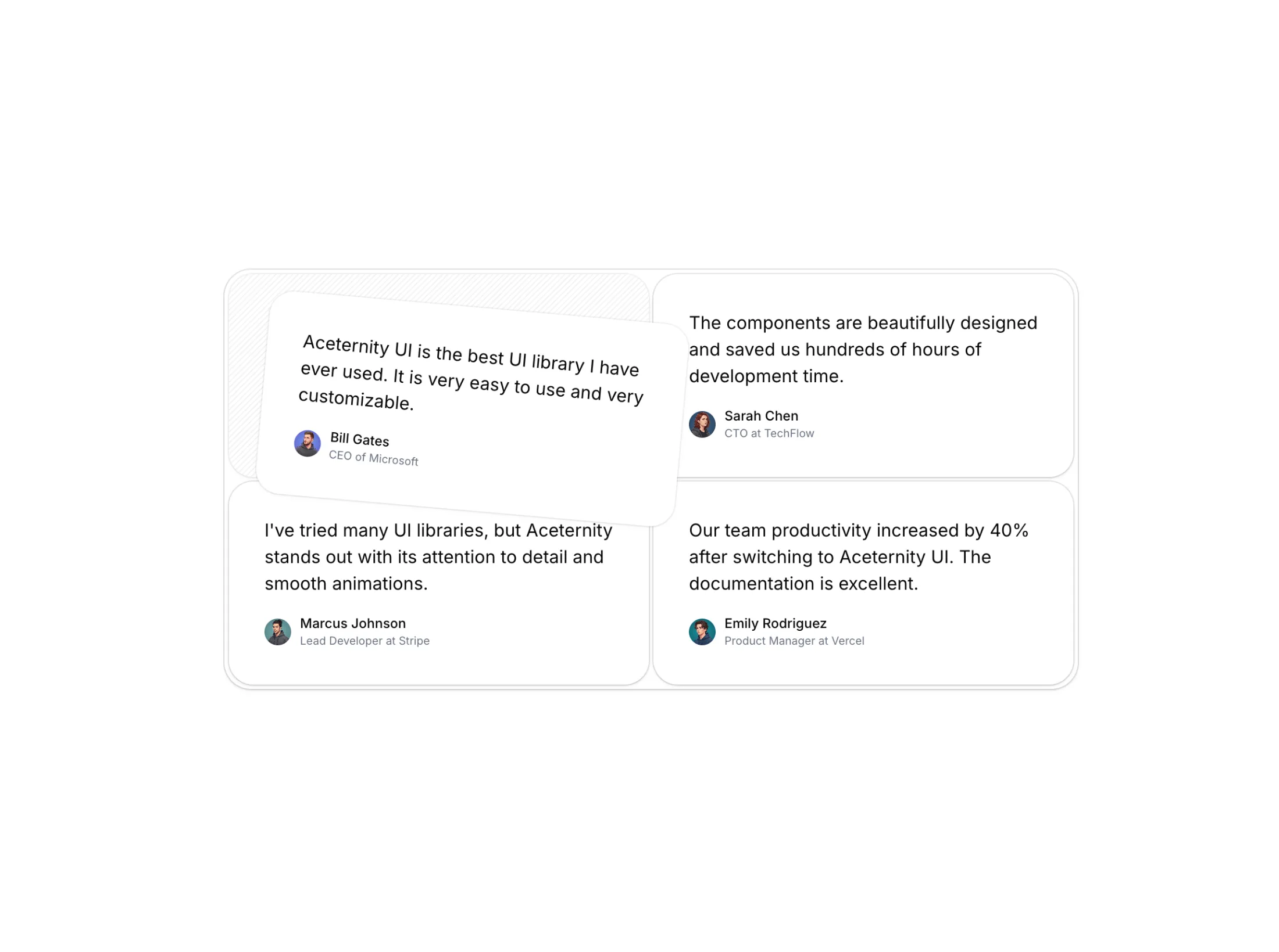
New testimonials grid in the testimonials pack. Headline, short intro, and a grid of quotes, with a little extra weight on one card when you want it noticed.
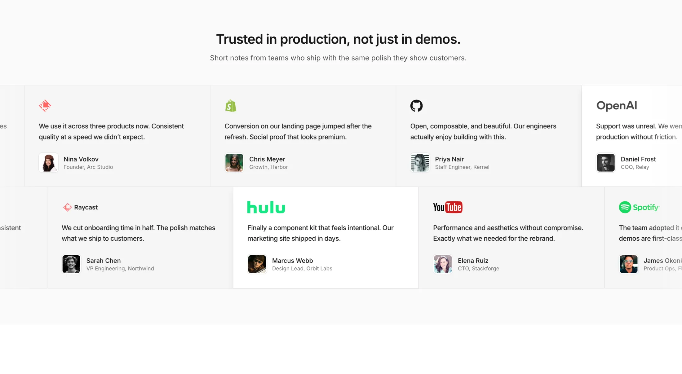
Also added a boxed testimonial marquee: two scrolling rows of logo quotes and avatars when you want social proof that moves without feeling like a carousel.
Added a new Hero Section with Shadow and Scales to the hero sections collection.
It is a full-height hero with a framed image, ruler-style edges, and a nav that collapses on small screens. Use it when you want a polished first screen without a busy layout.
Added Blog With Search Magazine to the Blog Sections bundle.
Built for editorial-style listings: one post gets the cover treatment, the rest live in a searchable card grid—nice when your archive is deep enough that people need to scan and search, not just scroll.
Added CTA Centered Masonry Gallery to the CTA Sections bundle.
Centered headline and button with a masonry strip underneath—works when you want the pitch up front and the proof in photos, without a two-column split.
Added Text Highlight Illustration to the Illustrations bundle.
It’s a tiny story beat: one line gets highlighted while a toolbar pops in above it—handy when you’re selling AI-assisted writing or “select and act” flows without mocking a whole editor.
We added Feature Section With Centered Skeleton to the Feature Sections bundle.
It's for when you want bullet-point story on both sides and a strong visual in the middle—room for a screenshot, campaign art, or a before-and-after style demo without turning the page into a wall of text.
Added Gooey Input to the free components.
It's for when you want a search icon first and the field to ease open afterward, instead of showing a full-width bar up front.
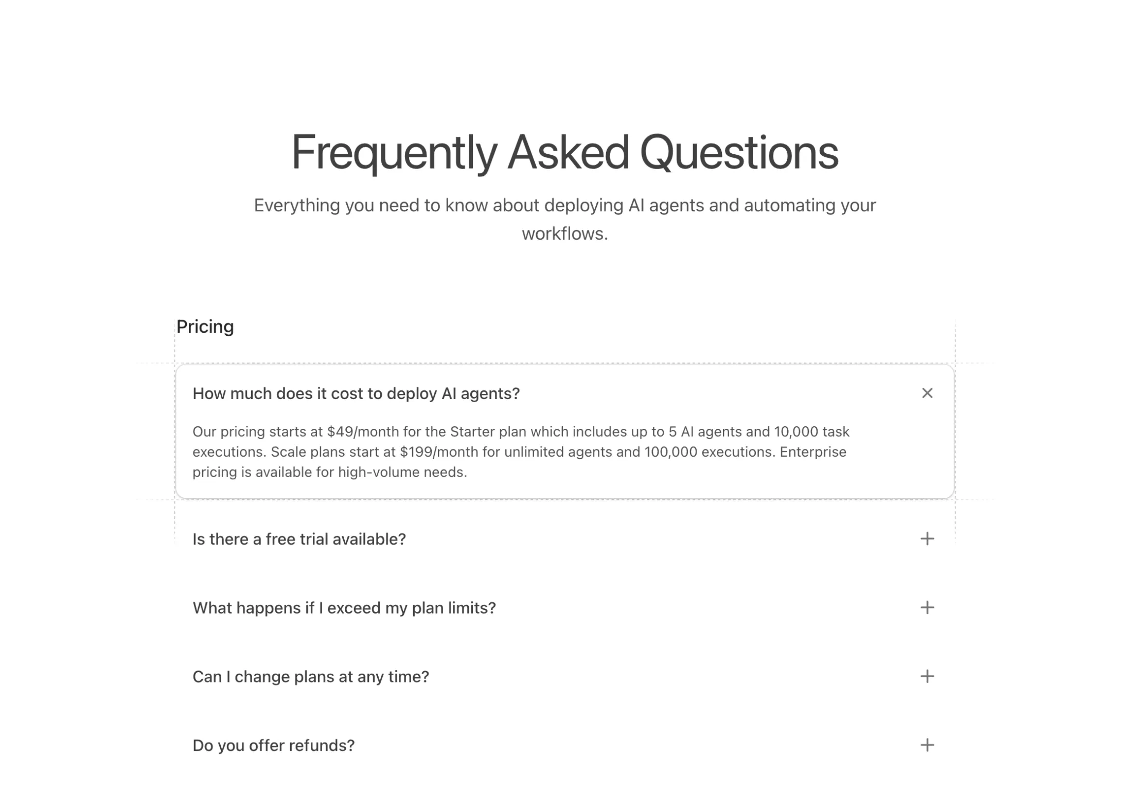
New FAQ block: FAQs With Dashed Lines.
An accordion FAQ component that groups questions into titled sections. Click a question and it expands smoothly while the plus icon rotates into an X. Active items get a subtle shadow and four dashed grid lines that extend beyond the card edges with fade effects.
New logo cloud block: Logo Cloud With Swap Animation.
A logo grid that automatically rotates through your partner logos. Ten logos display in a 5x2 grid, swapping every 3 seconds with smooth horizontal motion. Logos slide in from the right and exit left with a blur effect, each one staggered slightly after the previous for a wave-like transition. Cycles through 20 total logos, letting you showcase more partners than would fit on screen at once.
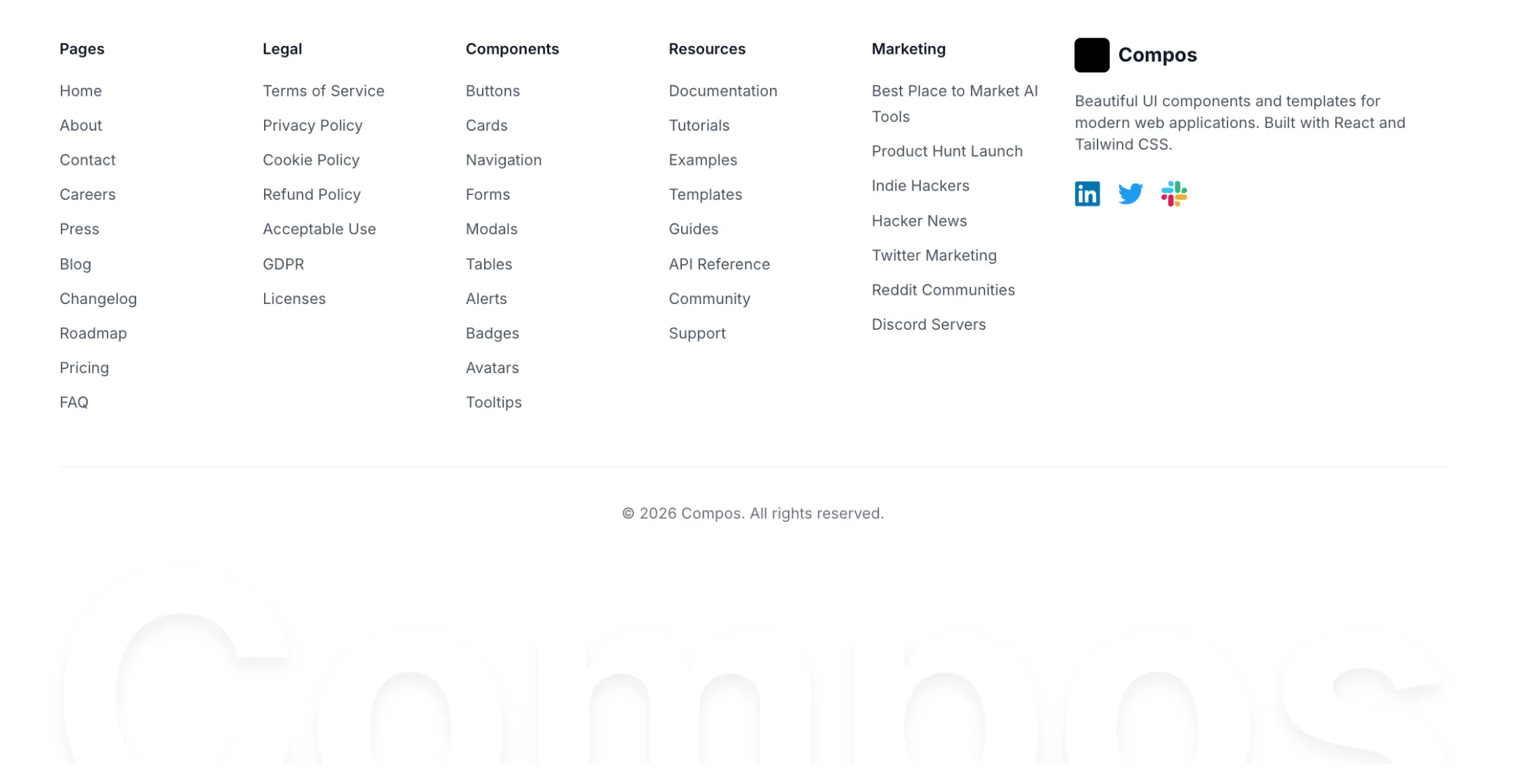
New footer block: Footer With Big Text.
A comprehensive footer with five link columns covering Pages, Legal, Components, Resources, and Marketing categories. The right section features a logo, description text, and social icons for LinkedIn, Twitter, and Slack with their brand colors.
The signature element is an oversized brand name at the bottom that pulses with animation. A gradient overlay fades the text into the background for added depth. The text scales from 6rem on mobile up to 20rem on desktop. Full dark mode support included, with all colors adapting to the theme.
New illustration block: MacBook Illustration With Icons.
A MacBook with floating AI company icons (Perplexity, OpenAI, Anthropic) that pop out on hover. The lid opens with spring physics while the icons animate upward with staggered timing and slight rotation. Each icon has a card-style shadow and inverts colors in dark mode.
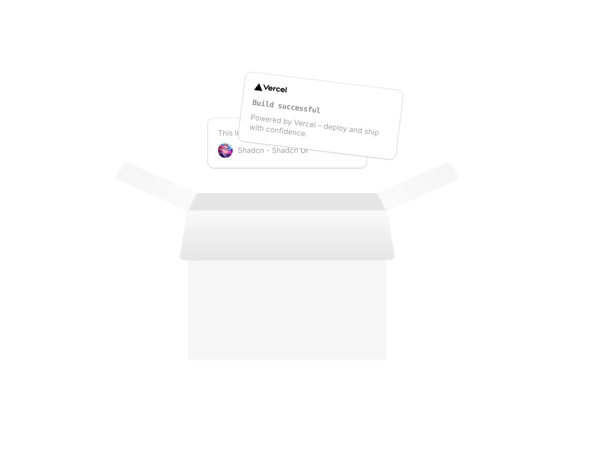
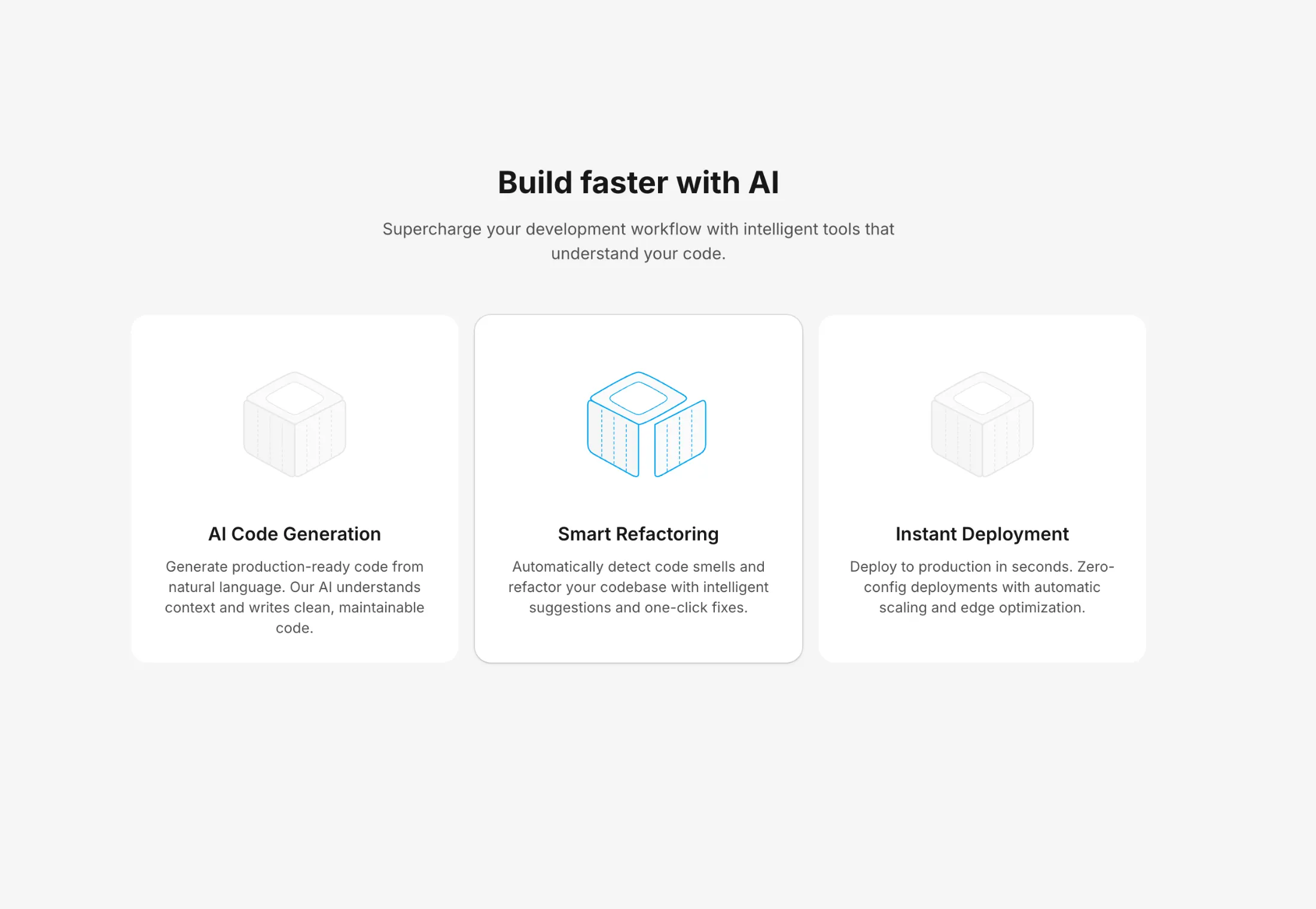
Four new pro blocks today: Box Illustration, Feature With Inline Icons, Pricing With Header and Icons, and Hero Section With Mousemove.
An interactive 3D box with popout cards on hover. Features a Vercel deployment card and testimonial card that animate upward with spring physics. The box uses CSS 3D transforms to create an open-box effect with front lid, back lid, and side flaps. Fully dark mode responsive.
A minimal feature grid with icons placed inline next to text. The layout adapts from 1 column on mobile to 2 on tablet to 3 on desktop. Responsive separators appear between items only—no borders on the outer edges. The separator logic calculates each item's grid position at each breakpoint to show the right combination of horizontal and vertical lines.
A data-driven pricing section with three tiers. Plans are defined in a typed array, making it easy to swap content without touching component structure. The featured plan inverts colors—dark in light mode, light in dark mode—to draw attention. Features can include React nodes for custom formatting like bold text. The CTA button on the featured tier uses a gradient, while others stick to subtle shadows. All shadows adapt to the current theme.
A hero with a Figma-style hover inspector. Hover over any element—headline, paragraph, buttons, or badge—and a blue border appears with a dimension label showing the width and height in pixels. The numbers animate with a sliding digit effect, counting up from zero on each hover.
Behind the content sits a horizontal masonry grid with 5 rows of component screenshots. Each row has a different horizontal offset, and a radial mask fades the images toward the center so they don't compete with the text.
The hover highlight moves smoothly between elements using Framer Motion's layoutId. After 5 seconds without interaction, it fades out. All sub-components use memo to avoid unnecessary re-renders.
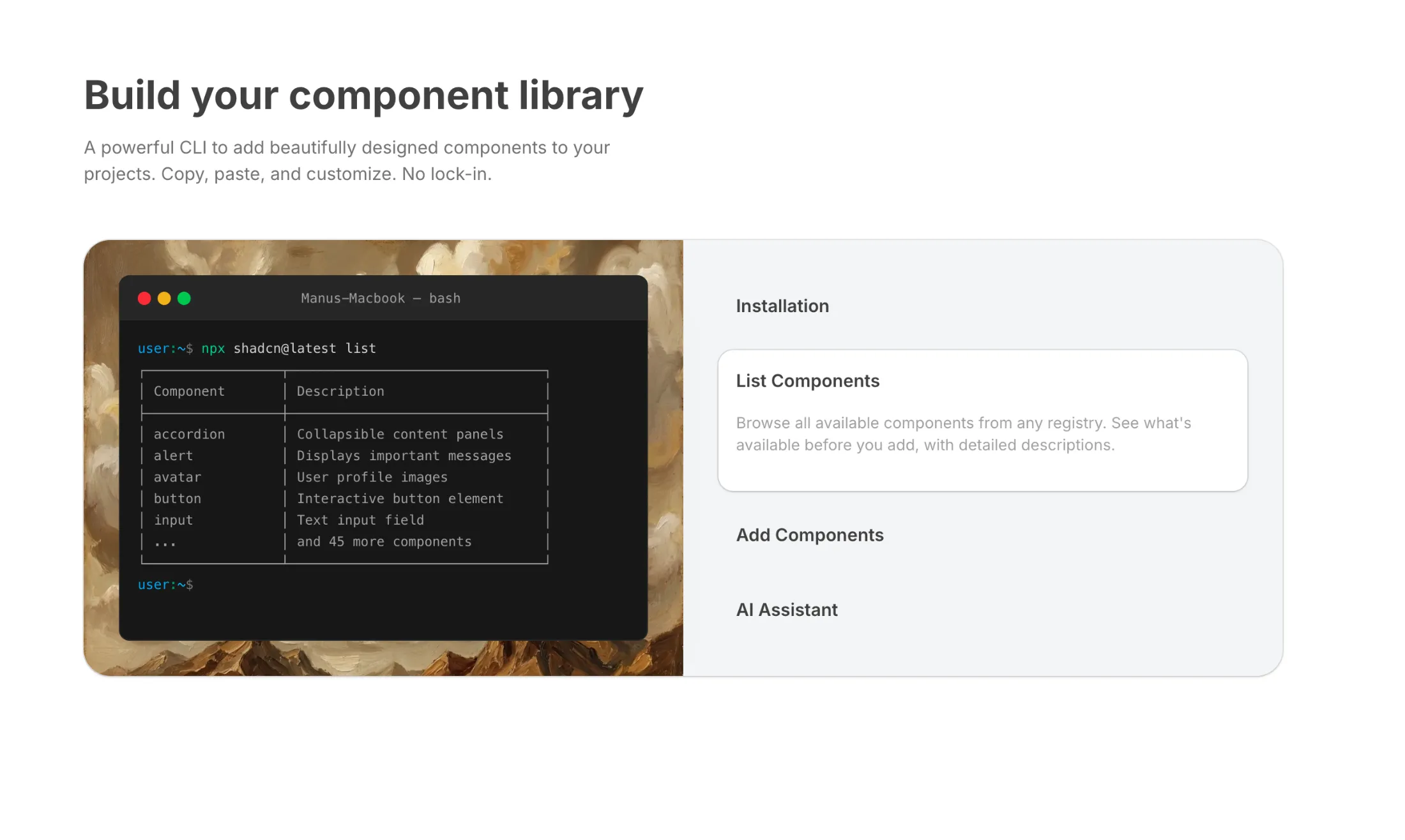
New component: Terminal and a new pro block: Feature Section with Terminal.
A Mac-style terminal with typewriter effect and bash syntax highlighting. Commands type out character by character with optional keyboard sounds.
A two-column layout pairing the terminal with expandable feature tabs. Click a tab to see relevant CLI commands typed out in real time. Tabs cover initialization, listing components, adding components, and AI-assisted discovery.
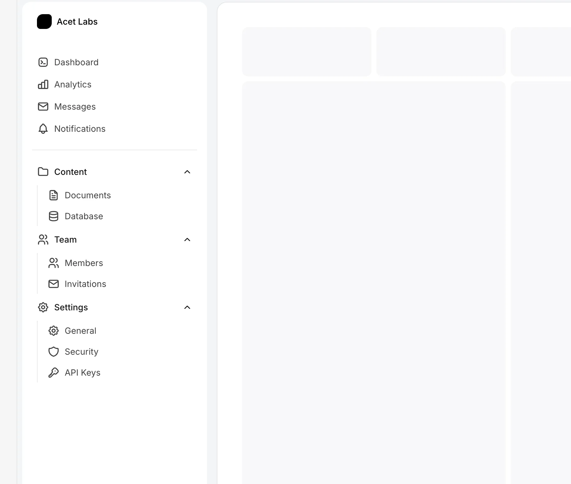
New Grouped Sidebar in the Sidebars bundle.
Collapsible sidebar with expandable navigation groups. Both sidebar state and group expansion persist to localStorage, so everything stays where you left it after page refresh.
Primary links up top, divider, then collapsible groups (Content, Team, Settings) below. Groups open by default. Works on mobile with a slide-out drawer.
New Text Generate Typewriter in the Text Animations bundle.
A typewriter effect with realistic mechanical keyboard sounds. Types words character by character with key down/up audio feedback—each keystroke plays the press sound, then the release sound when the character appears.
Backspace uses press-and-hold behavior: one key-down sound at the start, rapid deletion, then key-up when done. The final word stays on screen with a typed period and blinking cursor. Animation triggers on viewport entry and runs once.
New Simplistic SaaS Template for AI and Agentic startups.
New Feature Section With Vertical Grids added to the Feature Sections bundle.
New Feature Section With Horizontal Skeletons added to the Feature Sections bundle.
Background Grid with Dots - An SVG-based grid pattern background with circular dots at each intersection point. Features customizable grid size, dot radius, and colors with automatic dark mode support. The exported GridWithDots component can be used standalone as a background layer in hero sections, landing pages, and feature cards.
Background Grid with Dots and Animations - An interactive SVG grid background with line distortion and dot movement effects on mouse hover. Lines wave and change color based on cursor proximity, while dots follow their intersecting lines. Performance-optimized with requestAnimationFrame, passive event listeners, and automatic animation pause when idle.
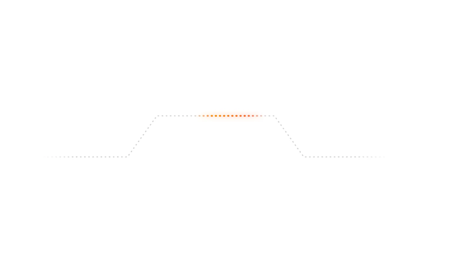
Animated Beam Path Illustration - A glowing gradient beam animation that travels along a dotted SVG path. Features orange-to-red gradient colors with soft glow effects, ideal for illustrating data flow, connections, or progress indicators in feature sections and bento grids.
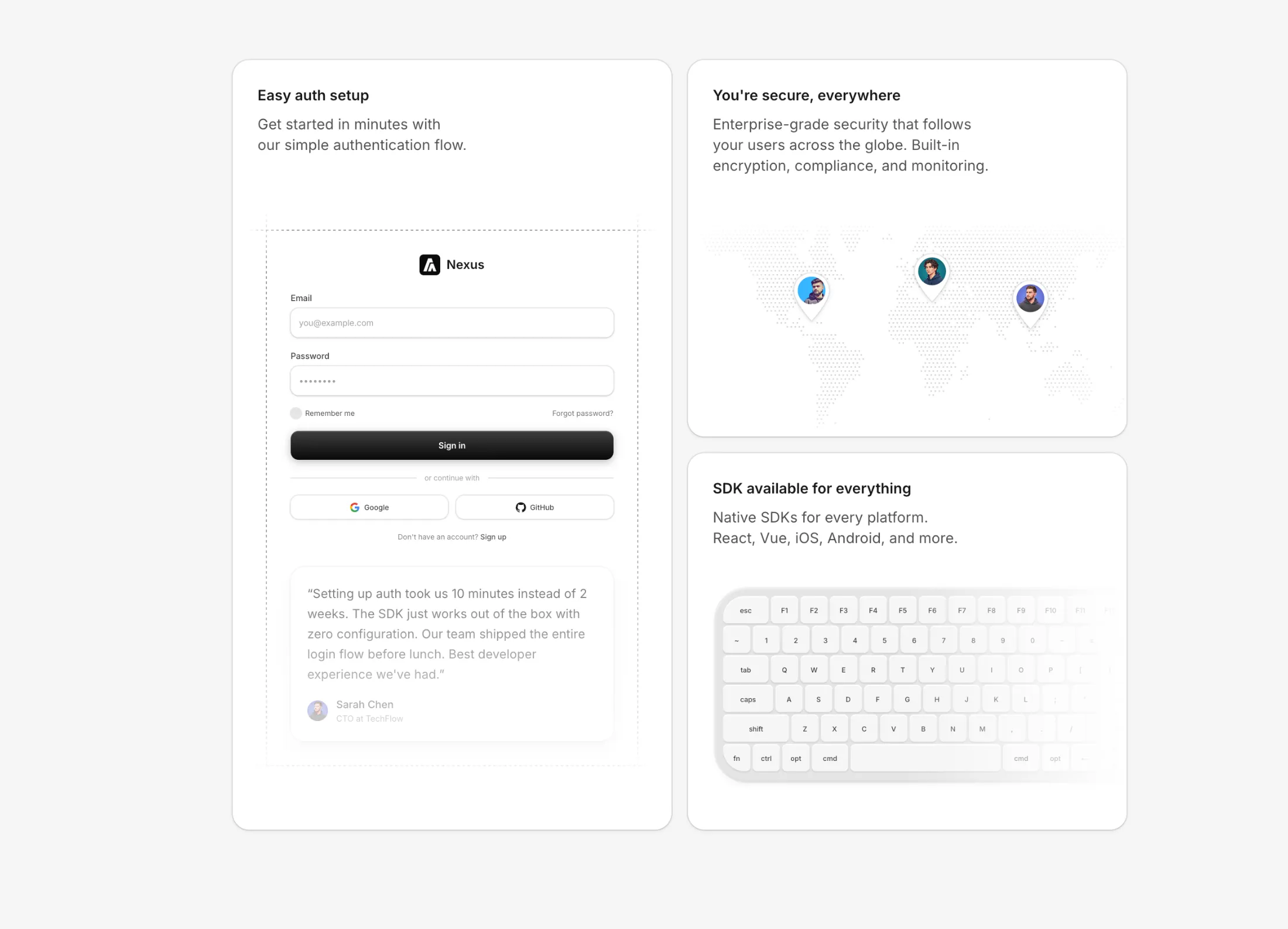
Multi Illustration Bento - A bento grid layout with 3 feature cards showcasing authentication, SDK availability, and global security. Features a login form skeleton with social auth and testimonial, a dotted world map with animated avatar pins, and a Mac keyboard illustration with hover effects. All cards use composition components with dark mode support.
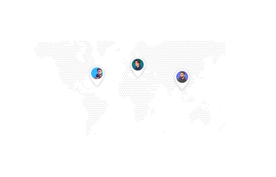
World Map Illustration - Interactive dotted world map with customizable location pins featuring teardrop-shaped markers and avatar support.
Keyboard Illustration - Compact Mac keyboard with blue hover glow effects and size variants (sm, md, lg, xl) for cards and bento grids.
Simple Login With Grid Lines - Clean login form with decorative dashed grid lines border, subtle input styling, and a dark gradient submit button.
All illustrations feature:
useAnimate hookuseImperativeHandle patternrepeat: Infinity
New free component: Parallax Hero Images - absolutely positioned images with mouse-driven parallax effect for hero sections.
Features include blur fade-in animations, depth-based movement speeds, and two variants: default (middle images closest) and edge-focus (top/bottom images closest). Fully responsive with touch support on mobile.
Features With Stacked Isometric Boxes - A two-column feature section with interactive stacked isometric boxes. Features autoplay that cycles through items every 5 seconds, with timer reset on click. The left column displays feature cards with titles and descriptions, while the right column shows stacked isometric boxes with the active one highlighted in blue. Built with Framer Motion for smooth spring animations.
CTA With Masonry Images - A two-column call-to-action block with left-aligned heading, supporting text, and a blue primary button styled like the brand button system. The right side uses a two-column masonry-style image grid with rectangular cards, subtle shadow/ring treatment, and soft edge fading for a polished static presentation.
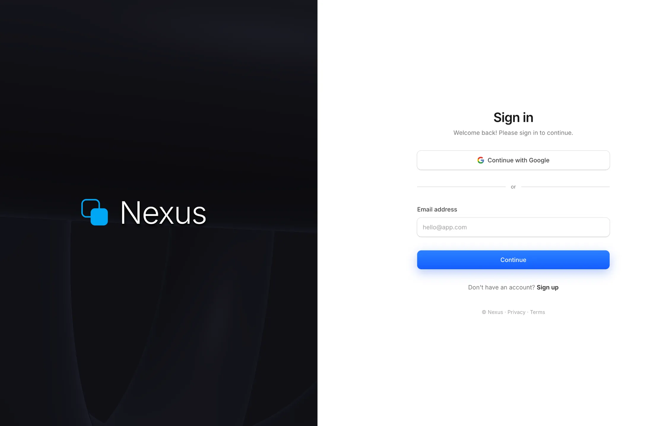
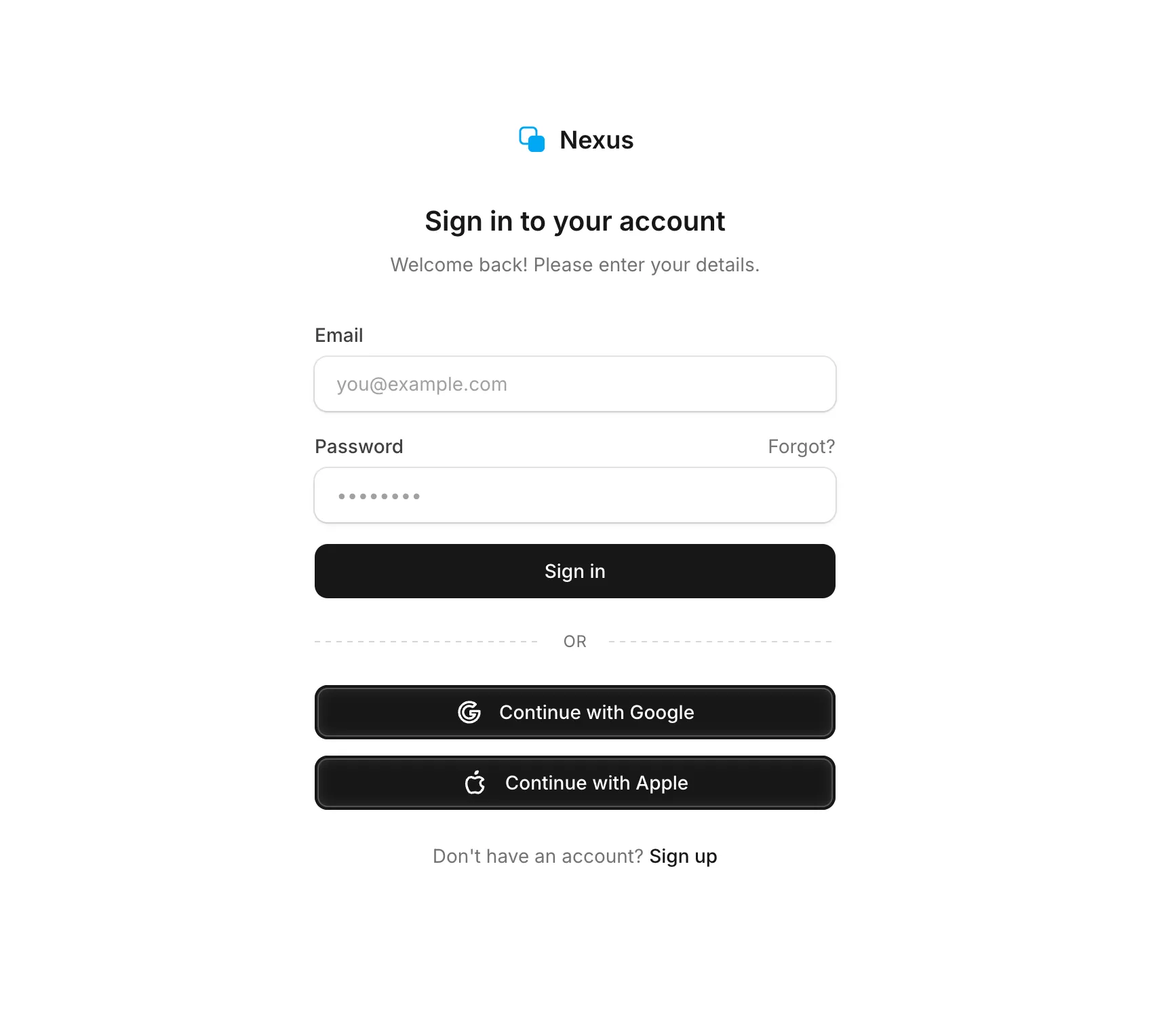
Premium Auth Split - A full-screen split authentication layout with a live WebGL raymarched shader on the left panel featuring three rotating torus shapes. Right panel has a sign-in form with Google OAuth, email input, and a gradient continue button. Full dark mode support.
New free component: Scales - a repeating line pattern for backgrounds.
Works in three directions: diagonal, horizontal, or vertical. You can change the size and color. There's also a ScalesContainer wrapper if you want to place content on top of it.

Isometric Box - Minimal isometric box illustration with smooth hover animations. Features rounded corners on the top face with sharp structural edges. On hover, the faces animate outward creating an exploded view effect using spring physics.
Features With Isometric Blocks - Feature cards with animated isometric box illustrations. Each card showcases a different animation direction on hover - left, right, or top face movement. Active cards highlight the moving face with a sky-500 stroke color.
Login Signup Minimal - Clean and minimal login form with email and password fields, followed by Google and Apple social login buttons. Features a dashed divider with gradient effect, subtle input styling with ring borders, and full dark mode support.
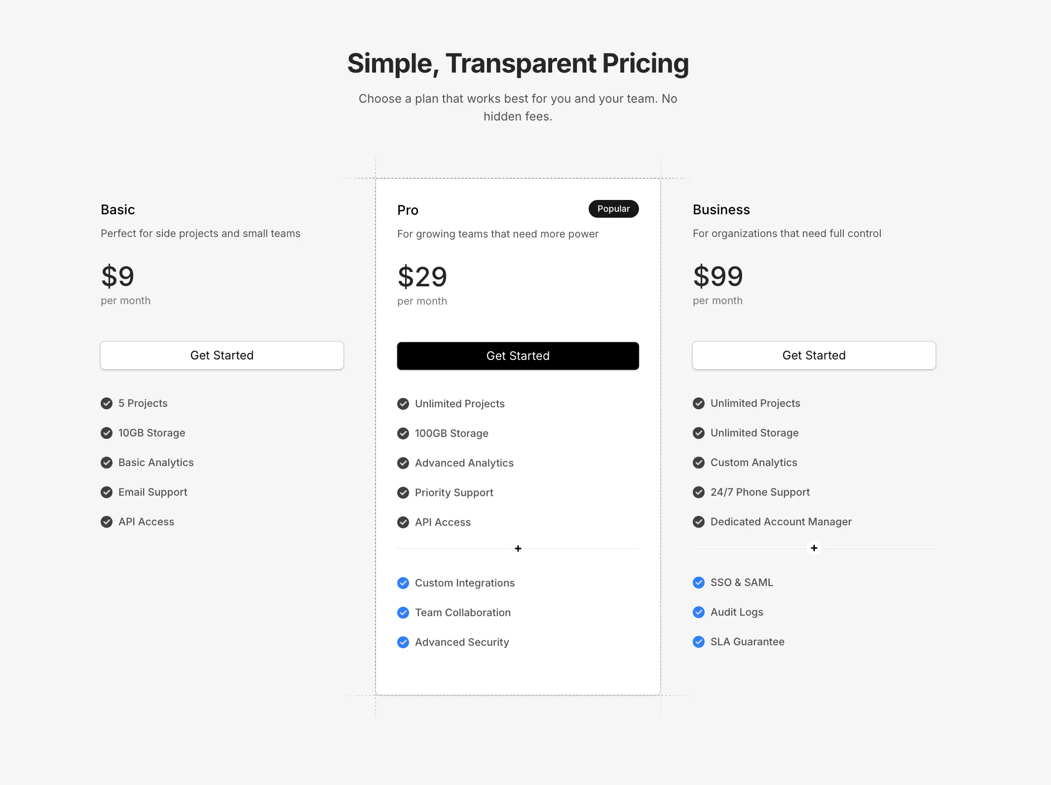
Pricing Minimal - Clean minimal pricing with three tiers and dashed grid line accents on the featured card. Features a decorative divider with plus icon for additional features, and self-contained mock data for easy customization.
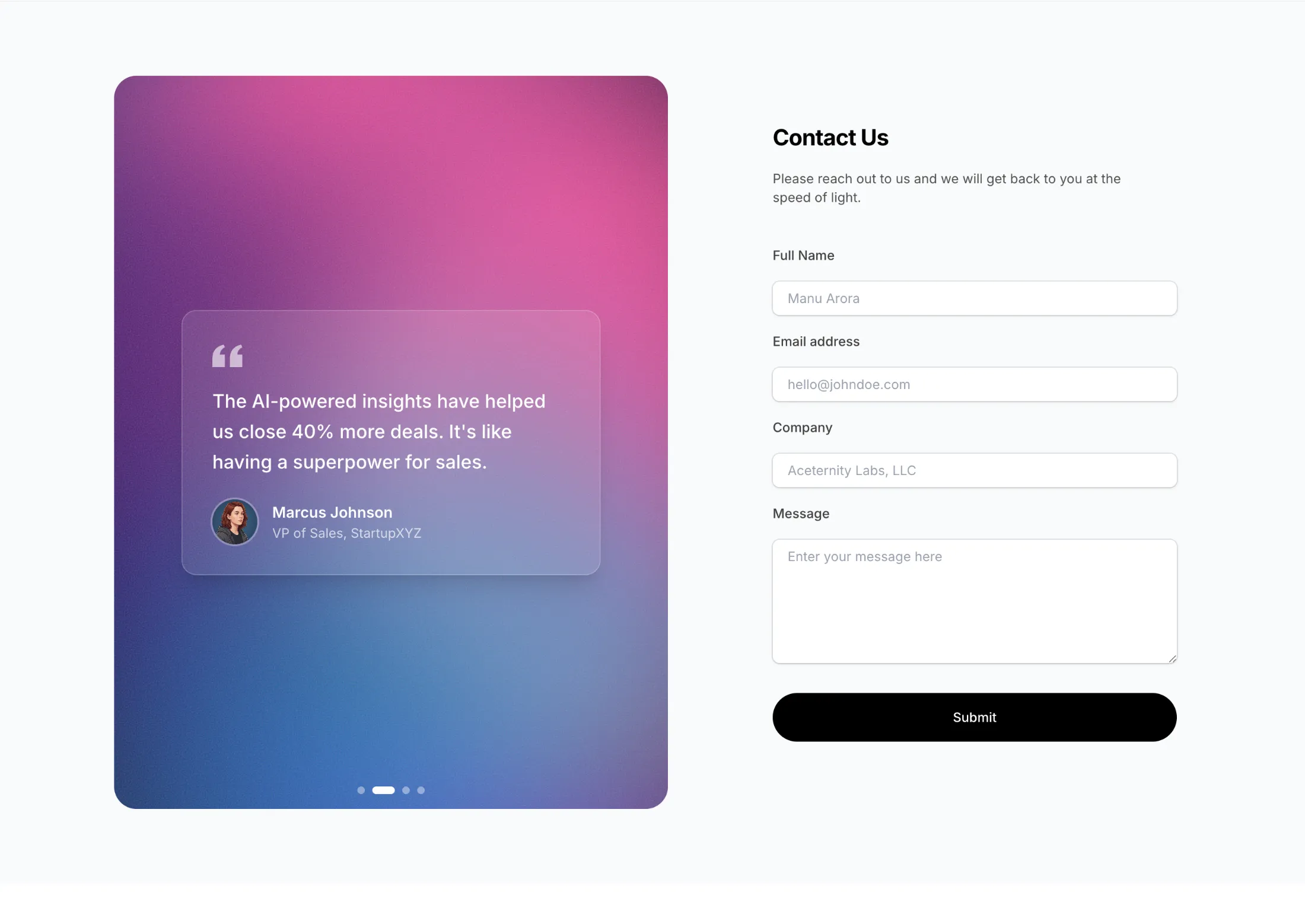
Contact Section With Shader - Two-column contact form with WebGL gradient background and rotating testimonials. Pass your own colors via the colors prop.
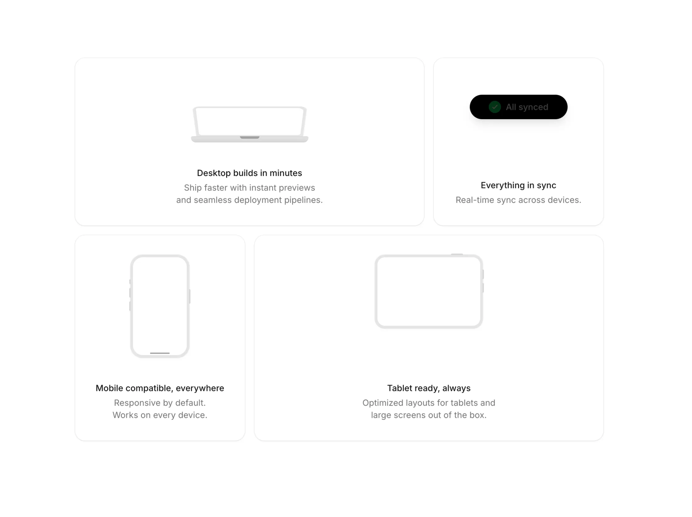
Feature Section Bento Skeletons - Bento grid with 4 cards. Each card has an animated skeleton showing the feature in action: messaging, file transfer, team collaboration, and testimonials.
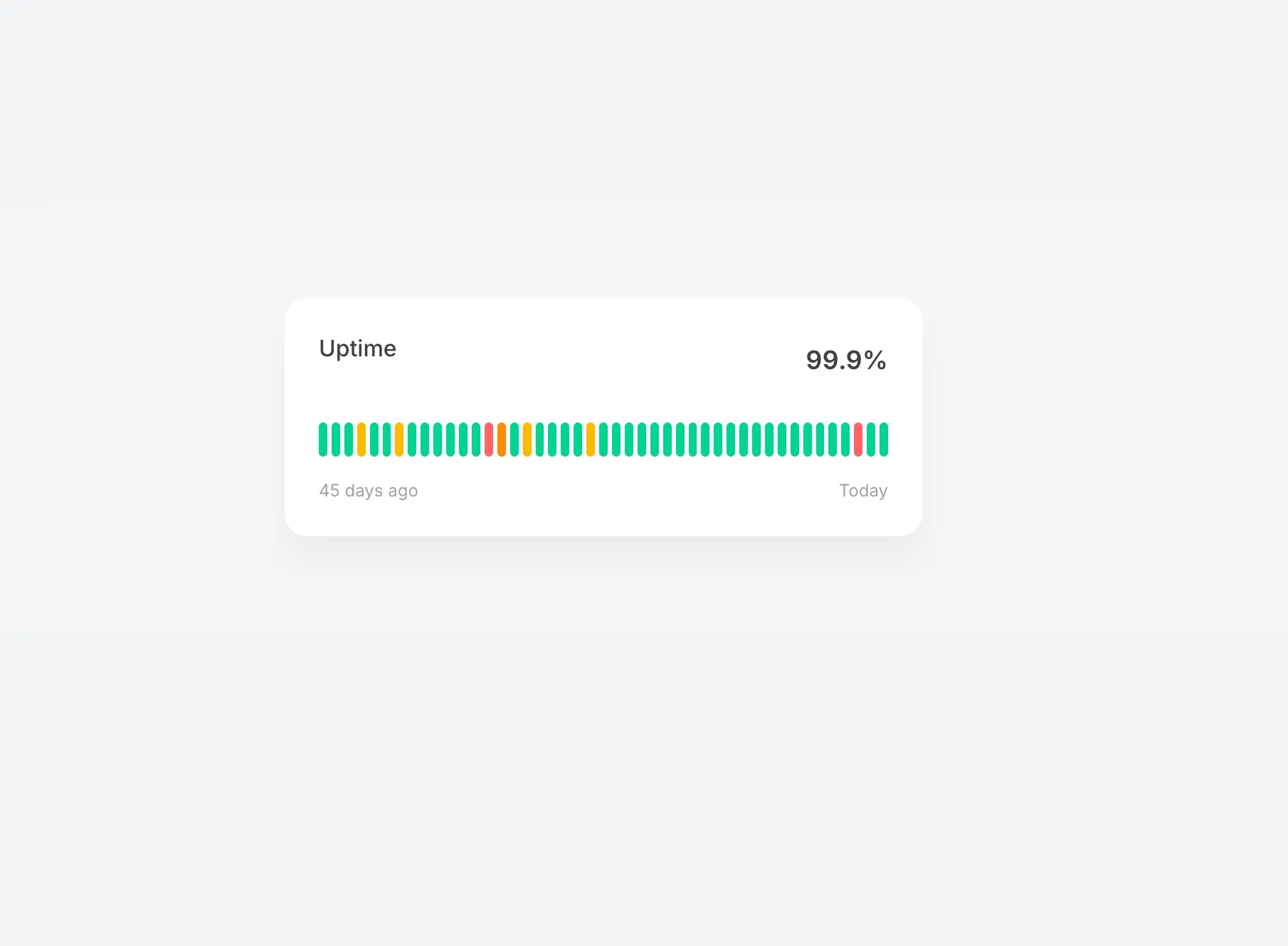
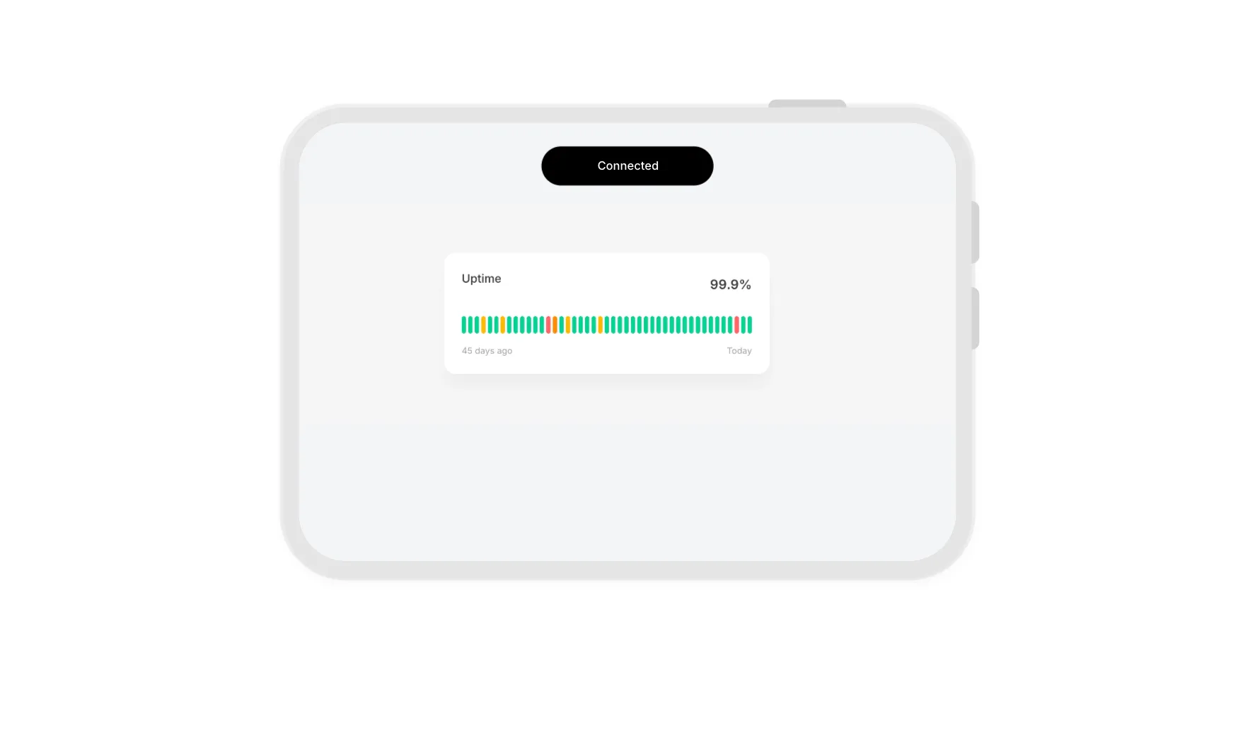
Uptime Status Illustration - Interactive uptime status bar with 45 days of history. Hover over each bar to reveal date, status, and uptime percentage with smooth blur animations. Color-coded for operational, degraded, partial outage, and major outage states.
Rotating Tabs With Text - Stacked notification cards that automatically rotate every 3 seconds. Features spring animations, 3D depth stacking, and full light/dark mode support.
Flipping Images With Bar - Animated image carousel with a scanning bar reveal effect. Images start grayscale and transition to full color as a glowing bar sweeps across with trailing sparkles. Features blur in/out transitions between images.
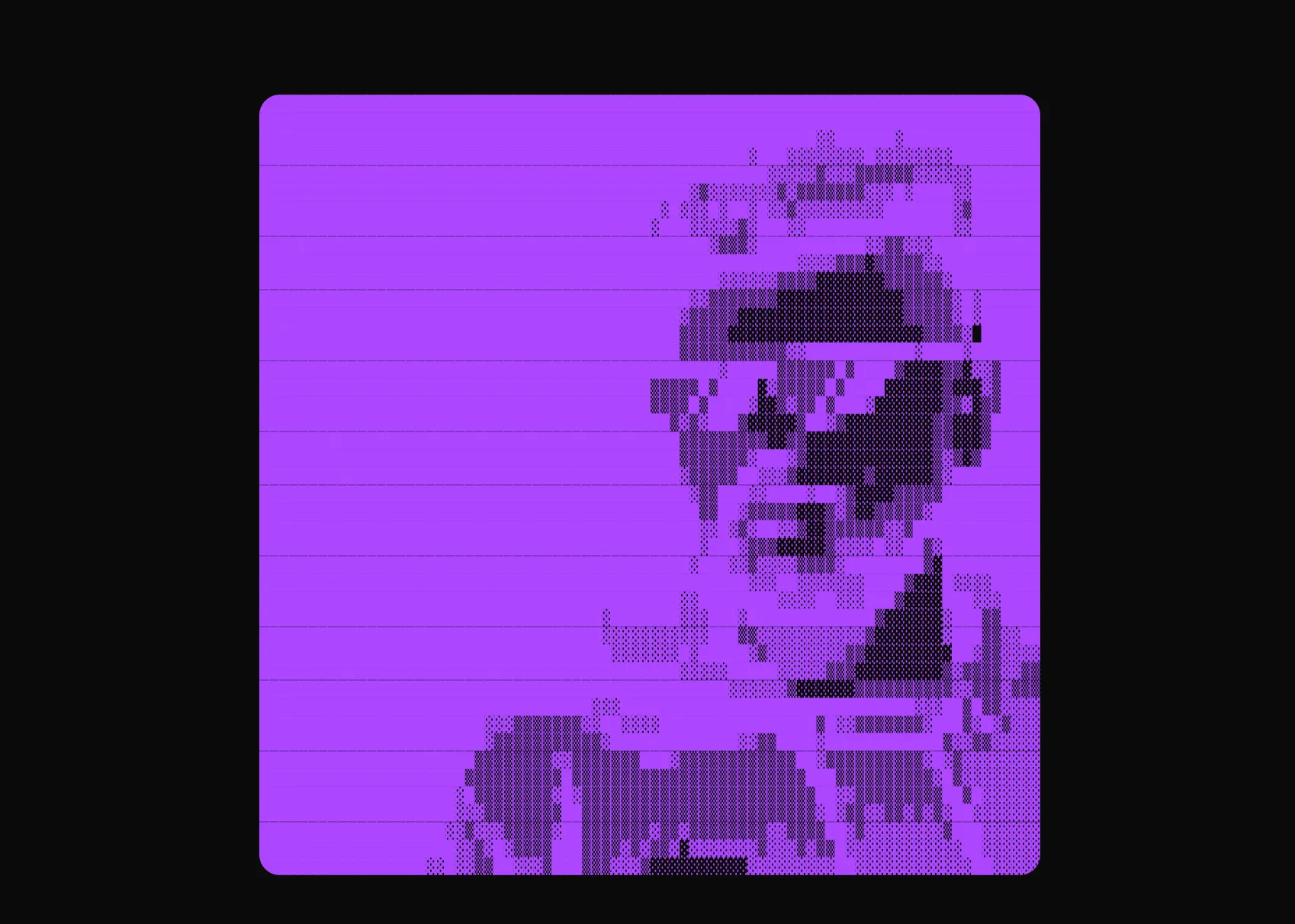
New component drop: ASCII Art - Transform any image into beautiful ASCII art with customizable charsets and animations.
| Prop | Type | Default | Description |
|---|---|---|---|
src | string | - | Source image URL |
resolution | number | 80 | Number of ASCII columns |
charset | string | "standard" | Charset preset or custom characters |
colored | boolean | false | Use original image colors |
animationStyle | "fade" | "typewriter" | "matrix" | "fade" | Animation effect on reveal |
objectFit | "cover" | "contain" | "fill" | "cover" | How image fits the ASCII grid |
Perfect for creative portfolios, retro-themed sites, or anywhere you want a unique visual effect.
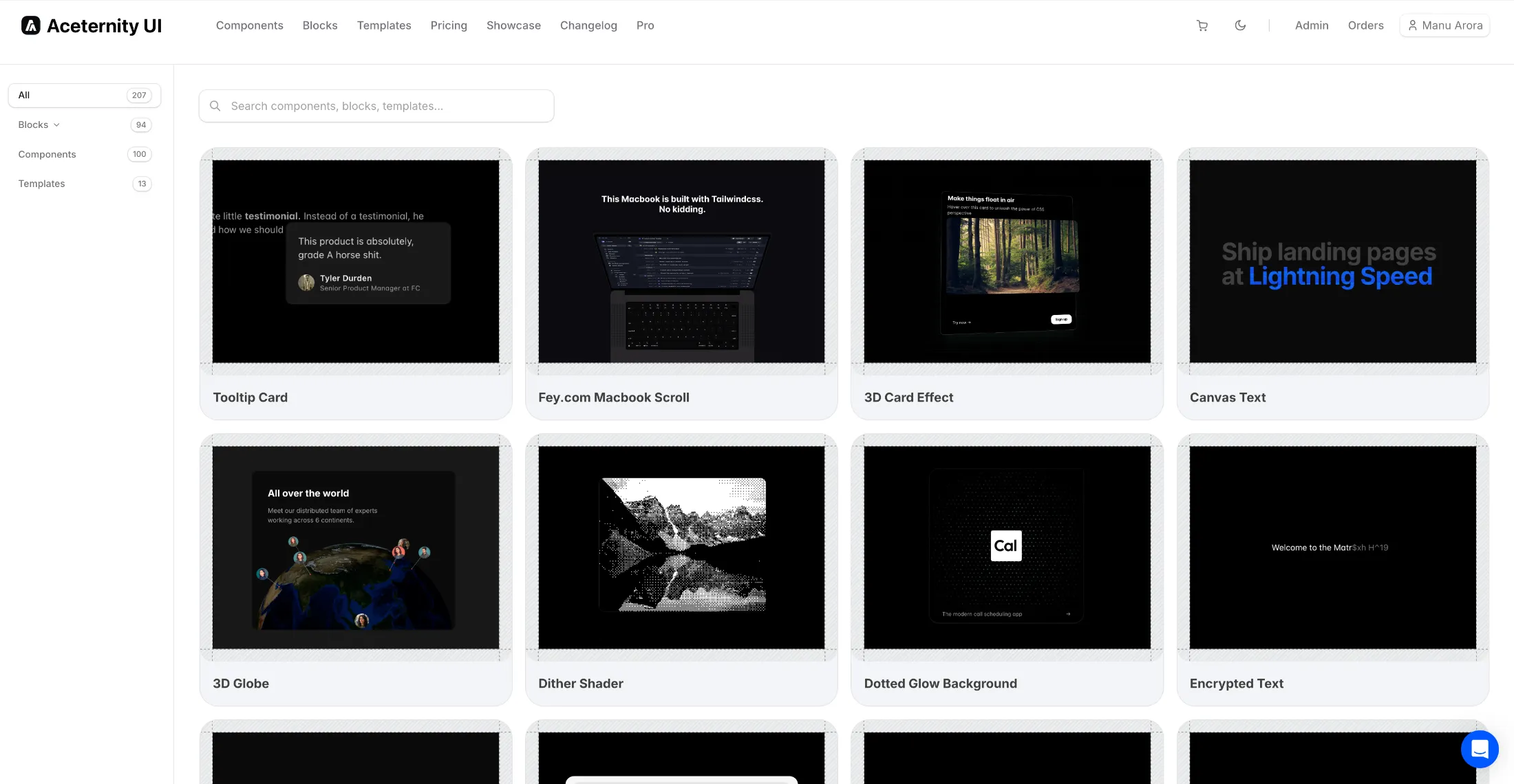
Introducing Explore Mode - a new way to browse and discover components on Aceternity UI.
Explore mode gives you a visual overview of all available components, blocks, and templates in a grid layout. Quickly scan through designs, find inspiration, and jump directly to any component that catches your eye.
Perfect for discovering new components or getting a quick overview of what's available.

New component drop: Canvas Text - An animated text component with colorful curved lines rendered on canvas, clipped to the text shape.
var(--color-blue-500) for colors| Prop | Type | Default | Description |
|---|---|---|---|
text | string | - | The text to display with animated background |
colors | string[] | - | Array of colors for animated lines |
animationDuration | number | 5 | Duration in seconds for one animation cycle |
lineGap | number | 10 | Vertical gap between lines in pixels |
curveIntensity | number | 60 | Intensity of the bezier curve animation |
overlay | boolean | false | Position absolutely for overlay use cases |
Perfect for hero sections, landing pages, or anywhere you want eye-catching animated text effects.
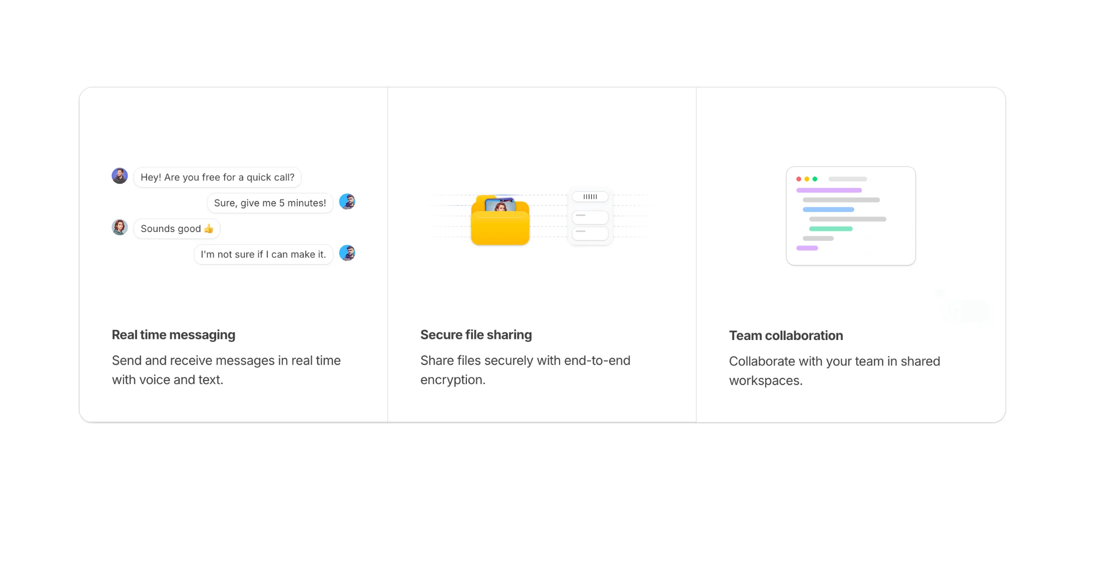
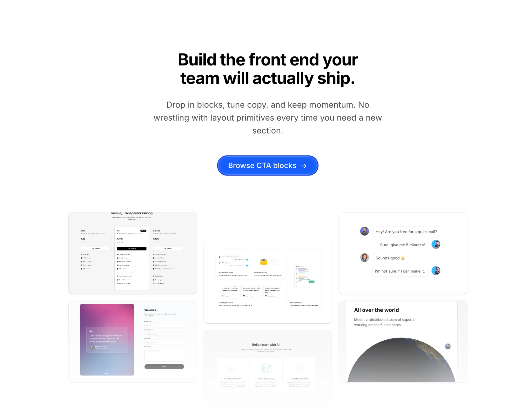
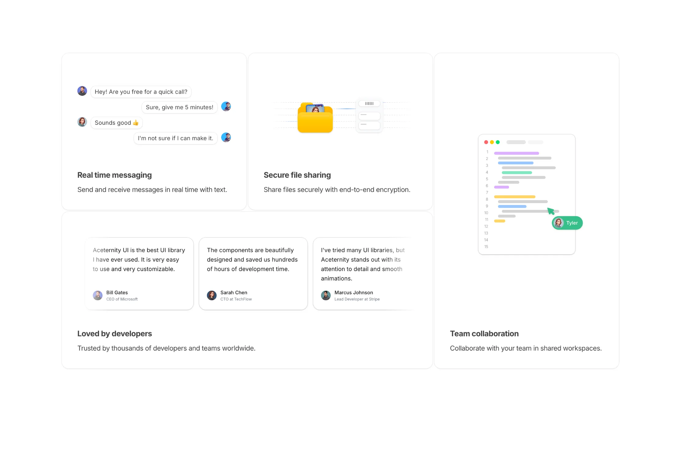
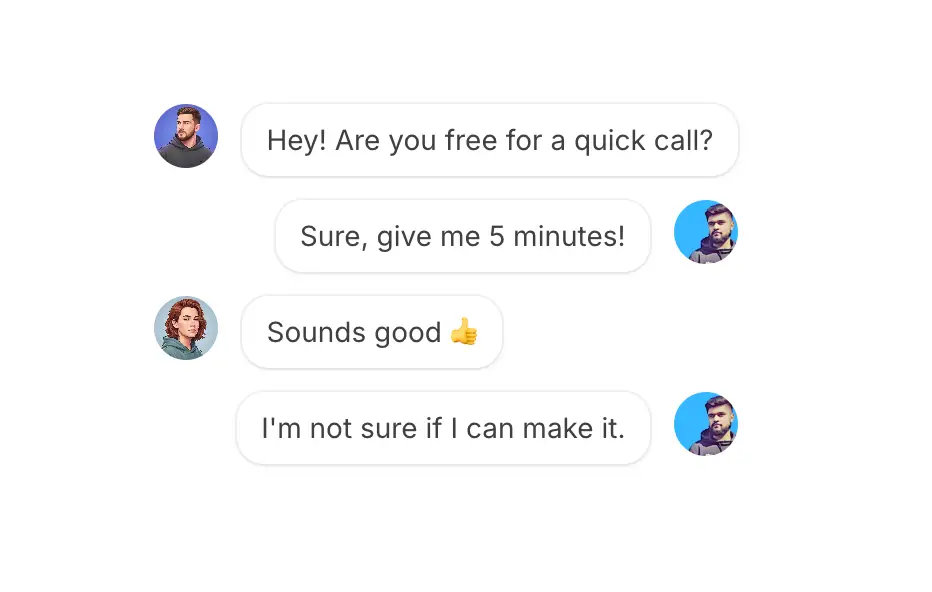
Added a new Features Section With Skeletons block to the feature sections collection.
A three-column features grid with animated skeleton illustrations for each feature. Includes a real-time messaging chat interface, secure file transfer with folder animations, and team collaboration with interactive cursor selections. Full dark mode support.
Introducing a new Illustrations category with four animated blocks for feature sections and landing pages.
Each illustration triggers on scroll using Motion's useInView hook. Full dark mode support included.
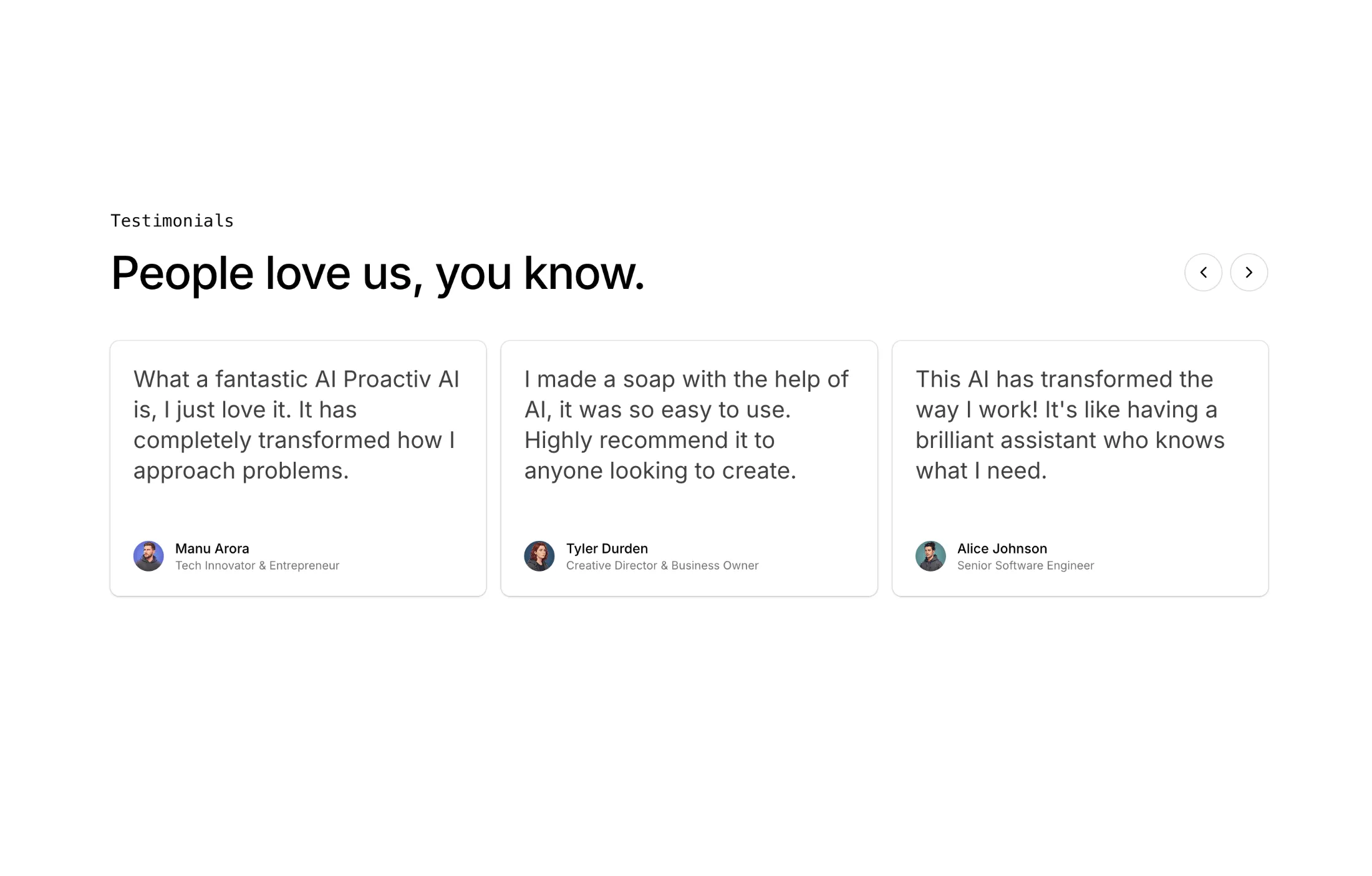
Added a new Testimonials With Carousel block to the testimonials collection.
This block shows three testimonials at a time with smooth animated transitions between pages. It includes previous and next controls, staggered entrance animation for cards, and wrap-around pagination for continuous browsing.
Each card includes quote text, avatar, name, and designation with responsive layout and dark mode support.
Added a new Hero Section with Mesh Gradient to the hero sections collection.
A modern hero section featuring a vibrant mesh gradient background created using multiple overlapping radial gradients positioned at different points. The colors blend smoothly to create a dynamic appearance without any hard edges, with CSS blend modes helping create seamless transitions where colors overlap.
Content is centered using flexbox, with large typography for the headline and lighter weight description text styled in contrasting colors for readability against the colorful background. Includes call-to-action buttons for quick user engagement.
Perfect for SaaS landing pages, creative agency sites, modern app launches, and any project that needs a bold, contemporary first impression.

Added a new Hero Section with Tabs to the hero sections collection.
A modern hero section featuring an interactive tabbed browser window preview. Tabs auto-rotate through different content sections with smooth fade and blur animations, showcasing multiple features or pages in a single component.
The hero includes a bold headline, descriptive subtext, dual CTA buttons, and a social proof section with avatars and star ratings. The browser window features macOS-style traffic light buttons and a scrollable tab bar with dividers. Content images animate in with opacity, translation, and blur effects using Framer Motion.
Perfect for SaaS landing pages, portfolio showcases, feature demonstrations, template galleries, and any product that benefits from showing multiple views in an engaging, interactive format.
Added a new Hero Section with Flickering Lights to the hero sections collection.
A cinematic hero section featuring animated light bulbs arranged on a steel grid that flicker to life in a dramatic staggered sequence. Each bulb transitions through off, flickering, and on states with realistic timing, while random bulbs occasionally fuse with spark particle effects before reigniting.
The component includes a bold headline, description text, and CTA buttons that brighten in sync with the grid illumination. Features a 3D-rotated steel grid with perspective transforms for added depth.
Perfect for industrial product launches, creative agency sites, entertainment platforms, and gaming landing pages.
You can now view components, blocks, and templates in full screen mode. Click the maximize icon in the preview toolbar to open a distraction-free view in a new tab.
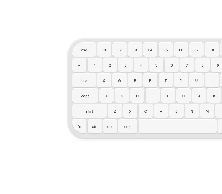
New component drop: Keyboard - A beautiful Mac-style keyboard with mechanical key sound effects and keystroke preview.
| Prop | Type | Default | Description |
|---|---|---|---|
enableSound | boolean | false | Enable mechanical keyboard sound effects |
showPreview | boolean | false | Show keystroke preview animation above keyboard |
Perfect for landing pages, developer portfolios, or anywhere you want to showcase keyboard interactions.
New component drop: Testimonials Background With Drag.
A super simple panning motion effect for testimonials. Showcases thousands (assumption, infact there are just 15 but repeated), yet focuses on one with panning movements.
Added 3 new Hero Sections to the hero sections collection.
These new hero components feature modern designs with stunning visual effects, perfect for creating impactful landing pages and capturing your visitors' attention right from the start.
The latest addition includes an Infinite Scroll Canvas hero section with an interactive draggable canvas featuring scattered image cards, momentum-based scrolling, and a clean center content area - perfect for showcasing portfolios, galleries, or product showcases.
Added a new Shaders collection - a set of reusable shaders for your backgrounds.
Perfect for adding depth and visual interest to your hero sections, landing pages, and backgrounds.
Added a new Webcam Pixel Grid component - a real-time webcam pixel grid effect, perfect for pixel art and retro aesthetics.
Added a new Bento Grid with Skeletons to the bento grids collection.
Added a new Pricing Page with Featured and Enterprise component to the pricing sections collection.
This pricing page is designed to showcase multiple pricing tiers with a focus on highlighting the featured plan. Includes:
Perfect for SaaS products, platforms, and services that need a comprehensive pricing presentation with emphasis on featured offerings.
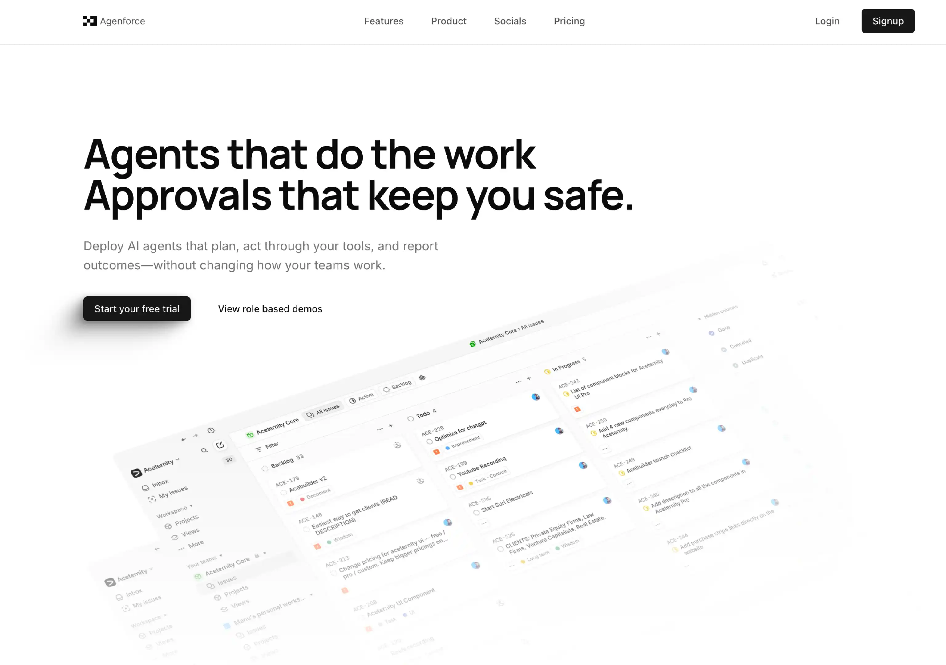
Added the new Agenforce Marketing Template. A marketing template designed for various use cases, including AI Agents, Agency, Chatbots and SaaS. Includes delightful micro-interactions and animations.
Agenforce focuses on delivering a modern, minimal and clean design that is tastefully filled with microinteractions to keep your users engaged.
Loved building this template, took a lot of time to design and develop, micro-interactions and animations are my favourite part of the template.
Perfect for AI agent companies, agencies, chatbot services, and SaaS products looking for a professional and engaging web presence.
Added a new Features Grid with Large Skeletons component to the feature sections collection.
This component showcases a modern 3-column grid layout with interactive skeleton cards that feature:
Perfect for showcasing product features, service capabilities, or workflow processes with an engaging and modern interface that emphasizes visual hierarchy and user interaction.
The component includes three distinct skeleton variations:
Built with Tabler Icons and full TypeScript support for seamless integration into any React application.
Added a new logo cloud component collection with beautiful micro interactions and animations.
These components are perfect for showcasing client logos, partners, or trusted brands with smooth animations and modern design patterns.
Added a new hero section component with parallax images with perspective.
Simple and monochromatic, multipurpose and useful for a lot of use cases.
Added a new hero section component with image and scales.
Useful for a modern hero sections with images that require micro interactions.
Added a new masonry bento grid with images block into the Bento Grids components and registry
Useful for showcasing brands or products.
Added 4 new navbar blocks into the Navbars components and registry
Simple and effective, covers majority of the use cases.
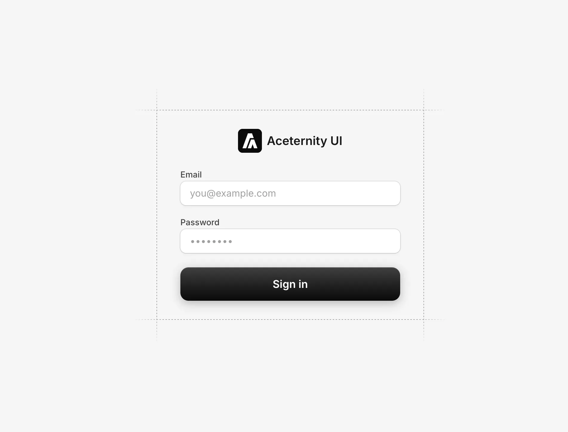
Added a login form component with gradient using WebGL and Motion for React. Perfect for login pages that want to add some flare to the page without actually having to compromise on the form elements.
Today we bring you a page where you can see all the changes and updates to Aceternity UI Pro.
I'll try my best to keep it up to date with the latest changes and updates.
Aceternity UI and Aceternity UI Pro now support ShadCN CLI 3.0.
Which means you can now use ShadCN CLI 3.0 to add components to your project.
npx shadcn@latest add @aceternity-pro [component]
Example:
npx shadcn@latest add @aceternity-pro/bento-grid-example-three
Visit the complete documentation here
If you want to use PRO components with the CLI, generate an API KEY in the dashboard and use it with the cli.
Added the new Nodus Marketing Template. Filled with amazing micro-interactions and animations.
Nodus focuses on bringing out the best part of your product in a minimal and concise manner.
Some of the key features are:
Added the new minimal portfolio template and bento grids components.
Now you can view any component in full screen mode. Click on the full screen button in the component preview to view it in full screen mode.
Improved website speed and User Experience. It is now faster and easier to use.
Added the first public release with core components and templates. Including 30+ blocks and 7+ templates
ceternity UI
Access an ever-growing collection of premium, meticulously crafted templates and Component Blocks.
© 2026 Aceternity Labs LLC. All Rights Reserved.