Simple Sidebar With Hover
A sidebar that expands on hover to reveal link labels. Shows only icons when collapsed, full labels when hovered or active.

The sidebar starts in a narrow state showing only icons. When users hover over it, it expands smoothly to reveal link labels using Framer Motion width animations. The expansion is controlled by mouse enter/leave events.
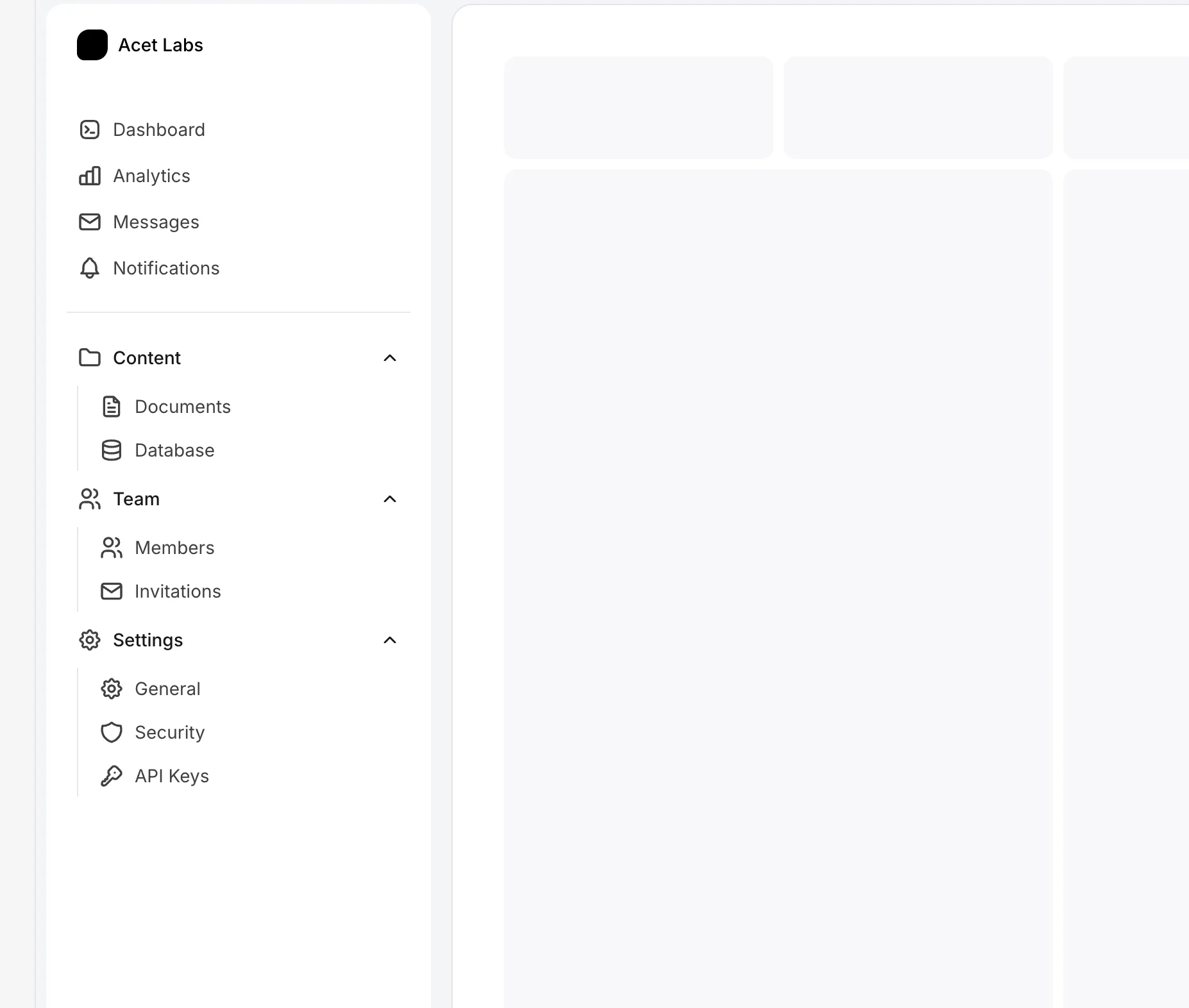
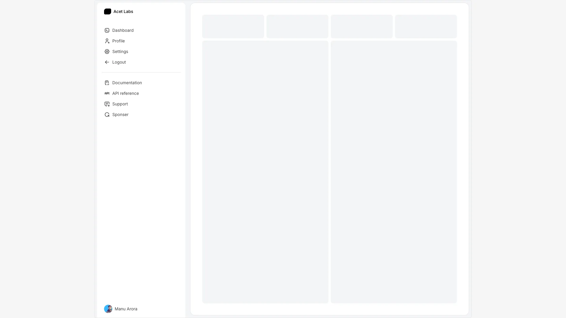
Links are organized into primary and secondary groups. Each link displays an icon and label, with the label visibility tied to the sidebar's open state. A user profile section sits at the bottom.
On mobile, a hamburger menu opens a full-screen overlay with the navigation links. AnimatePresence handles the mobile menu's enter/exit animations with height and opacity transitions.
Works well for dashboards, admin panels, documentation sites, or any application where screen space is valuable but users still need access to navigation.
More from Sidebars
Included with All-Access
One payment unlocks the code for this block and every other block, template and page.
Get All-AccessAbout this block
The sidebar starts in a narrow state showing only icons. When users hover over it, it expands smoothly to reveal link labels using Framer Motion width animations. The expansion is controlled by mouse enter/leave events.
Links are organized into primary and secondary groups. Each link displays an icon and label, with the label visibility tied to the sidebar's open state. A user profile section sits at the bottom.
On mobile, a hamburger menu opens a full-screen overlay with the navigation links. AnimatePresence handles the mobile menu's enter/exit animations with height and opacity transitions.
Works well for dashboards, admin panels, documentation sites, or any application where screen space is valuable but users still need access to navigation.