Footer With Grid
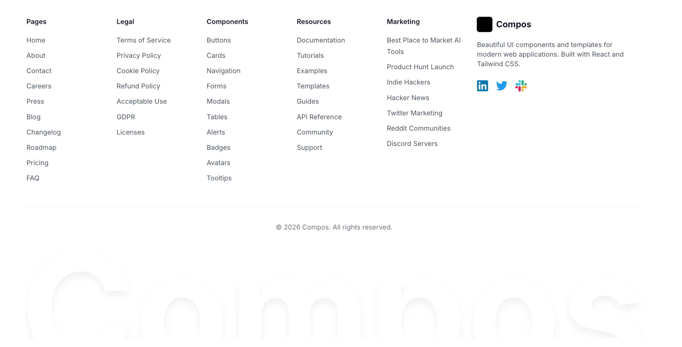
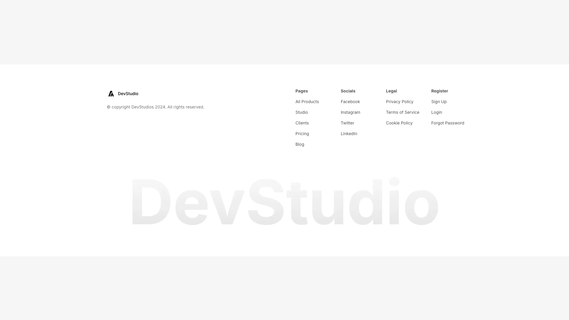
A comprehensive footer with logo section, four-column link grid, newsletter signup, and social icons. Built for sites with extensive navigation needs.


Access an ever-growing collection of premium, meticulously crafted templates and Component Blocks. Built by the founders of Aceternity UI.
- Components
- Hero Sections
- Logo Clouds
- Bento Grids
- CTA Sections
- Testimonials
- Team Sections
- Empty States
- Feature Sections
- Pricing Sections
- Cards
- Navbars
- Footers
- Login and Signup
- Contact sections
- Blog Sections
- Blog Content Sections
- FAQs
- Sidebars
- Stats Sections
- Templates
- Startup Landing Page Template
- AI SaaS Template
- Proactiv Marketing Template
- Agenlabs Agency Template
- DevPro Portfolio Template
- Foxtrot Marketing Template
© 2026 Aceternity Labs LLC. All Rights Reserved.
The top section includes the logo, a multi-line description, and "A product by" and "Building in public at" attribution links. A horizontal border separates this from the four-column link grid below.
Link columns have bold category headers (Components, Templates, Pages) followed by lists of individual links. Each link has a hover state that transitions text color. The columns are defined as arrays for easy content management.
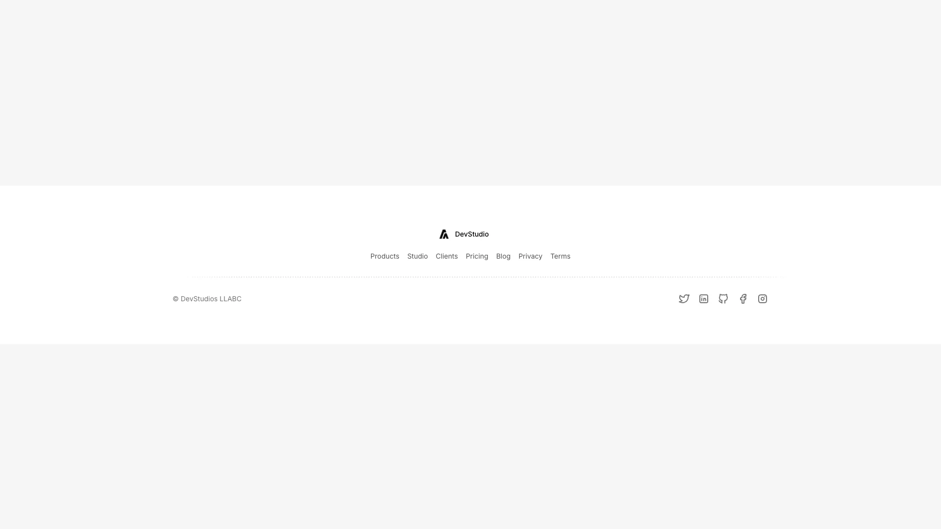
The bottom section includes copyright text, social media icons, and a "Made with love" attribution. Social icons include Twitter, Instagram, GitHub, and LinkedIn. The entire footer uses a gray-50 background in light mode and neutral-800 in dark mode.
Ideal for documentation sites, component libraries, SaaS products, or any site with multiple product categories and extensive linking needs.
Included with All-Access
One payment unlocks the code for this block and every other block, template and page.
Get All-AccessExplore more
About this block
The top section includes the logo, a multi-line description, and "A product by" and "Building in public at" attribution links. A horizontal border separates this from the four-column link grid below.
Link columns have bold category headers (Components, Templates, Pages) followed by lists of individual links. Each link has a hover state that transitions text color. The columns are defined as arrays for easy content management.
The bottom section includes copyright text, social media icons, and a "Made with love" attribution. Social icons include Twitter, Instagram, GitHub, and LinkedIn. The entire footer uses a gray-50 background in light mode and neutral-800 in dark mode.
Ideal for documentation sites, component libraries, SaaS products, or any site with multiple product categories and extensive linking needs.