Navbar Pill
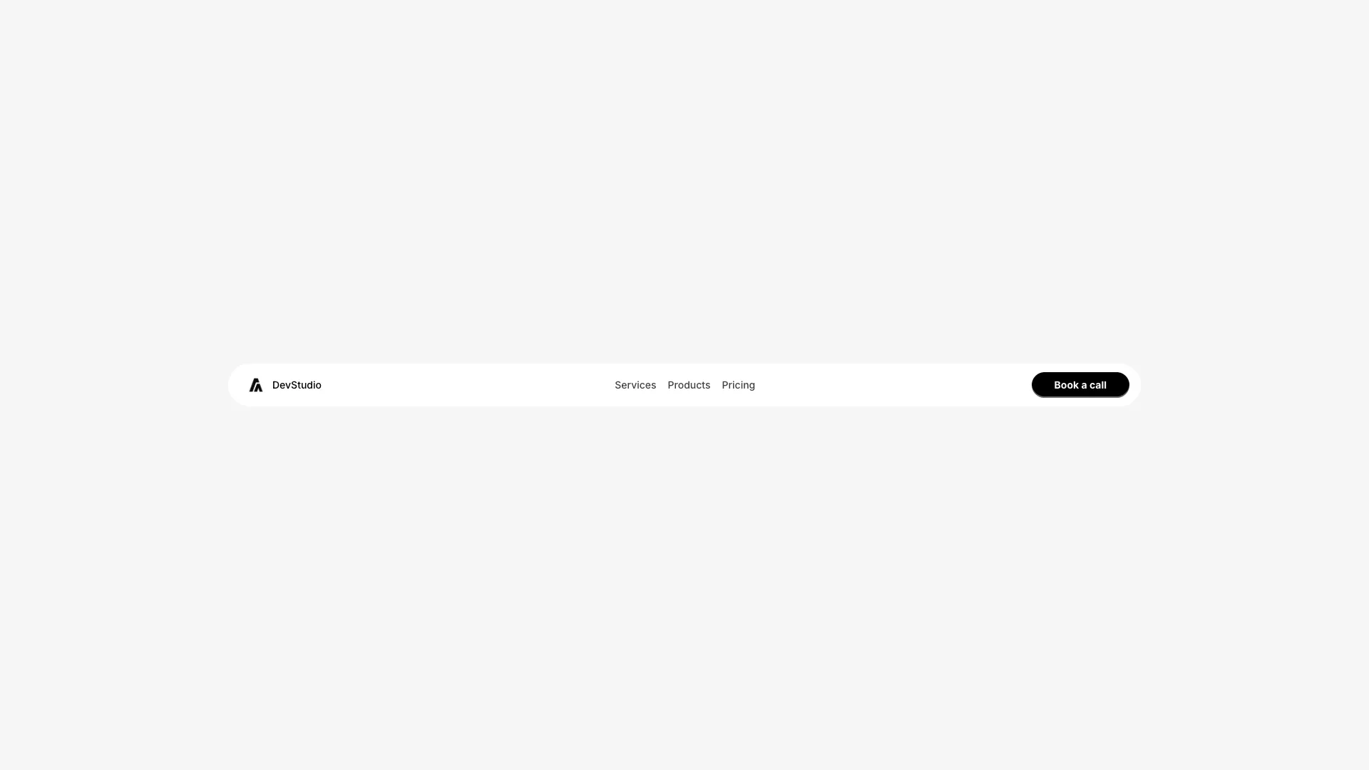
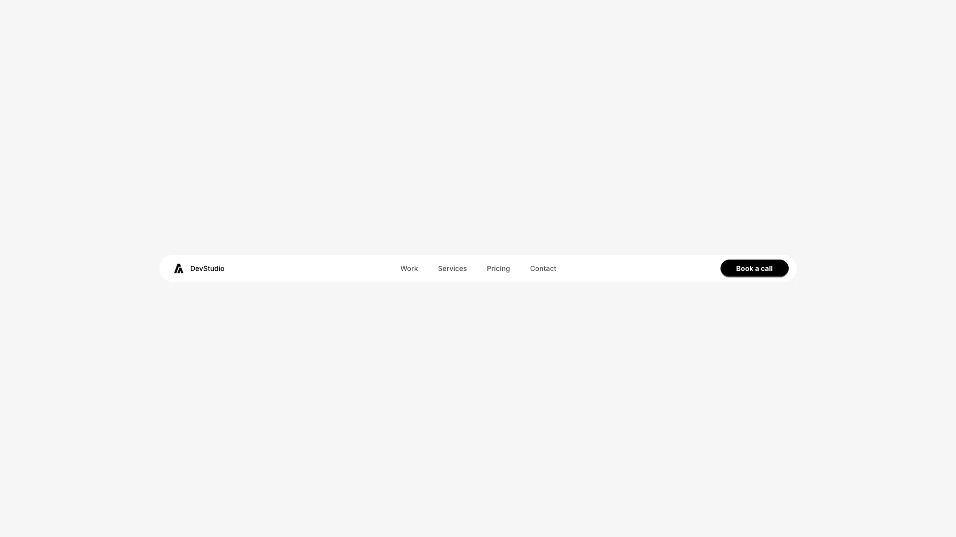
A navigation bar with pill-style tabs that highlight the active link. The centered nav sits inside a rounded container with backdrop blur.
The navigation links sit inside a rounded pill container with a semi-transparent background and backdrop blur. Clicking a link updates the active state, which applies a solid black (or white in dark mode) background to that item.
Active state is managed with useState. The clicked item gets contrasting text color and a solid background, while other items remain transparent with hover states. Transitions are smooth with whileHover and whileTap effects.
The logo sits on the left, the pill navigation centers, and a CTA button positions on the right. The layout uses flexbox with gap spacing for consistent alignment.
The mobile version shows a hamburger menu with vertical link layout. Works well for dashboards, admin panels, app interfaces, or any site with a limited number of primary navigation items.
More from Navbars
Included with All-Access
One payment unlocks the code for this block and every other block, template and page.
Get All-AccessAbout this block
The navigation links sit inside a rounded pill container with a semi-transparent background and backdrop blur. Clicking a link updates the active state, which applies a solid black (or white in dark mode) background to that item.
Active state is managed with useState. The clicked item gets contrasting text color and a solid background, while other items remain transparent with hover states. Transitions are smooth with whileHover and whileTap effects.
The logo sits on the left, the pill navigation centers, and a CTA button positions on the right. The layout uses flexbox with gap spacing for consistent alignment.
The mobile version shows a hamburger menu with vertical link layout. Works well for dashboards, admin panels, app interfaces, or any site with a limited number of primary navigation items.