Navbar Underline
A navigation bar with underline indicators for active and hover states. A thin line appears below the selected link.
Each nav link has an absolutely positioned span at the bottom that serves as the underline indicator. When a link is active, this span becomes visible with a solid color. Inactive links have transparent underlines.
The underline uses CSS transitions for smooth show/hide. Links also have subtle vertical hover animations with whileHover moving them slightly up. Text color changes on hover from muted to full contrast.
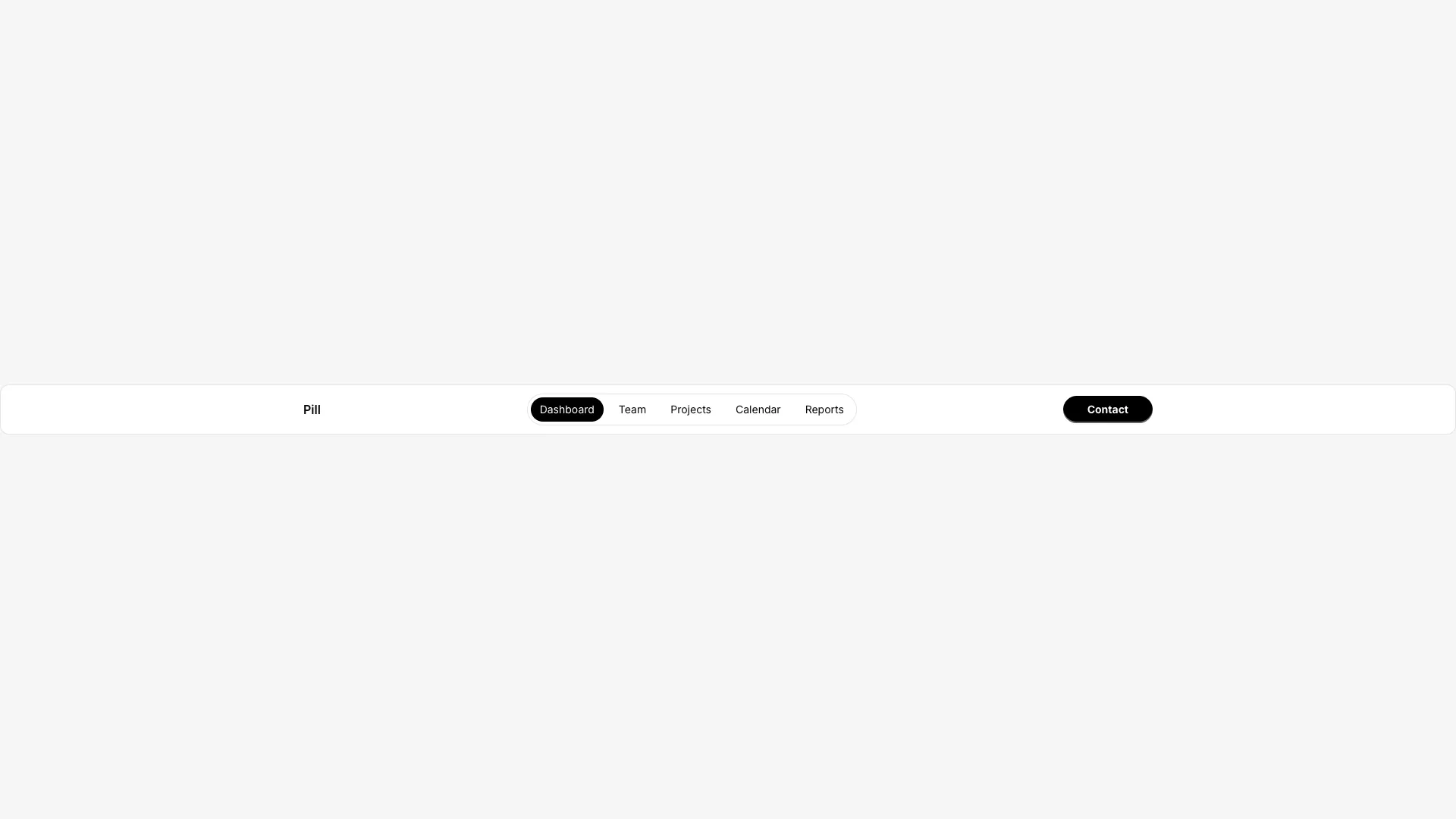
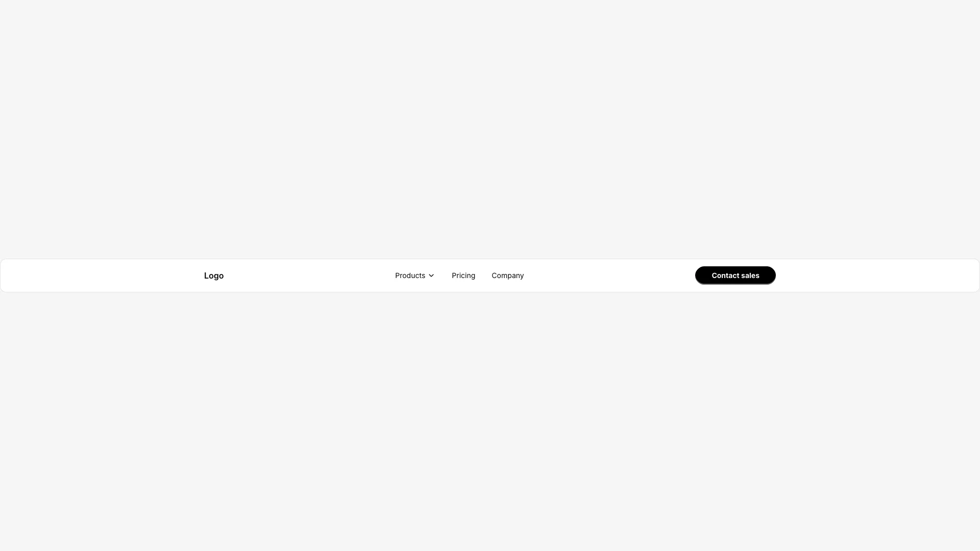
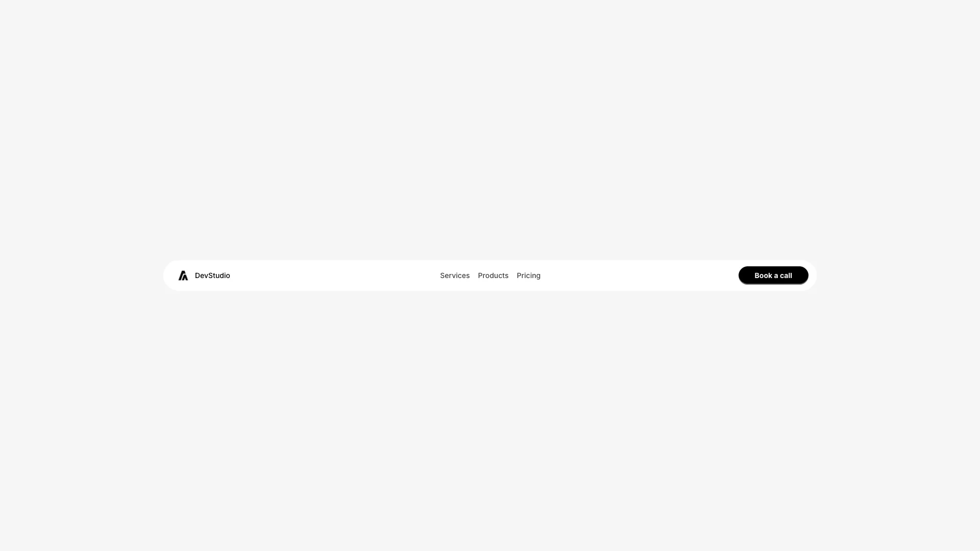
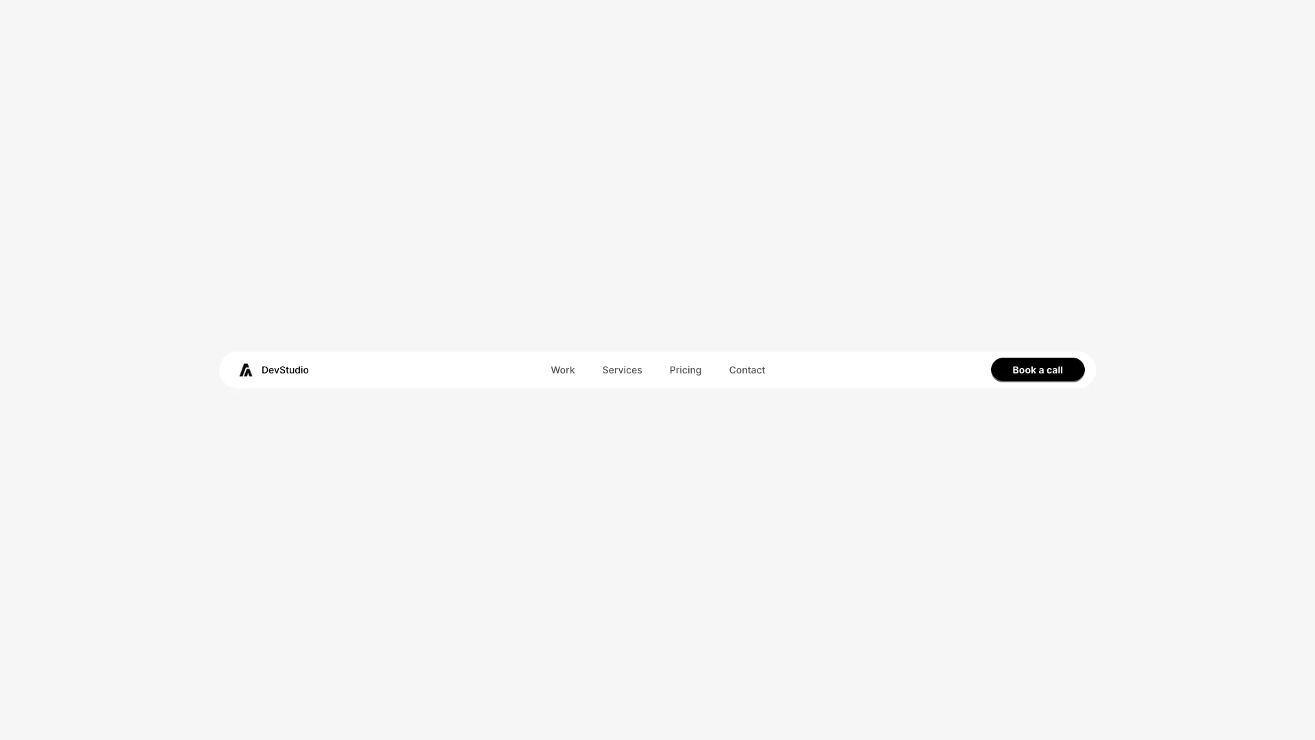
The layout follows a standard structure with logo left, nav center, and CTA right. The header has a card background with rounded corners and border.
The mobile version uses a hamburger menu with vertical link layout. Works well for minimal designs, portfolio sites, or anywhere you want a subtle but clear indication of current location.
More from Navbars


Included with All-Access
One payment unlocks the code for this block and every other block, template and page.
Get All-AccessAbout this block
Each nav link has an absolutely positioned span at the bottom that serves as the underline indicator. When a link is active, this span becomes visible with a solid color. Inactive links have transparent underlines.
The underline uses CSS transitions for smooth show/hide. Links also have subtle vertical hover animations with whileHover moving them slightly up. Text color changes on hover from muted to full contrast.
The layout follows a standard structure with logo left, nav center, and CTA right. The header has a card background with rounded corners and border.
The mobile version uses a hamburger menu with vertical link layout. Works well for minimal designs, portfolio sites, or anywhere you want a subtle but clear indication of current location.