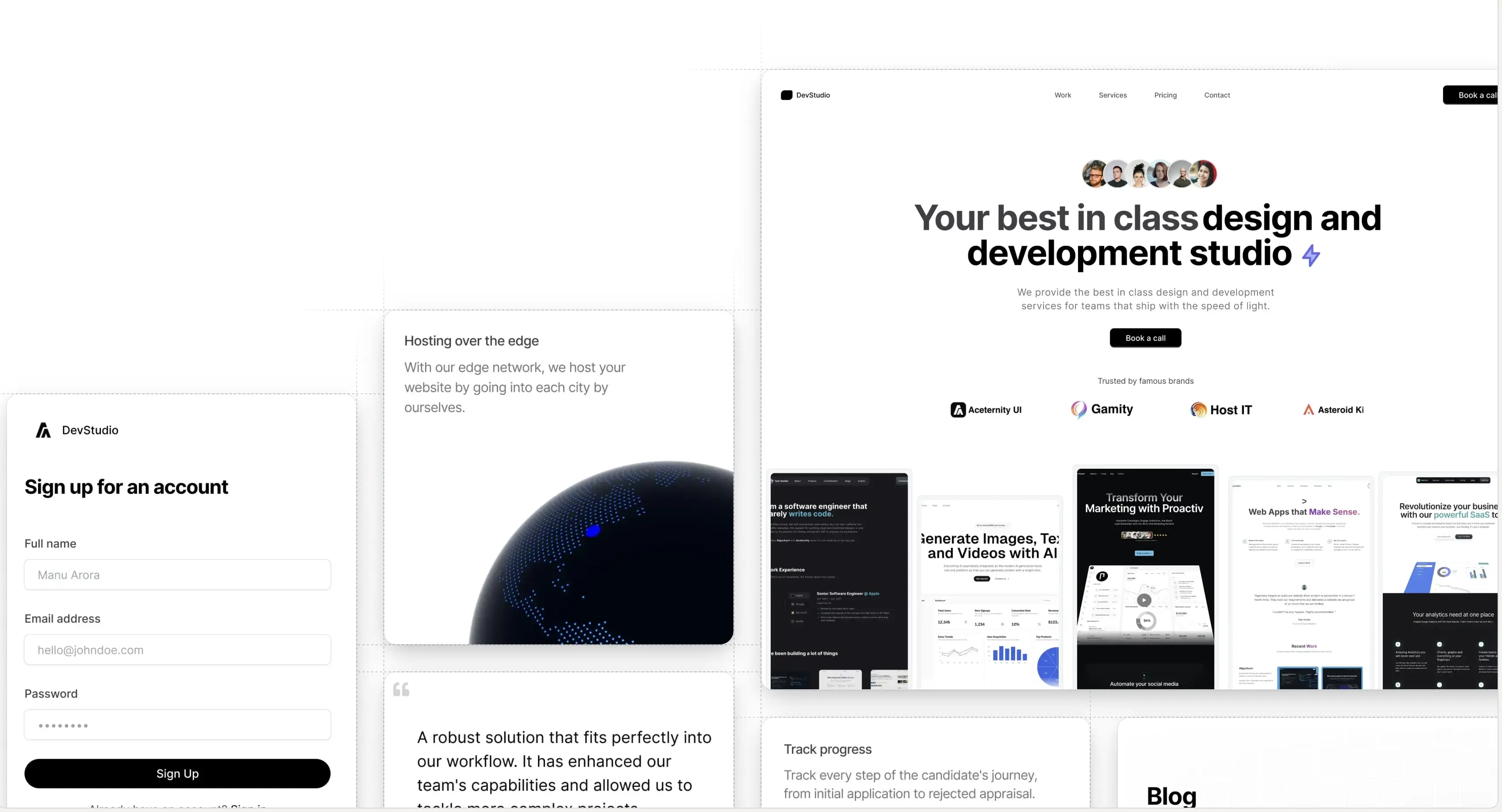
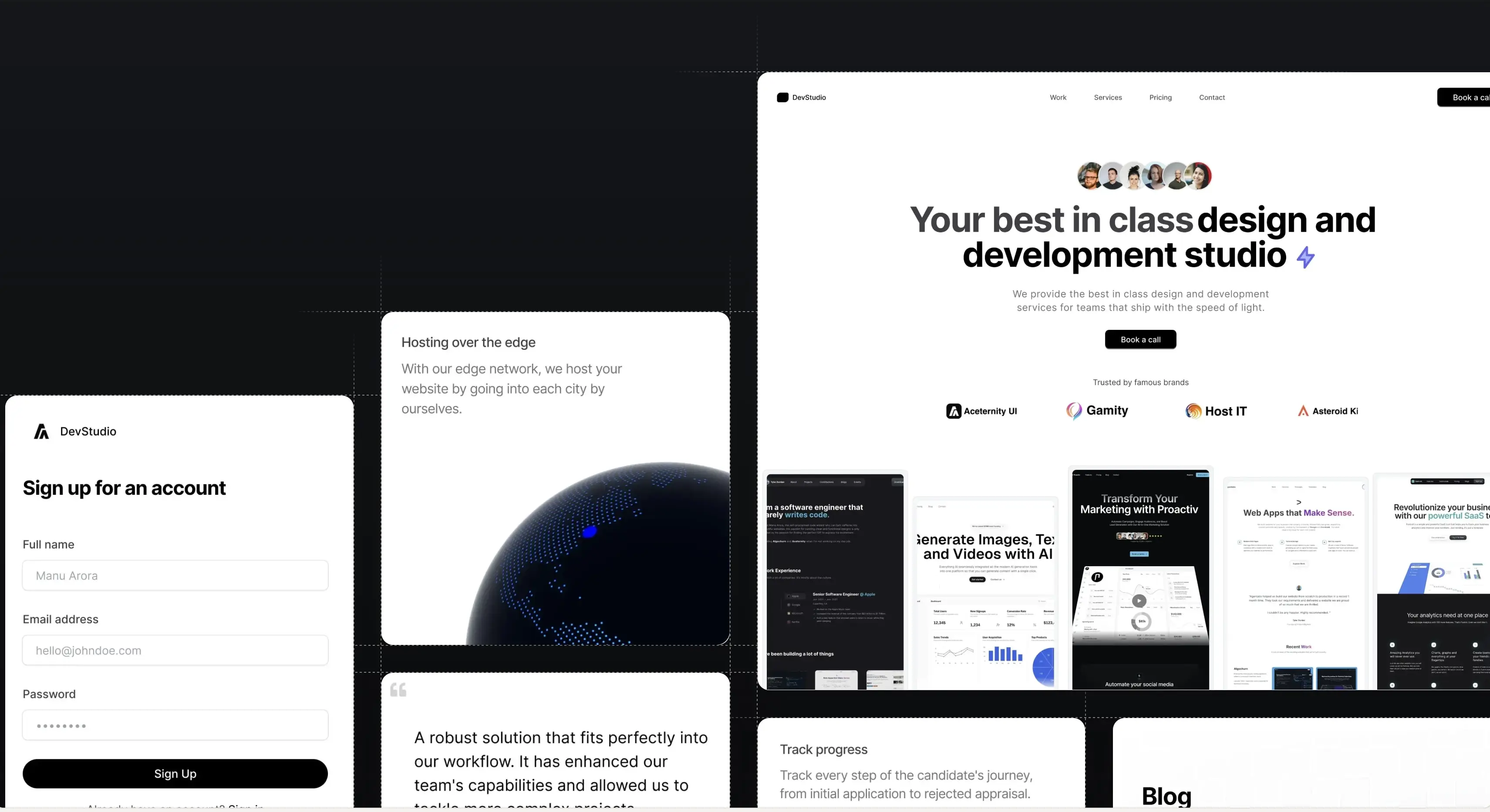
CTA With Masonry Images
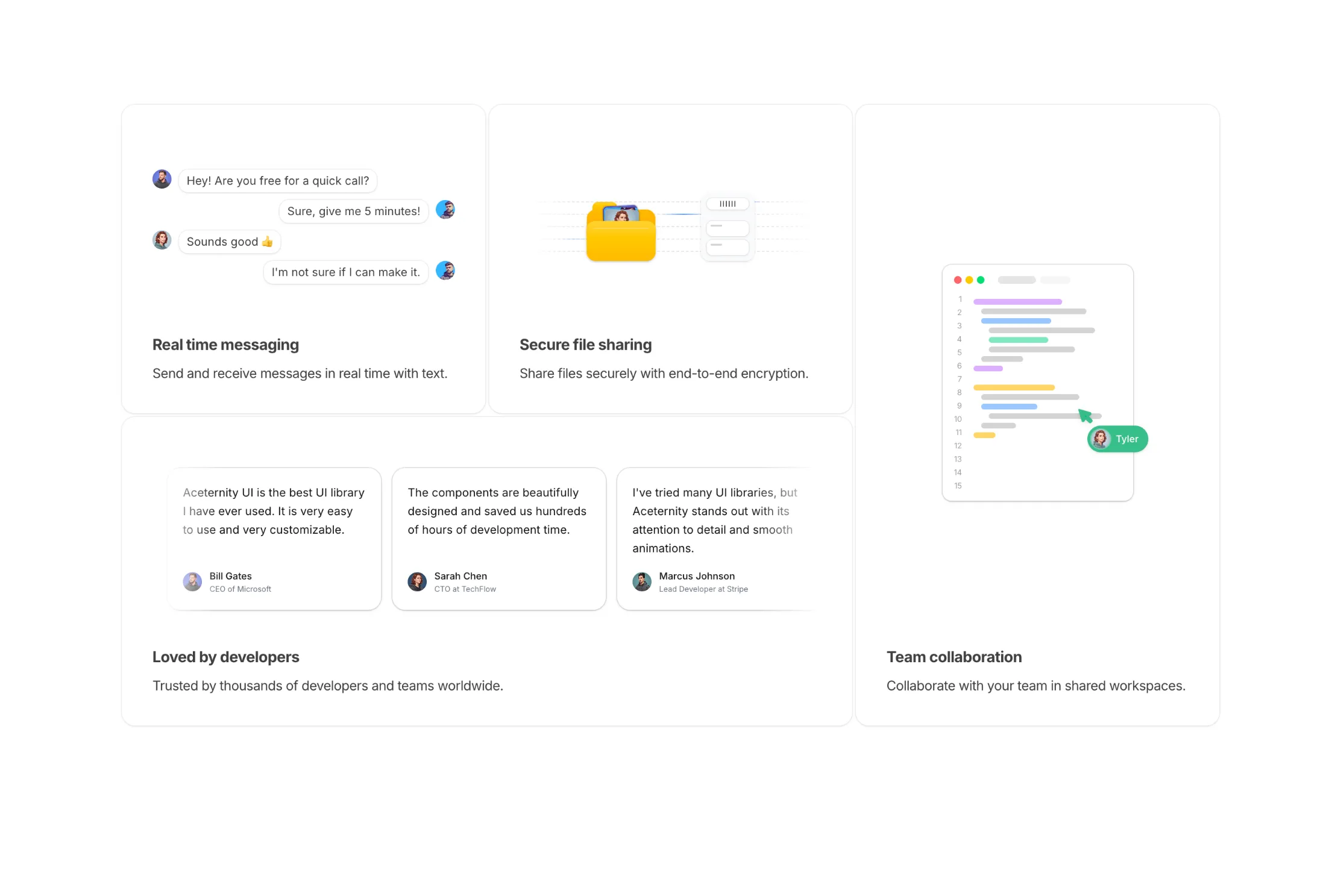


This layout uses a clean two-column CTA composition. The left side includes a strong heading, supporting copy, and a primary button, while the right side presents a rectangular two-column masonry image arrangement to add visual depth.
The image cards use subtle borders and shadows (shadow-sm shadow-black/10 ring-1 ring-black/5) to stay lightweight but defined. The container uses directional fading so the gallery blends naturally into the section edges without any motion.
Works well for SaaS product launches, premium feature announcements, and conversion-focused landing sections where visual examples strengthen the CTA.
Part of CTA Sections · All blocks
Build websites faster and 10x better than your competitors with
Aceternity UI Pro
Next.js 15, Tailwind CSS v4 and Motion for react powered templates
200+ templates and blocks combined
Ready to copy paste component blocks, save days of development time