Features Section With Hover Effects
An eight-card feature grid with icons and animated hover states. A vertical accent bar and gradient overlay appear on hover.
Built for engineers, developers, dreamers, thinkers and doers.
It's as easy as using an Apple, and as expensive as buying one.
Our prices are best in the market. No cap, no lock, no credit card required.
We just cannot be taken down by anyone.
You can simply share passwords instead of buying new seats
We are available a 100% of the time. Atleast our AI Agents are.
If you donot like EveryAI, we will convince you to like us.
I just ran out of copy ideas. Accept my sincere apologies
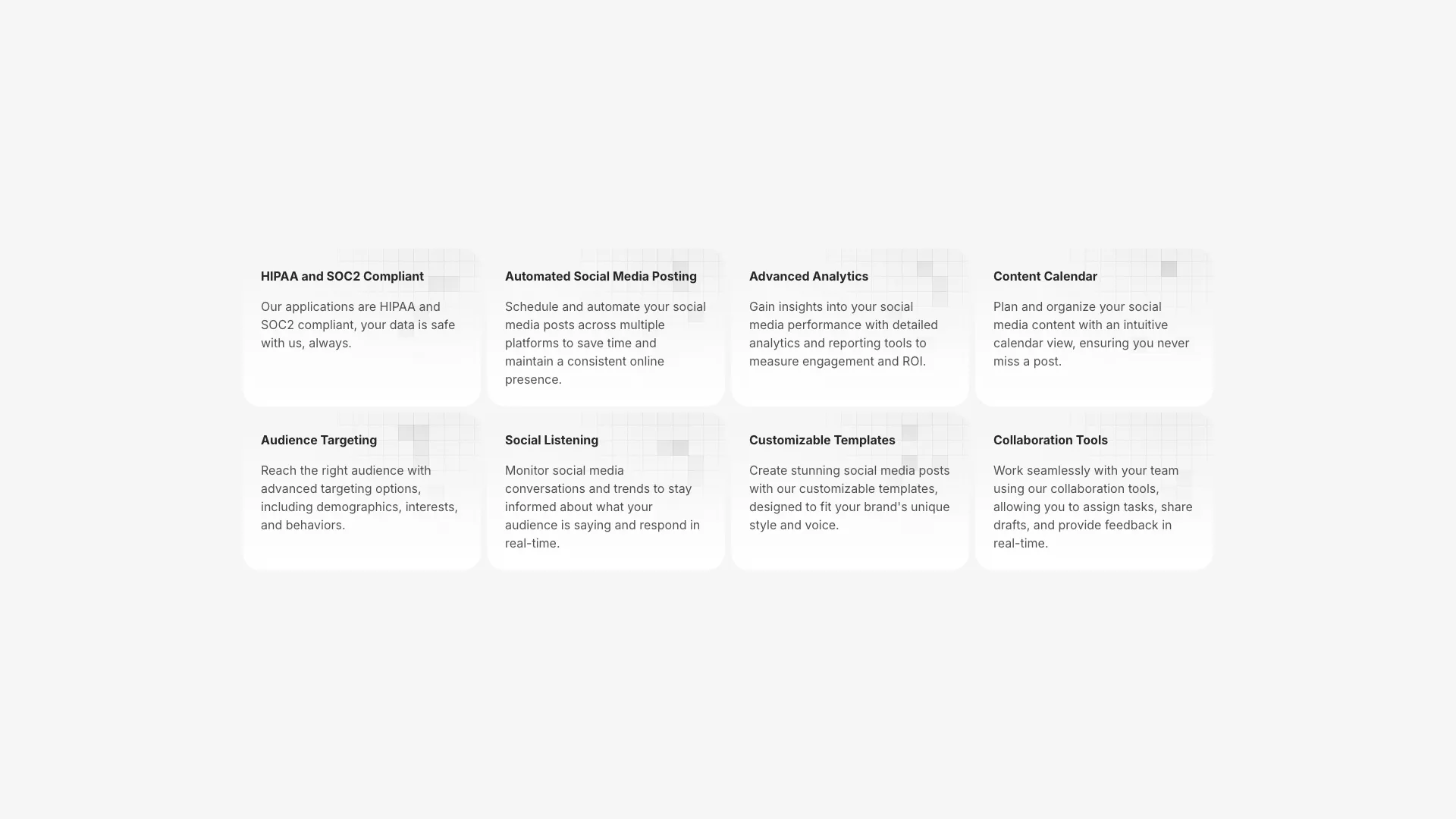
Cards are arranged in a 4-column grid on large screens with border lines between them. The top row has bottom borders, and all cards have right borders except the last in each row. This creates a connected grid appearance.
On hover, a gradient overlay fades in from bottom (for top row cards) or from top (for bottom row cards). A vertical accent bar on the left edge grows from 6 to 8 pixels in height and changes color from neutral to blue.
Each card includes a Tabler icon at the top, followed by a bold title that shifts right on hover, and a description below. The transition duration is 200ms for smooth feedback.
Good for SaaS product pages, developer tool landing pages, or any section where you want to highlight key features with subtle interactivity.
More from Feature Sections
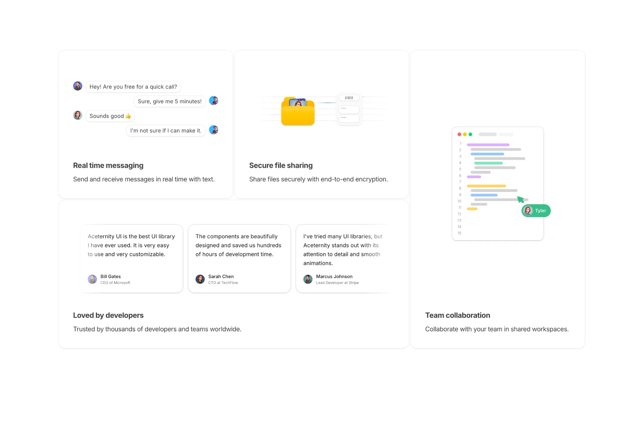
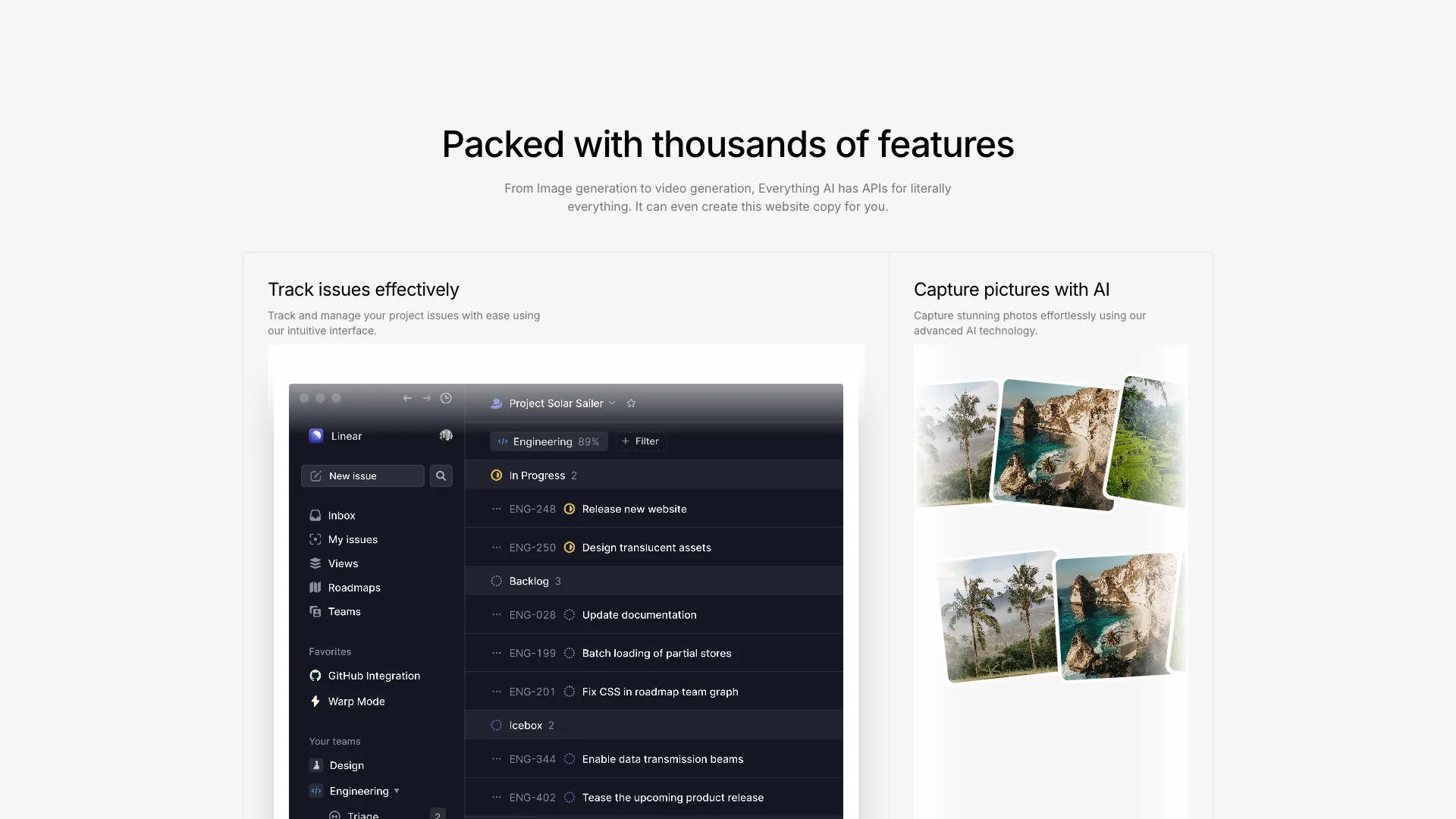
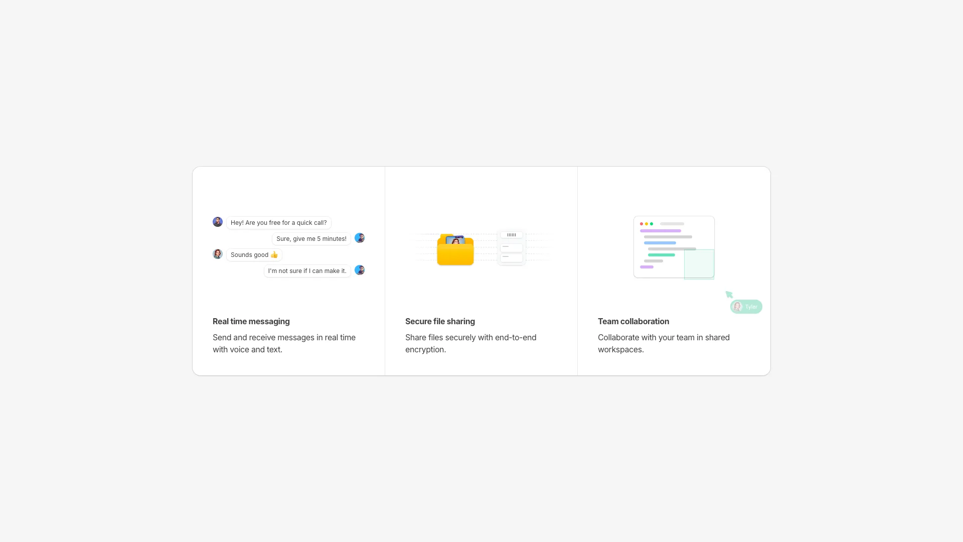
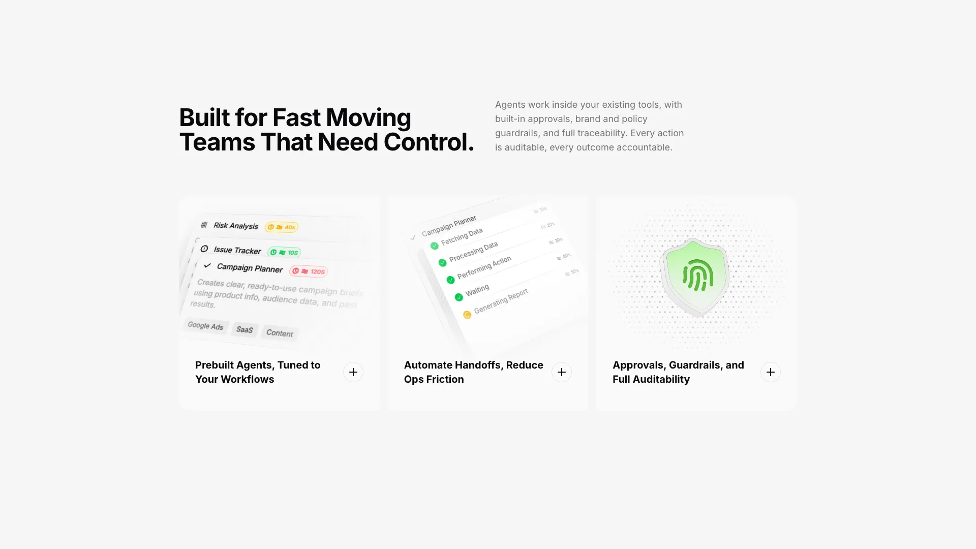
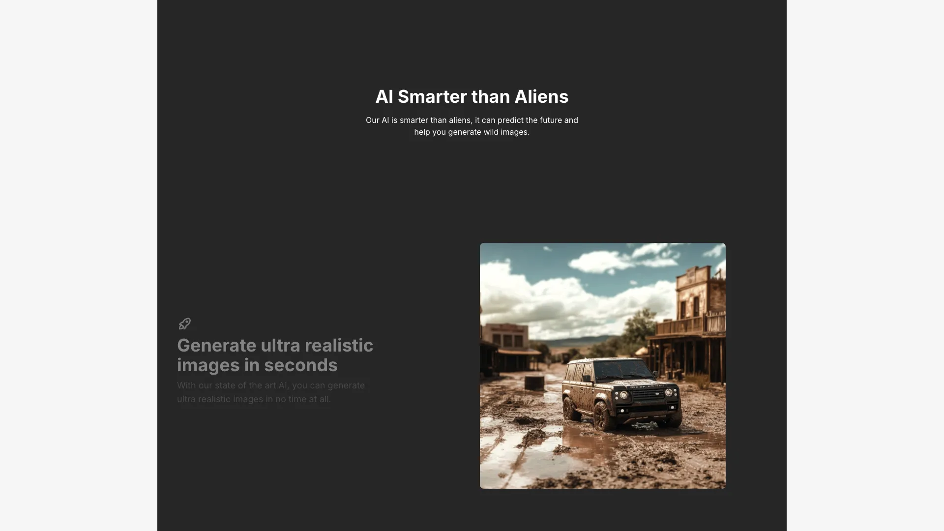
Included with All-Access
One payment unlocks the code for this block and every other block, template and page.
Get All-AccessExplore more
About this block
Cards are arranged in a 4-column grid on large screens with border lines between them. The top row has bottom borders, and all cards have right borders except the last in each row. This creates a connected grid appearance.
On hover, a gradient overlay fades in from bottom (for top row cards) or from top (for bottom row cards). A vertical accent bar on the left edge grows from 6 to 8 pixels in height and changes color from neutral to blue.
Each card includes a Tabler icon at the top, followed by a bold title that shifts right on hover, and a description below. The transition duration is 200ms for smooth feedback.
Good for SaaS product pages, developer tool landing pages, or any section where you want to highlight key features with subtle interactivity.