Blog With Categories
A changelog-friendly blog layout: three large featured posts with category, excerpt, and author row, plus a tighter four-column grid for the rest.
Blog & Changelog
Latest news and updates from AnthopenAI Team
AI
Revolutionizing Documentation with GPT-5
Discover how the introduction of GPT-5 enables dynamic, context-aware technical documentation with real-time code samples and instant Q&A for developers.

Jules Winnfield +1
June 2, 2026
Design
Design Trends for Web Apps in 2026
A look at the newest UI patterns that are shaping highly interactive and accessible web applications, with practical implementation examples.

Samantha Carter
April 14, 2026
Frontend
Edge Computing: Scaling React at the Edge
Explore practical strategies to optimize and deploy React applications using edge networks, ensuring lightning-fast UX worldwide.

Tyler Durden +1
March 28, 2026
More posts

CSS
Advanced Animation in CSS: Fluid and Natural Patterns
Feb 17, 2026
Backend
Serverless Functions: Real-World Use-Cases
Jan 21, 2026
AI
Enhancing UX with AI Personalization
Dec 11, 2025
Performance
Optimizing Mobile Performance with Modern Tooling
Nov 15, 2025

Open Source
Open Source in 2026: Collaboration at Scale
Oct 23, 2025
Design
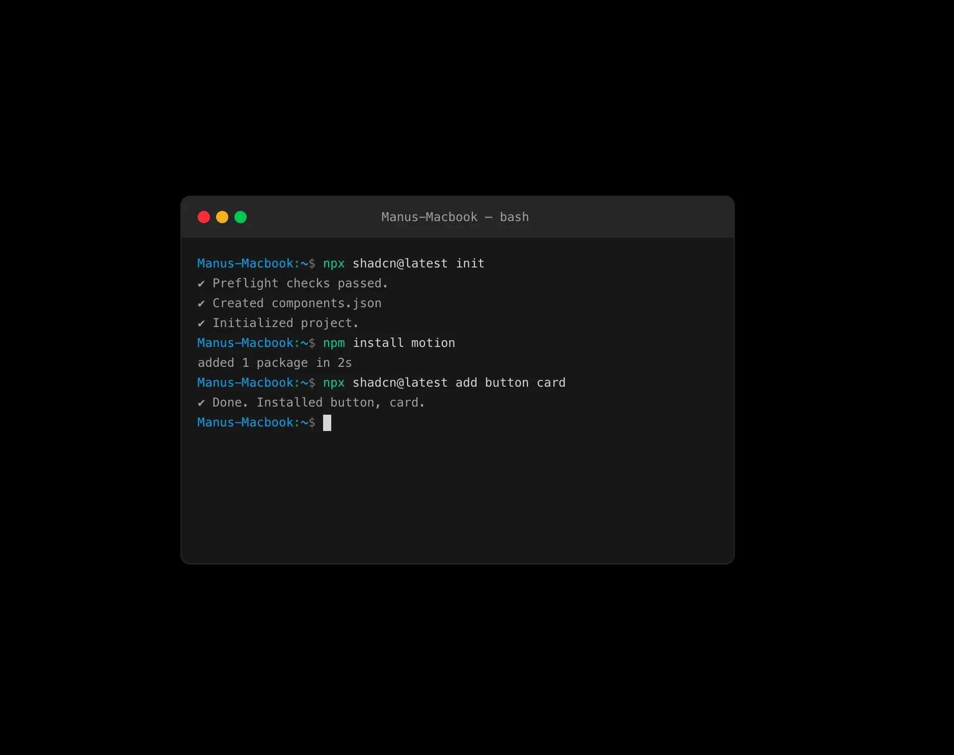
From Sketch to Production: Figma Plugins You Need
Sep 14, 2025
Testing
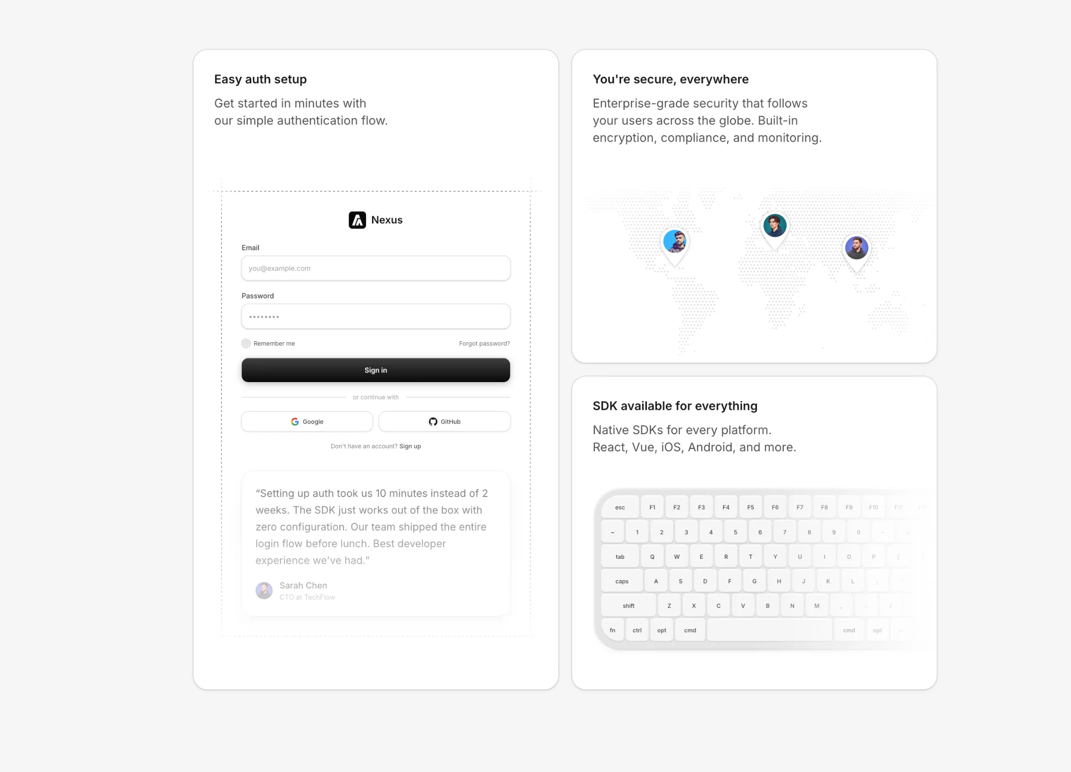
Zero-Config Testing: Simplify Developer Experience
Aug 30, 2025
DevOps
Build Once, Deploy Everywhere: Cross-Platform Stacks in 2026
Jul 18, 2025
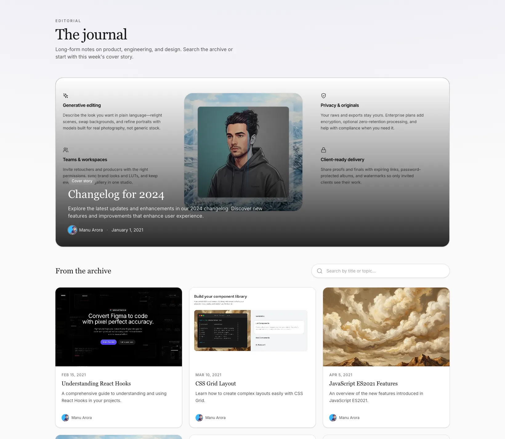
The top row highlights three posts at full detail: image, category pill, title, two-line summary, and a footer with author and date. Everything after that drops into a four-column grid with less chrome—category, title, and date only—so the first row stays the focus.
Works well for product blogs and changelogs where you want readers to see what matters first and skim the backlog underneath without another pattern.
More from Blog Sections
Included with All-Access
One payment unlocks the code for this block and every other block, template and page.
Get All-AccessExplore more
About this block
The top row highlights three posts at full detail: image, category pill, title, two-line summary, and a footer with author and date. Everything after that drops into a four-column grid with less chrome—category, title, and date only—so the first row stays the focus.
Works well for product blogs and changelogs where you want readers to see what matters first and skim the backlog underneath without another pattern.