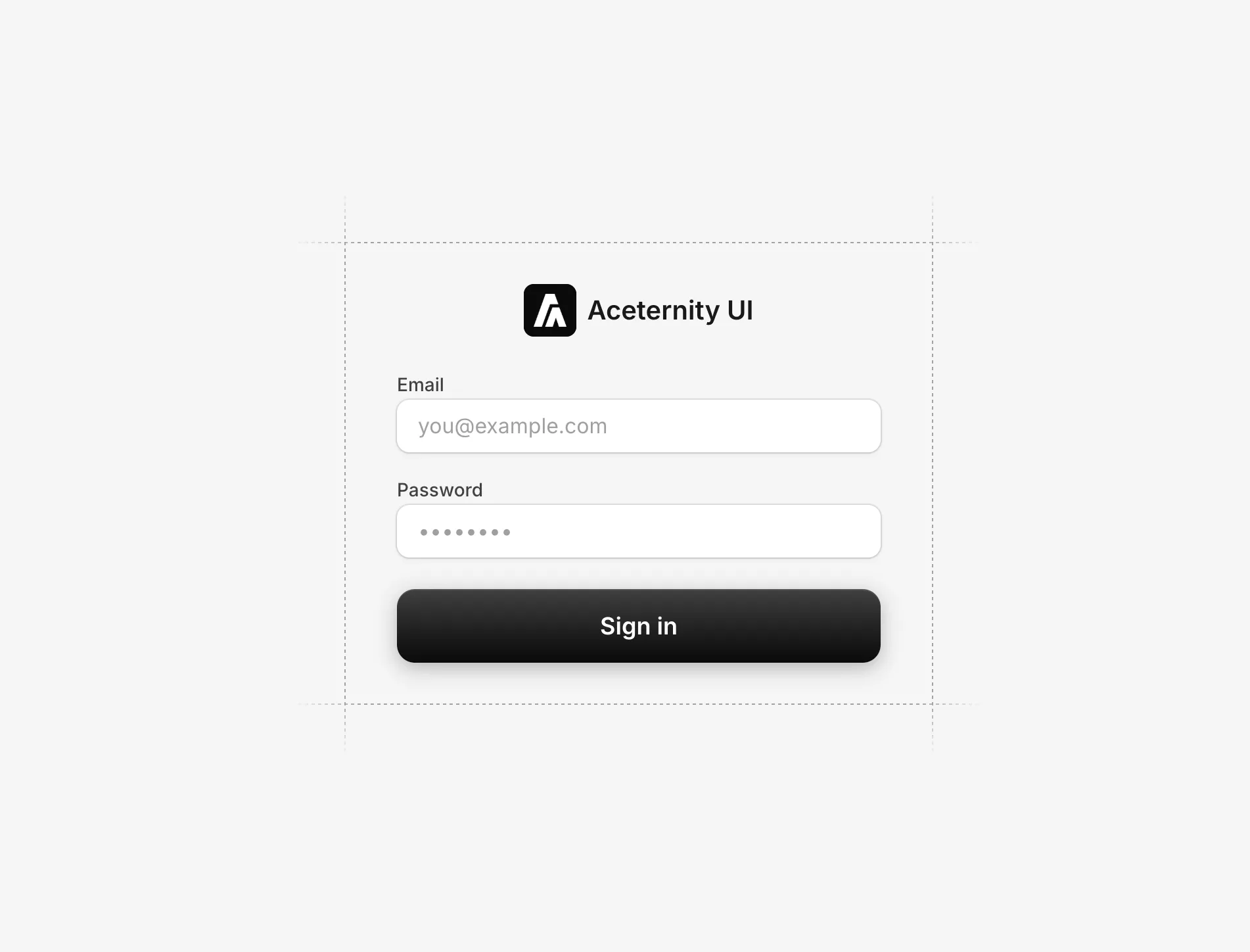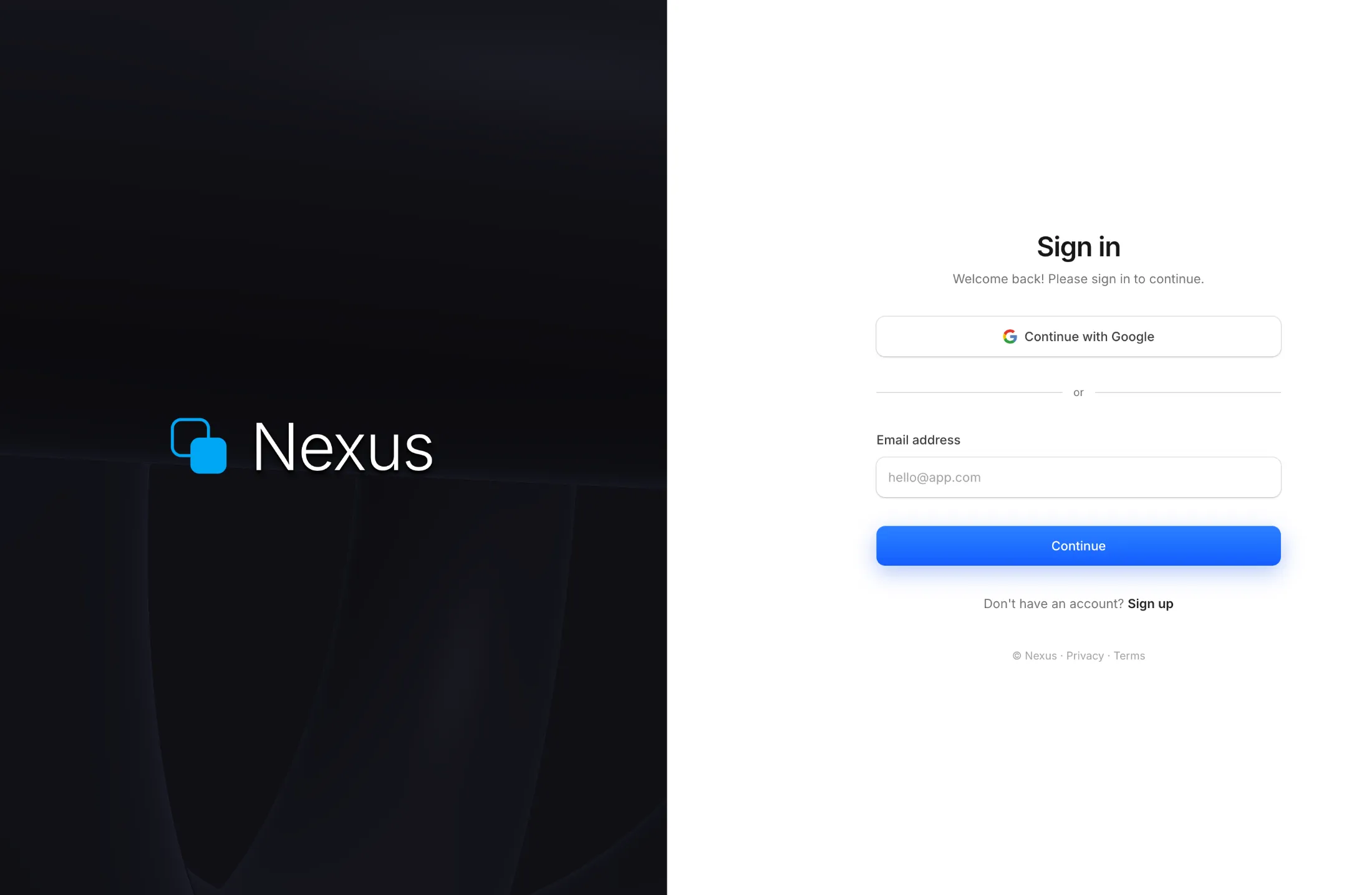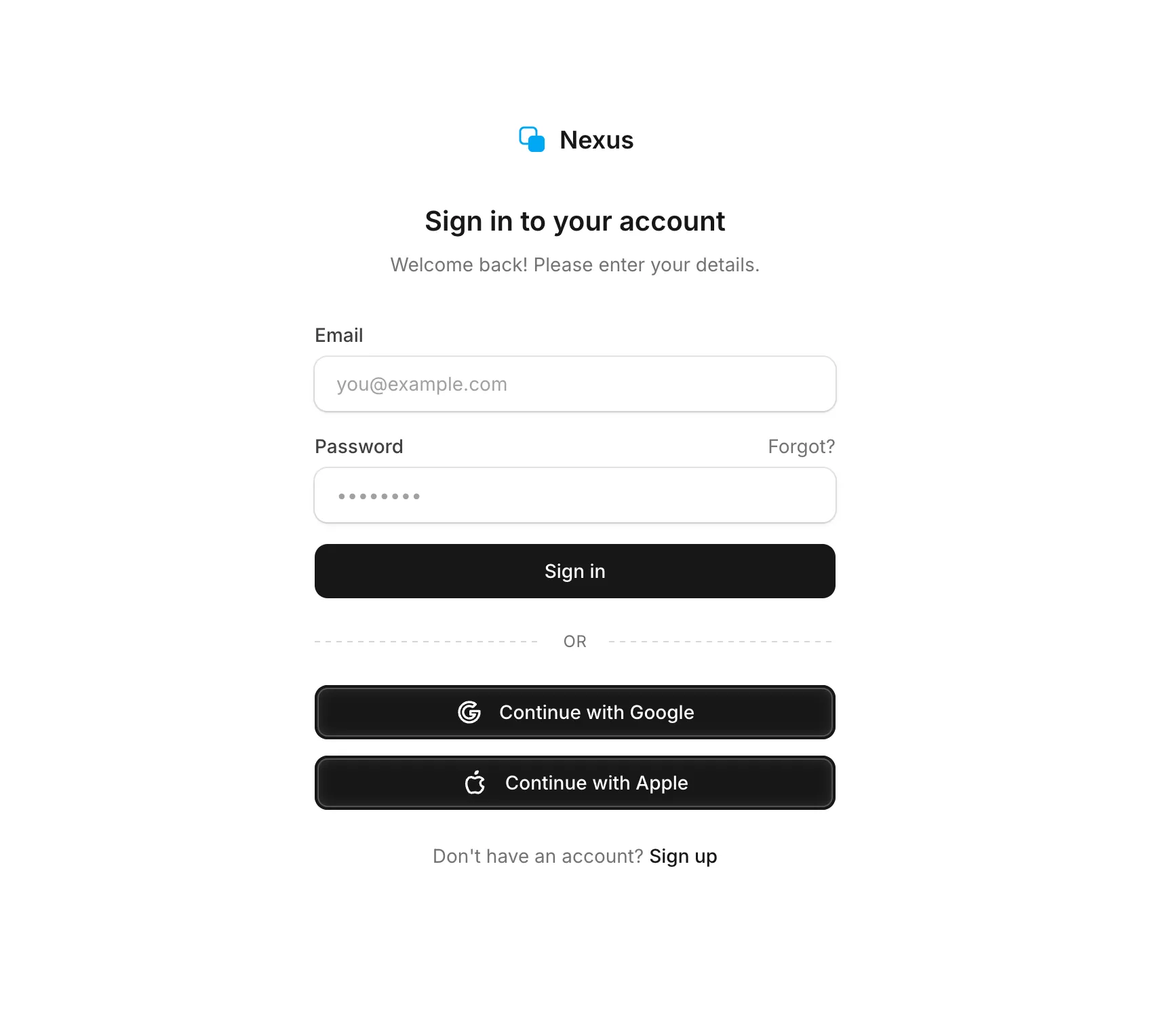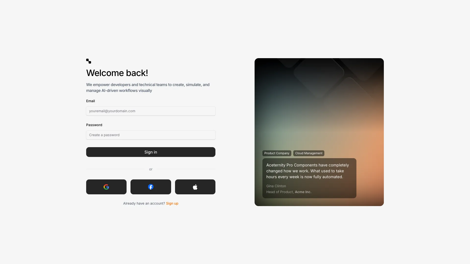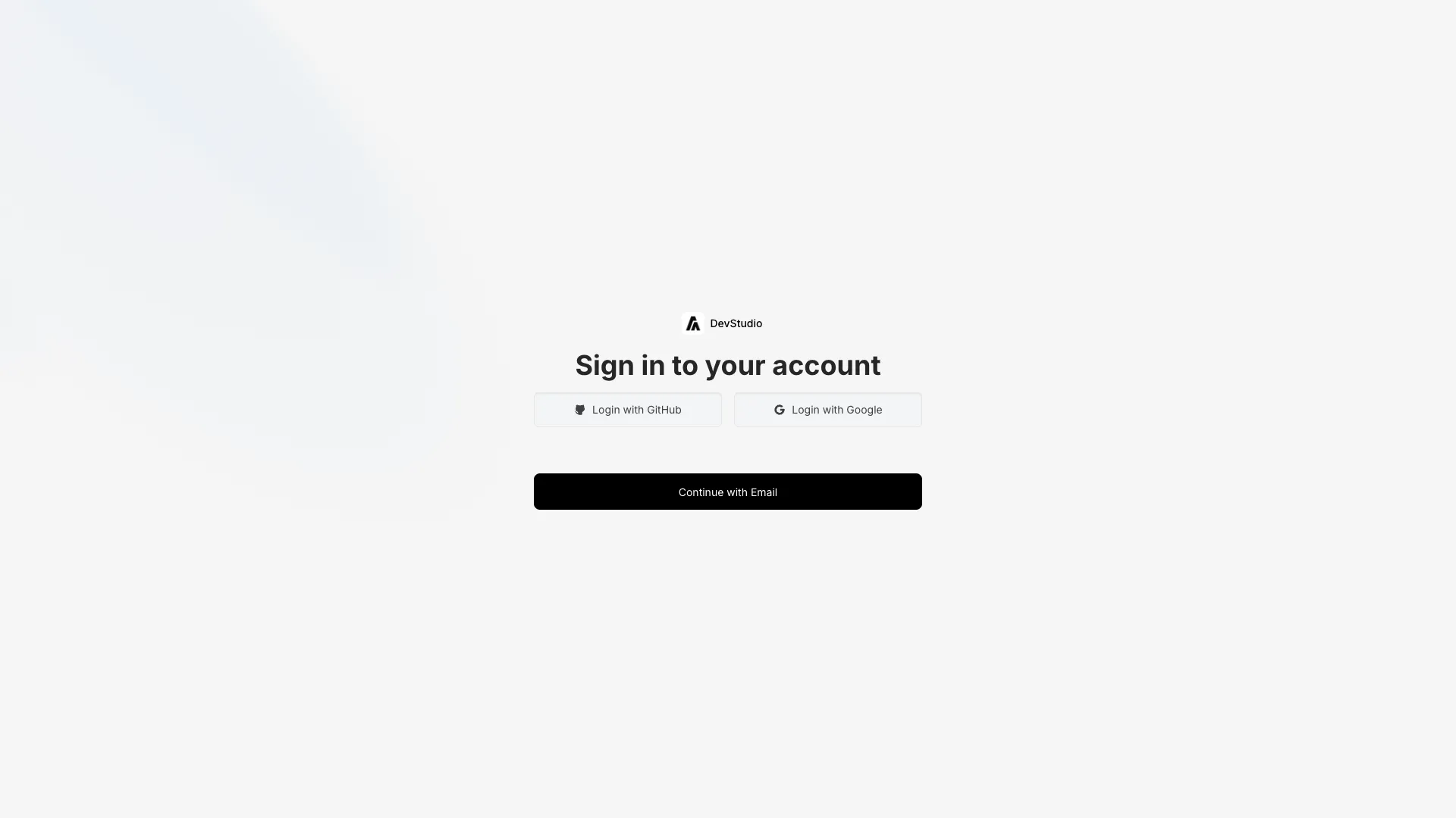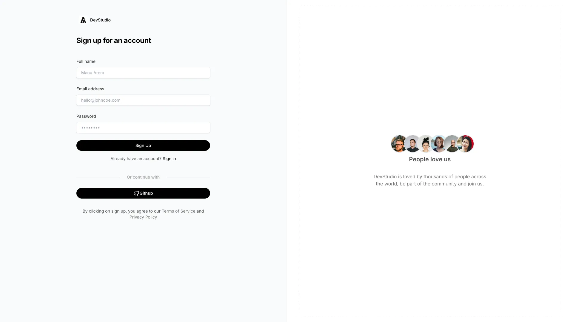








The forms are unwired on purpose, so connect them to NextAuth, Clerk, Supabase or your own route handler. Field names and labels are already in place.
Autocomplete attributes are not optional polish. Put autocomplete="username" or "email" on the identifier field, autocomplete="current-password" on a login password, and autocomplete="new-password" on registration and reset forms. Set type="email" so mobile keyboards show the right layout, and give every input a name and an id that its label points at. Without these, browsers and password managers guess, and they guess wrong often enough that people give up and reset their password instead.
Password managers break on custom inputs for predictable reasons. They look for a real input element inside a real form element, so anything built out of contenteditable divs, split single-character boxes, or fields that only mount after an animation finishes will confuse them. Never block paste, and never strip characters on input, because both behaviours specifically punish the people using generated passwords. If you add a show-password toggle, swap the type attribute on the same node rather than swapping in a different element, otherwise the manager loses track of the field.
Error handling on a login form has a security dimension the rest of your forms do not. Say "that email or password is not right" rather than confirming an account exists, since a message that distinguishes the two lets anyone enumerate your user list. Keep the email field populated after a failure, put the message in an aria-live region so it is announced, and do not clear a wrong password silently with no explanation. Rate limit attempts server side and be explicit when you lock someone out, including when they can try again.
The decorative half of a split-screen layout must never gate the form. The shader panel in one of these blocks is a real WebGL canvas, so lazy load it, render the form first in the DOM, and make sure a failed context creation leaves a plain background instead of a blank page. Someone hitting your login page is usually trying to get back into something urgently, and a two second animation between them and a password field is a cost with no return. On the OAuth buttons, keep the order stable across visits and mark which provider was used last, because people forget which one they signed up with.
Use autocomplete="username" or "email" on the identifier input and autocomplete="current-password" on the password input. On signup and password reset forms use autocomplete="new-password" instead, which is what tells a password manager to offer to generate and save a new credential.
Managers detect credentials by looking for standard input elements with recognised type, name and autocomplete values inside a form element. Custom widgets built from divs, split character boxes, inputs that mount late, or forms that block paste all defeat that detection. Keep a real form with real inputs and the problem usually disappears.
Separate pages are easier to get right, because signup needs new-password autocomplete, terms consent and different validation, while login should stay as short as possible. A single toggling component is fine if you swap the autocomplete attributes and the submit endpoint along with the labels.
Render each provider as a button that starts the OAuth redirect through your auth library, such as signIn("github") in NextAuth or the equivalent Supabase call. Put the providers above the email form, keep their order fixed between visits, and show a loading state on the clicked button since the redirect takes a moment.
Here's what some of our users have to say about Aceternity UI.

amazing to see @calcom find its way into proper templates 🥳 excited to be powering the next thousands of startups and their demo calls!

Stumbled upon ui.aceternity.com today and my mind is blown 🤯 The seamless integration of framer-motion, tailwind CSS, and shadcn showcases a masterclass in UI design. 🚀 Kudos to @mannupaaji for creating such an innovative and inspirational resource for devs! #UI #nextjs

Have you heard of Aceternity UI? It's packed with various animated components that are ready to copy and paste! Mind-blowing stuff... 🤯 Click here ➡️ ui.aceternity.com #framermotion #nextjs #tailwindcss #techinnovation

ui.aceternity.com So well done. And its bloody free 🤯🤯 Phenomenal work by @mannupaaji

So happy to see @mannupaaji work being recognised 🥹🤌🏻♥️ His work is literally a treasure trove for devs 💎

Aceternity UI has some of the best components for designing landing pages I've ever seen. If you're struggling with figuring out what animations to use. Check it out. Thank me later 😉. ui.aceternity.com
See what the best YouTubers are saying about Aceternity UI.



ceternity UI
Access an ever-growing collection of premium, meticulously crafted templates and Component Blocks.
© 2026 Aceternity Labs LLC. All Rights Reserved.