







These are interaction patterns rather than plain containers. Each page lists the Motion or Tailwind dependencies the effect needs.
Decide early whether the whole card is one link or a container holding several. A card with a title link, a tag link, and an author link means three tab stops and a confusing hit area, and wrapping all of that in an outer anchor produces nested interactive elements, which is invalid HTML and unpredictable for screen readers. The pattern that works is one anchor on the title, stretched over the card with an absolutely positioned pseudo-element, and any secondary links placed above it in the stacking order.
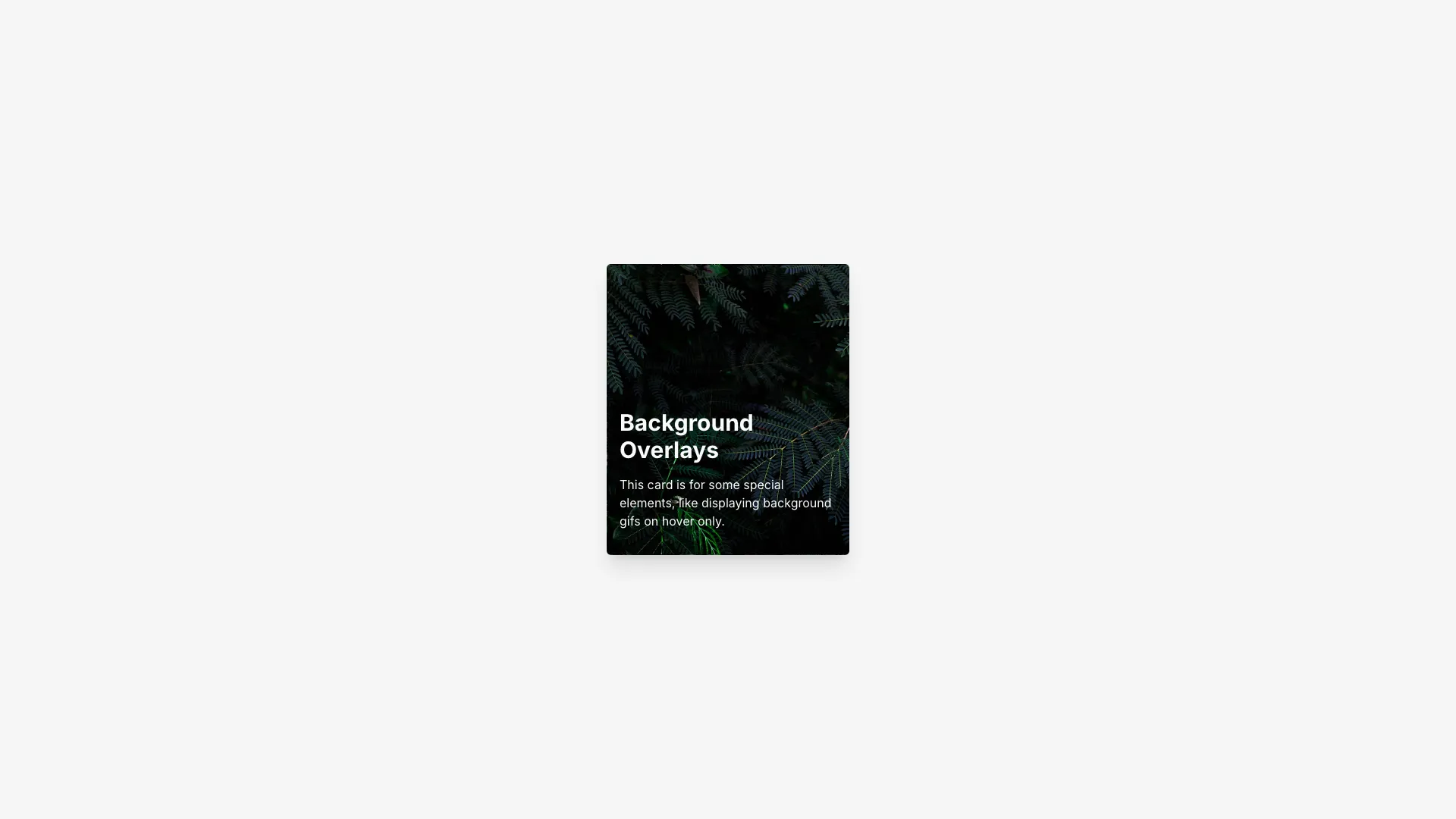
Hover effects are the default way to make cards feel alive and they simply do not exist on touch. If a card reveals its description, its category, or a play button only on hover, roughly half your visitors never see it. Treat hover as decoration, keep every piece of information visible in the resting state, and test the card by loading the page on a phone. The overlay card here swaps a still image for an animated one on hover, which degrades cleanly because the still frame already communicates the subject.
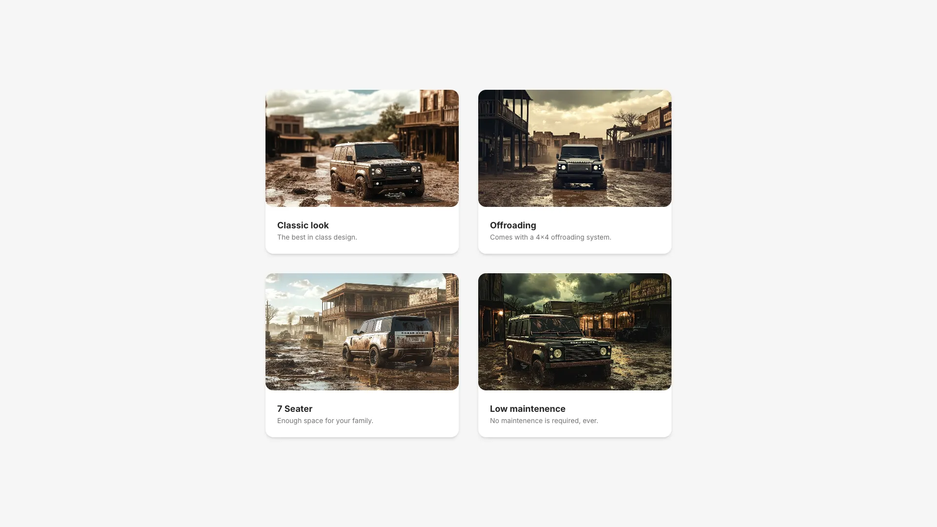
Images inside cards cause most of the layout shift on listing pages. Give every image a fixed aspect ratio with the aspect-video or aspect-square utility, set object-cover so different source ratios crop instead of stretching the card, and pass width and height. In a grid of twelve cards, one unsized image reflows the entire row. Also constrain the title to two lines with line-clamp, since a three-line title in one card makes every sibling taller and the grid starts looking accidental.
The expandable card uses Motion's layoutId to animate a grid item into a modal, and shared layout transitions have sharp edges. The element must exist in both states with the same layoutId or the animation snaps. You also inherit modal responsibilities: lock body scroll while it is open, close on escape and on backdrop click, move focus into the panel, and return it to the card that was clicked. Skipping the focus return is the bug people notice last and complain about first.
Put a single anchor on the card title and stretch it across the card with an absolutely positioned overlay, using after:absolute after:inset-0 in Tailwind. This keeps one link in the accessibility tree while giving you a full-card hit area.
Give the image wrapper a fixed aspect ratio with aspect-video or aspect-square, apply object-cover, and always pass width and height or use next/image. Without an intrinsic size the card grows on load and shifts the whole grid.
No. Touch devices have no hover state, so anything revealed on hover is invisible there. Keep titles, categories, and prices visible by default and use hover only for emphasis that nobody needs to read.
It uses Motion's layoutId to link the grid card and the open modal, so Motion interpolates position and size between them. Both elements need the same layoutId, and the modal still needs escape-to-close, scroll locking, and focus handling.
Here's what some of our users have to say about Aceternity UI.

amazing to see @calcom find its way into proper templates 🥳 excited to be powering the next thousands of startups and their demo calls!

Stumbled upon ui.aceternity.com today and my mind is blown 🤯 The seamless integration of framer-motion, tailwind CSS, and shadcn showcases a masterclass in UI design. 🚀 Kudos to @mannupaaji for creating such an innovative and inspirational resource for devs! #UI #nextjs

Have you heard of Aceternity UI? It's packed with various animated components that are ready to copy and paste! Mind-blowing stuff... 🤯 Click here ➡️ ui.aceternity.com #framermotion #nextjs #tailwindcss #techinnovation

ui.aceternity.com So well done. And its bloody free 🤯🤯 Phenomenal work by @mannupaaji

So happy to see @mannupaaji work being recognised 🥹🤌🏻♥️ His work is literally a treasure trove for devs 💎

Aceternity UI has some of the best components for designing landing pages I've ever seen. If you're struggling with figuring out what animations to use. Check it out. Thank me later 😉. ui.aceternity.com
See what the best YouTubers are saying about Aceternity UI.



ceternity UI
Access an ever-growing collection of premium, meticulously crafted templates and Component Blocks.
© 2026 Aceternity Labs LLC. All Rights Reserved.