Using Skeletons to Uplift Your Feature Sections
Recently, we release a lot of Skeleton and Illustration components at Aceternity.
Skeletons (I'm going to refer to them as skeletons because its easier) are something that convey the message in a better form.
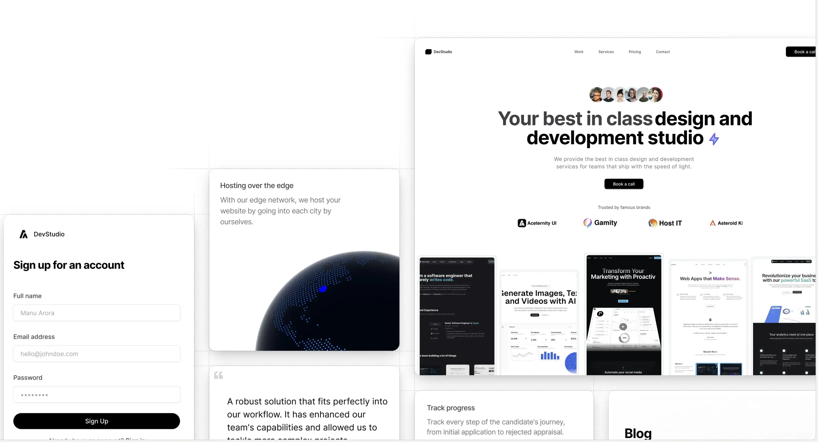
For example, take a look at this component that we built recently
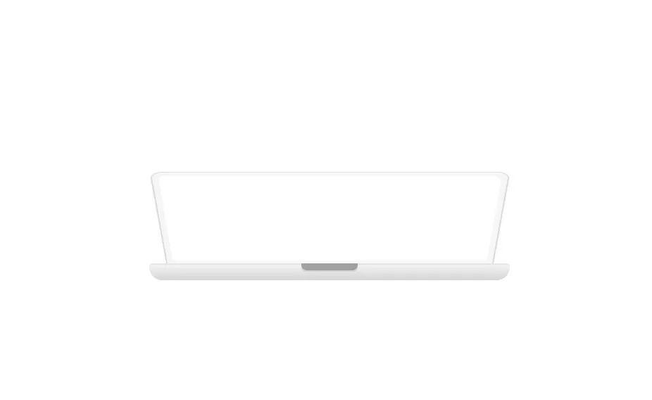
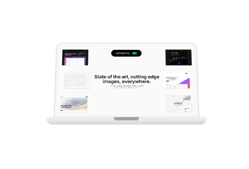
Now this is a motion component. Hover over on the image and it opens the lid of the macbook.
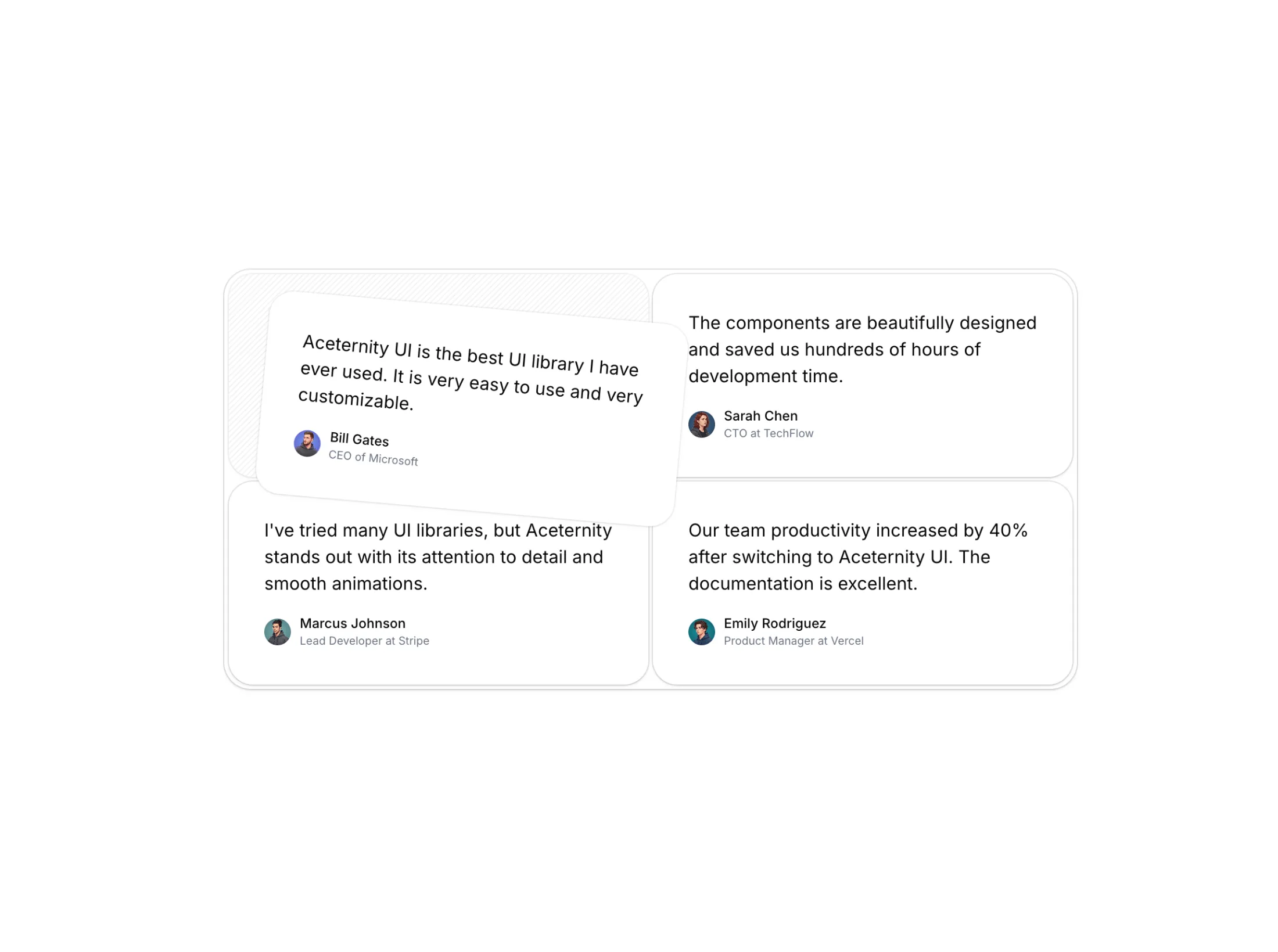
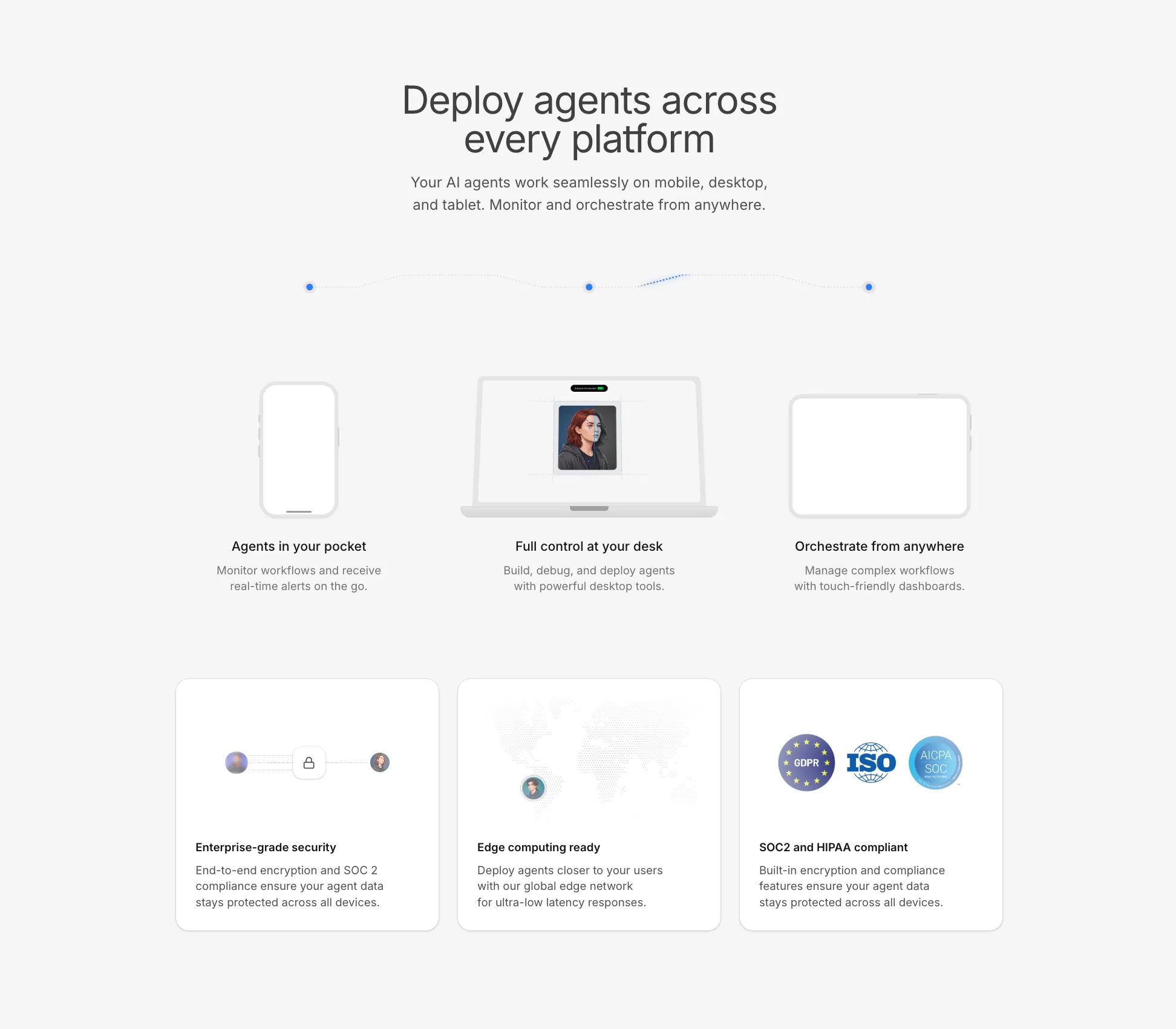
This is a standalone skeleton, pair it with a hero section or a feature section for the bigger picture and you have something like this
Sweating the details
When it comes to detailing, one should spend the most amount of time in polishing the details.
Sweating the details means exploring all the little touches that can elevate your UI from generic to genuinely engaging. With skeletons, consider specifics like how the shadows fall, where you place highlights, the smoothness of curves, and how interactions feel instead of just look.
For example, we often iterate several times on the animation speed when unveiling a skeleton. A lid that opens too quickly feels jarring, while one that's too slow feels unresponsive. It's a small adjustment, but it determines whether the transition feels delightful or awkward.
Paying attention to things like border radii, layering, and lighting—sometimes barely noticeable—can add a sense of polish and professionalism. Don't hesitate to obsess over pixel-level tweaks or play with micro-interactions until things look and feel just right.
And finally, always test your skeletons in context! What works in a standalone block might disappear or overpower a section once you pair it with real copy and layout. Elevate your sections by sweating the details, and your users will feel the difference even if they can't quite explain why.
Copy should direct skeleton
Skeletons should be used or created keeping the copy in mind. It should not be the other way round. The copy on the feature card should direct how the skeleton looks.
This is because the copy is everything on a website. It dictates how the user percieves the product or service. A skeleton should act as a catalyst in conveying that message across.
It's tempting to design a flashy skeleton or illustration and then force the copy or feature content to fit around it. But that's backwards: effective UI puts the message first. Before you start sketching out shapes, gradients, or animations, figure out what your product feature or section needs to say.
Ask: What feeling or value do we want to communicate? Is it "fast onboarding," "trusted security," or "playful creativity"? Once you know your message, style the skeleton to echo that sentiment—maybe through its form, color accents, or even the type of motion you use.
This way, your feature sections will feel cohesive and intentional. The copy and the skeleton illustration should reinforce each other, making it easier for users to understand, trust, and remember what you're presenting.
It's a partnership:
- Copy gives context and meaning to the visuals
- Skeletons make those words tangible, memorable, and engaging
Always start with clarity on your message, and let that drive your design decisions. That's how you create feature sections that truly uplift your product (and not just decorate it).
Keep it subtle
Now a lot of people are going to overdo animations at every chance they get. The devil is in the details and you need to be careful about it.
Most of the times, a GREAT animations is always about timing and subtle movements. It should be invisible to the human eye and at the same time, it should be a delight in terms of UX.
For example, if you are using a skeleton, you need to be careful about the timing of the animation. If the animation is too fast, it will feel jarring and if it is too slow, it will feel unresponsive.
Keep it simple and subtle. Great animations are always subtle.
Conclusion
Skeletons or illustrations are perfect for conveying your message across. They are a great way to uplift your feature sections and make them more engaging.
But like anything else, they need to be used with care. Sweat the details, keep it subtle, and always start with clarity on your message.
That's how you create feature sections that truly uplift your product (and not just decorate it).