
How to create a bento grid with Tailwind CSS, Next.js and Framer Motion
A Bento grid is a design trend that has picked up recently where one displays a grid of cards that showcase various features of your product or business.
Recently, we released a brand new template at Aceternity that focuses on marketing. There, we happened to create a bento grid that focuses on displaying the features of the product in a minimalistic and clean manner.
Card Structure
To design a bento grid, you need to have a card structure. The card structure is simple with compound components.
For a Card compound component, we are going to require 4 components
CardCardTitleCardDescriptionCardSkeletonContainer
export const Card = ({
className,
children,
}: {
className?: string;
children: React.ReactNode;
}) => {
return (
<div
className={cn(
"p-8 rounded-xl border border-[rgba(255,255,255,0.10)] bg-[rgba(40,40,40,0.30)] shadow-[2px_4px_16px_0px_rgba(248,248,248,0.06)_inset] group",
className
)}
>
{children}
</div>
);
};
export const CardTitle = ({
children,
className,
}: {
children: React.ReactNode;
className?: string;
}) => {
return (
<h3 className={cn("text-lg font-semibold text-white py-2", className)}>
{children}
</h3>
);
};
export const CardDescription = ({
children,
className,
}: {
children: React.ReactNode;
className?: string;
}) => {
return (
<p
className={cn("text-sm font-normal text-neutral-400 max-w-sm", className)}
>
{children}
</p>
);
};
export const CardSkeletonContainer = ({
className,
children,
showGradient = true,
}: {
className?: string;
children: React.ReactNode;
showGradient?: boolean;
}) => {
return (
<div
className={cn(
"h-[20rem] rounded-xl z-40",
className,
showGradient &&
" bg-[rgba(40,40,40,0.30)] [mask-image:radial-gradient(50%_50%_at_50%_50%,white_0%,transparent_100%)]"
)}
>
{children}
</div>
);
};Now since we have a card structure in place, let's see how to use it with some data and see how it looks on the UI.
export const FirstCard = () => {
return (
<Card>
<CardSkeletonContainer>
<SkeletonTwo />
</CardSkeletonContainer>
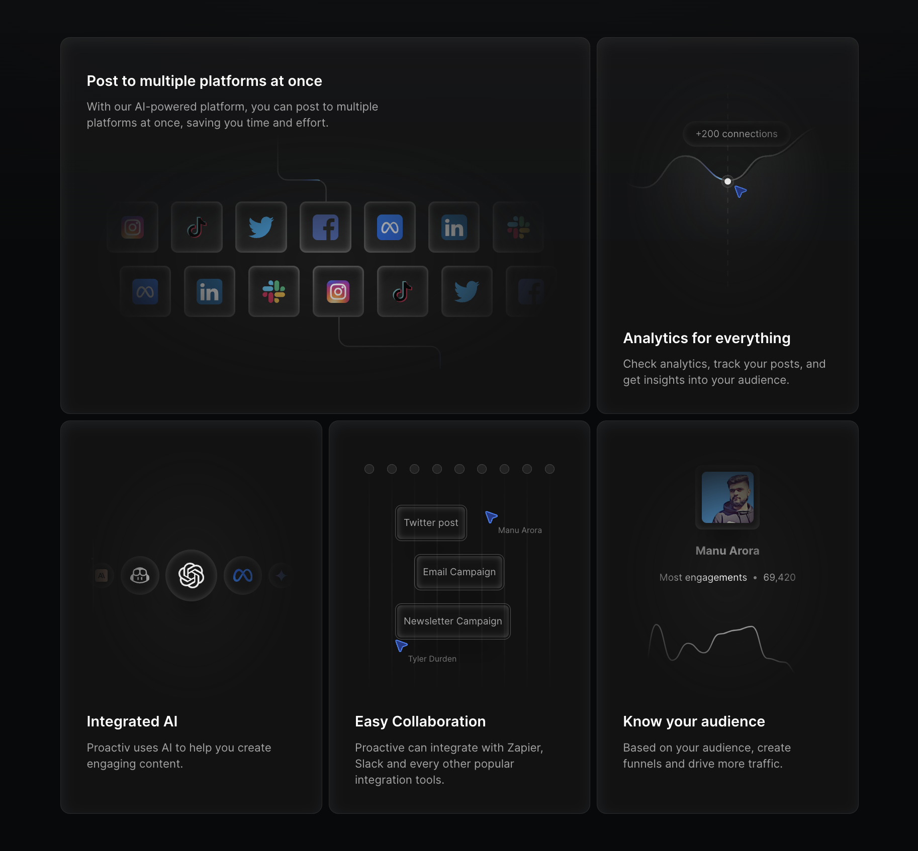
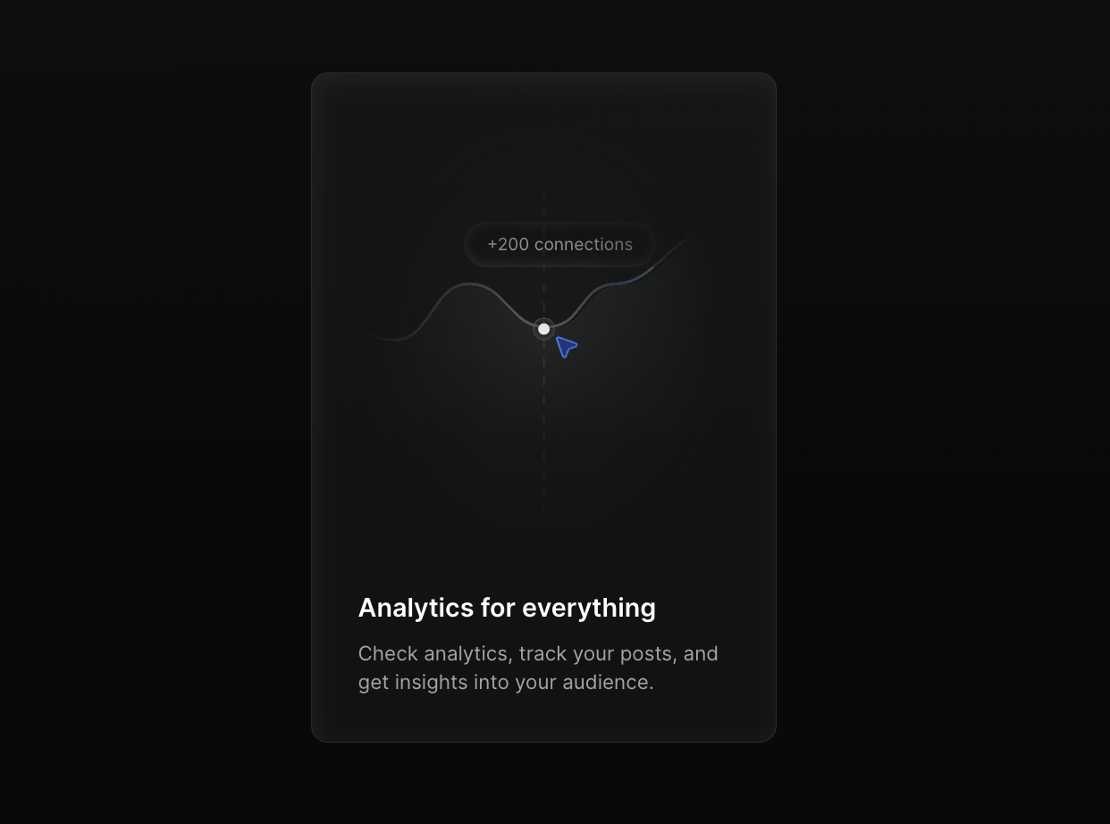
<CardTitle>Analytics for everything</CardTitle>
<CardDescription>
Check analytics, track your posts, and get insights into your audience.
</CardDescription>
</Card>
);
};Now since we have the card in place, let's see how we can create a Bento Grid with this.
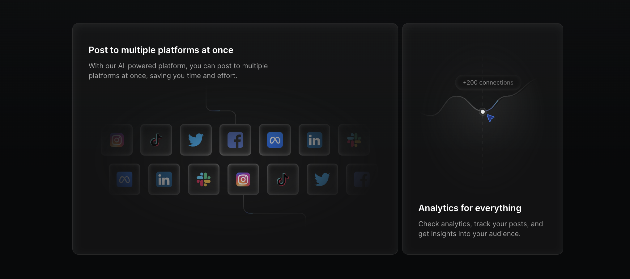
We can use col-span utilities provided by Tailwind CSS to span a card across multiple columns.
For example, if we have a grid of 4 columns and we want to span 1 card across 3 columns and 1 card across 1 column, we can do something like this
export const Example = () => {
return (
<div className="grid grid-cols-4 gap-4">
<Card className="col-span-3">
<CardSkeletonContainer>
<SkeletonTwo />
</CardSkeletonContainer>
<CardTitle>Analytics for everything</CardTitle>
<CardDescription>
Check analytics, track your posts, and get insights into your
audience.
</CardDescription>
</Card>
<Card>
<CardSkeletonContainer>
<SkeletonTwo />
</CardSkeletonContainer>
<CardTitle>Analytics for everything</CardTitle>
<CardDescription>
Check analytics, track your posts, and get insights into your
audience.
</CardDescription>
</Card>
</div>
);
};Here's how the Bento row looks like once we have col-span-3 in the first card.
Now, we can replicate the exact same thing to the second row to create a similar layout
export const Example = () => {
return (
<div className="grid grid-cols-4 gap-4">
<Card className="col-span-3">
<CardSkeletonContainer>
<SkeletonTwo />
</CardSkeletonContainer>
<CardTitle>Analytics for everything</CardTitle>
<CardDescription>
Check analytics, track your posts, and get insights into your
audience.
</CardDescription>
</Card>
<Card>
<CardSkeletonContainer>
<SkeletonTwo />
</CardSkeletonContainer>
<CardTitle>Analytics for everything</CardTitle>
<CardDescription>
Check analytics, track your posts, and get insights into your
audience.
</CardDescription>
</Card>
<Card>
<CardSkeletonContainer>
<SkeletonTwo />
</CardSkeletonContainer>
<CardTitle>Analytics for everything</CardTitle>
<CardDescription>
Check analytics, track your posts, and get insights into your
audience.
</CardDescription>
</Card>
<Card className="col-span-3">
<CardSkeletonContainer>
<SkeletonTwo />
</CardSkeletonContainer>
<CardTitle>Analytics for everything</CardTitle>
<CardDescription>
Check analytics, track your posts, and get insights into your
audience.
</CardDescription>
</Card>
</div>
);
};The output looks something like this after we have the above code in place.
The idea is to span your card to multiple columns to create a bento grid.
The same idea can be replicated to span the card in multiple rows with row-span- classes.
Example
We have create a few bento grids at aceternity where we talk about how you can create super simple and elegant looking bento grids with Tailwind CSS. Let's take a look at one such example.
Here, the card structure is similar to the one we have created above.
import { cn } from "@/lib/utils";
import React from "react";
import { BentoGrid, BentoGridItem } from "../ui/bento-grid";
import {
IconArrowWaveRightUp,
IconBoxAlignRightFilled,
IconBoxAlignTopLeft,
IconClipboardCopy,
IconFileBroken,
IconSignature,
IconTableColumn,
} from "@tabler/icons-react";
export default function BentoGridDemo() {
return (
<BentoGrid className="max-w-4xl mx-auto">
{items.map((item, i) => (
<BentoGridItem
key={i}
title={item.title}
description={item.description}
header={item.header}
icon={item.icon}
className={i === 3 || i === 6 ? "md:col-span-2" : ""}
/>
))}
</BentoGrid>
);
}
const Skeleton = () => (
<div className="flex flex-1 w-full h-full min-h-[6rem] rounded-xl bg-gradient-to-br from-neutral-200 dark:from-neutral-900 dark:to-neutral-800 to-neutral-100"></div>
);
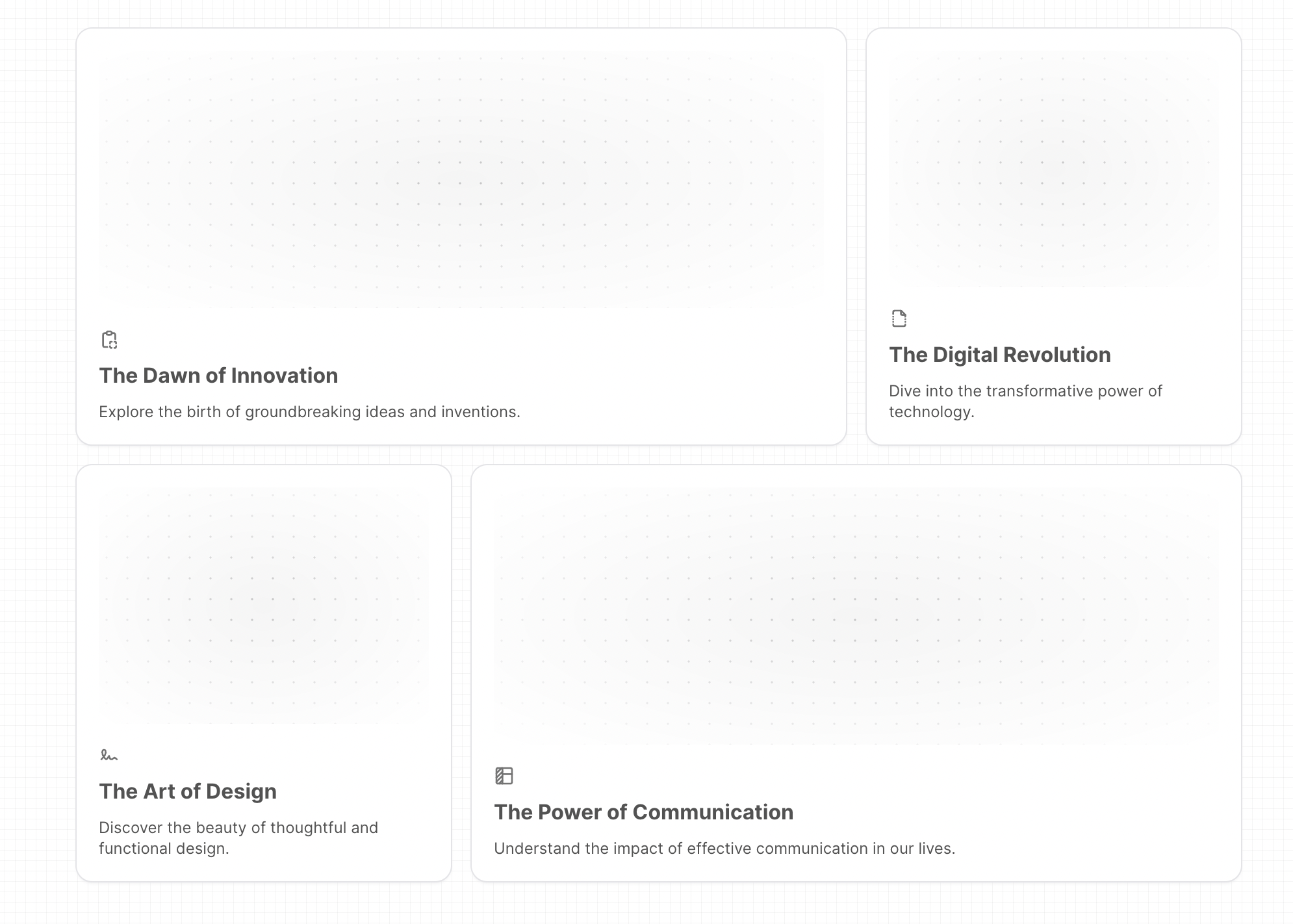
const items = [
{
title: "The Dawn of Innovation",
description: "Explore the birth of groundbreaking ideas and inventions.",
header: <Skeleton />,
icon: <IconClipboardCopy className="h-4 w-4 text-neutral-500" />,
},
{
title: "The Digital Revolution",
description: "Dive into the transformative power of technology.",
header: <Skeleton />,
icon: <IconFileBroken className="h-4 w-4 text-neutral-500" />,
},
{
title: "The Art of Design",
description: "Discover the beauty of thoughtful and functional design.",
header: <Skeleton />,
icon: <IconSignature className="h-4 w-4 text-neutral-500" />,
},
{
title: "The Power of Communication",
description:
"Understand the impact of effective communication in our lives.",
header: <Skeleton />,
icon: <IconTableColumn className="h-4 w-4 text-neutral-500" />,
},
{
title: "The Pursuit of Knowledge",
description: "Join the quest for understanding and enlightenment.",
header: <Skeleton />,
icon: <IconArrowWaveRightUp className="h-4 w-4 text-neutral-500" />,
},
{
title: "The Joy of Creation",
description: "Experience the thrill of bringing ideas to life.",
header: <Skeleton />,
icon: <IconBoxAlignTopLeft className="h-4 w-4 text-neutral-500" />,
},
{
title: "The Spirit of Adventure",
description: "Embark on exciting journeys and thrilling discoveries.",
header: <Skeleton />,
icon: <IconBoxAlignRightFilled className="h-4 w-4 text-neutral-500" />,
},
];import { cn } from "@/lib/utils";
export const BentoGrid = ({
className,
children,
}: {
className?: string;
children?: React.ReactNode;
}) => {
return (
<div
className={cn(
"grid md:auto-rows-[18rem] grid-cols-1 md:grid-cols-3 gap-4 max-w-7xl mx-auto ",
className
)}
>
{children}
</div>
);
};
export const BentoGridItem = ({
className,
title,
description,
header,
icon,
}: {
className?: string;
title?: string | React.ReactNode;
description?: string | React.ReactNode;
header?: React.ReactNode;
icon?: React.ReactNode;
}) => {
return (
<div
className={cn(
"row-span-1 rounded-xl group/bento hover:shadow-xl transition duration-200 shadow-input dark:shadow-none p-4 dark:bg-black dark:border-white/[0.2] bg-white border border-transparent justify-between flex flex-col space-y-4",
className
)}
>
{header}
<div className="group-hover/bento:translate-x-2 transition duration-200">
{icon}
<div className="font-sans font-bold text-neutral-600 dark:text-neutral-200 mb-2 mt-2">
{title}
</div>
<div className="font-sans font-normal text-neutral-600 text-xs dark:text-neutral-300">
{description}
</div>
</div>
</div>
);
};Notice how we are passing the md:col-span-2 class in the BentoGridItem component.
That makes sure that once the component renders on a medium screen, it will span 2 columns.
Conclusion
We've seen how we can make use of the col-span- and row-span- classes to create a bento grid.
We've also seen how we can make use of the grid-cols- and grid-rows- classes to create a bento grid with the number of rows and columns that we need inside of it.
If you liked this article, you can read more about how to create a bento grid with Tailwind CSS.
Cheers!

